Hi, my name is Mimi Farr, and I am a student at EKC Folkestone Junior College and I am currently working on my final project, also known as my unit 8. This website is where I am going to be documenting all things to-do with this project including my initial exploration of my theme, (which is transformation and illusion) research, experimentation, idea development, and any other work that I do.
initial theme exploration:
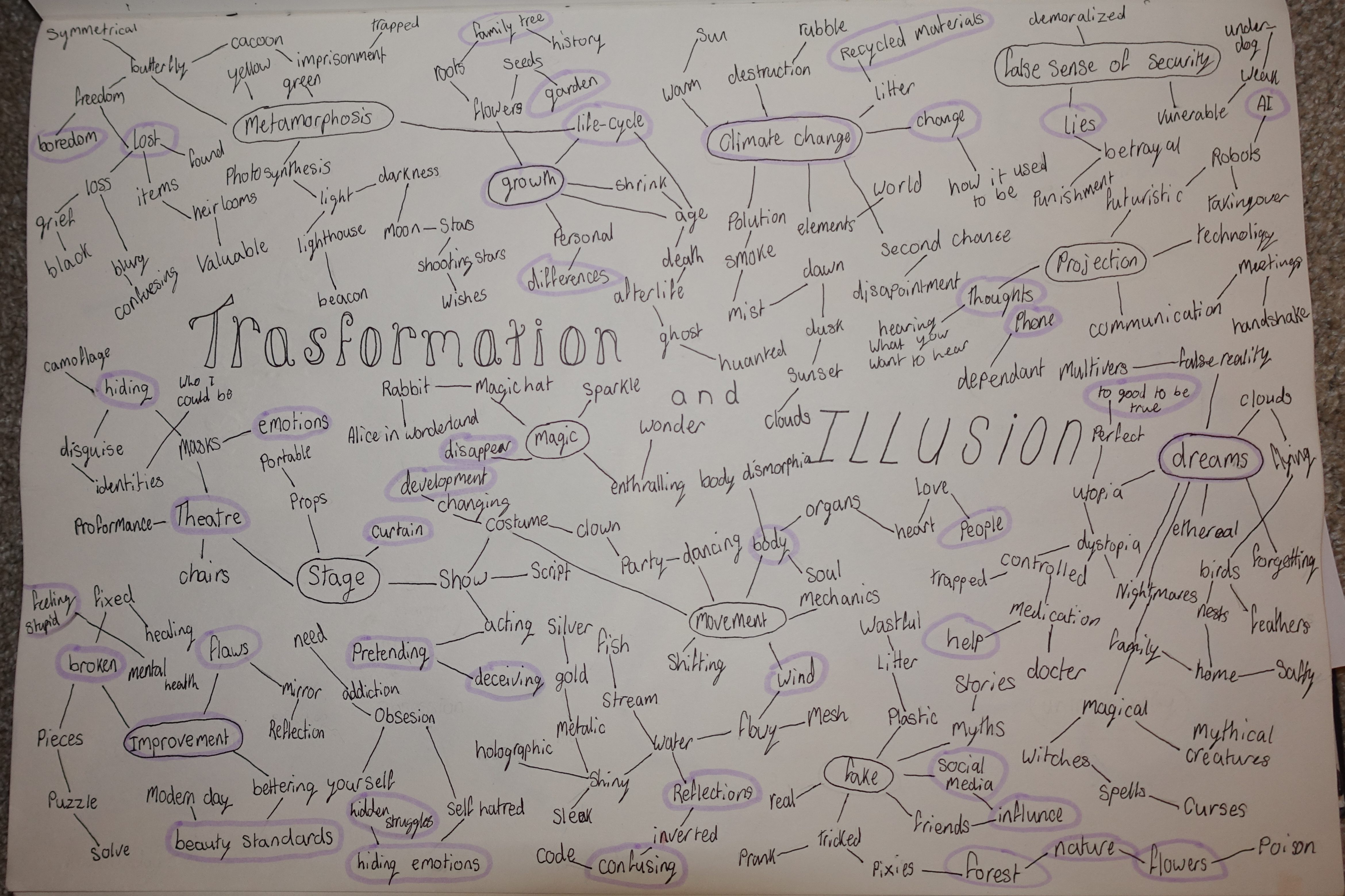
The first thing I did to help me figure out what I wanted to create for my unit 8 was to make a mind map, (as shown in the photo) on my chosen theme, transformation and illusion. I started off by writing down the first words or topics that came to my mind when thinking about my theme and circling them in black, then, writing anything I thought of that was linked to those words and so on. After I had finished writing down everything I could think of, I then went back and circled my favourite words or topics in purple.
Doing this made me start thinking about how I wanted to interpret the theme of transformation and illusion in relation to this project. To me, transformation means something changing from one thing into another over a period of time, if I wanted to express this through my work I would show the process of that change. When I think of an illusion I think of something that seems real but isn’t, I wouldn’t create a physical illusion but rather display through my art a far to common thing that doesn’t seem like an illusion but it is one.
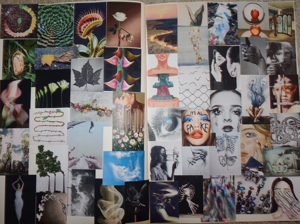
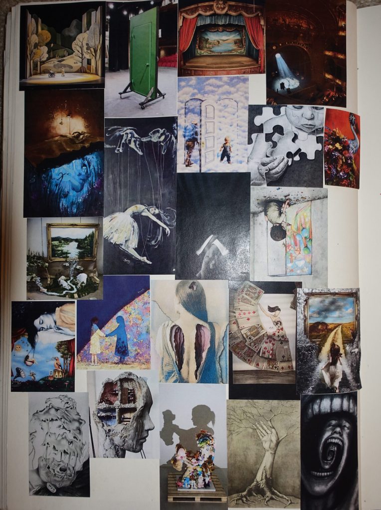
After making my mind map I was a little stuck on what I should do next, while I had narrowed my ideas down to some favourites it was still hard for me to decide on one or two from just that, so I thought it might help me if I made a mood board based on my ideas to see possible directions I could take my project. I went online, (mostly Pinterest) and searched for images that are related to the topics I had circled on my mind map then printed them all out and stuck them in my sketchbook so I could have physical access to these photos.
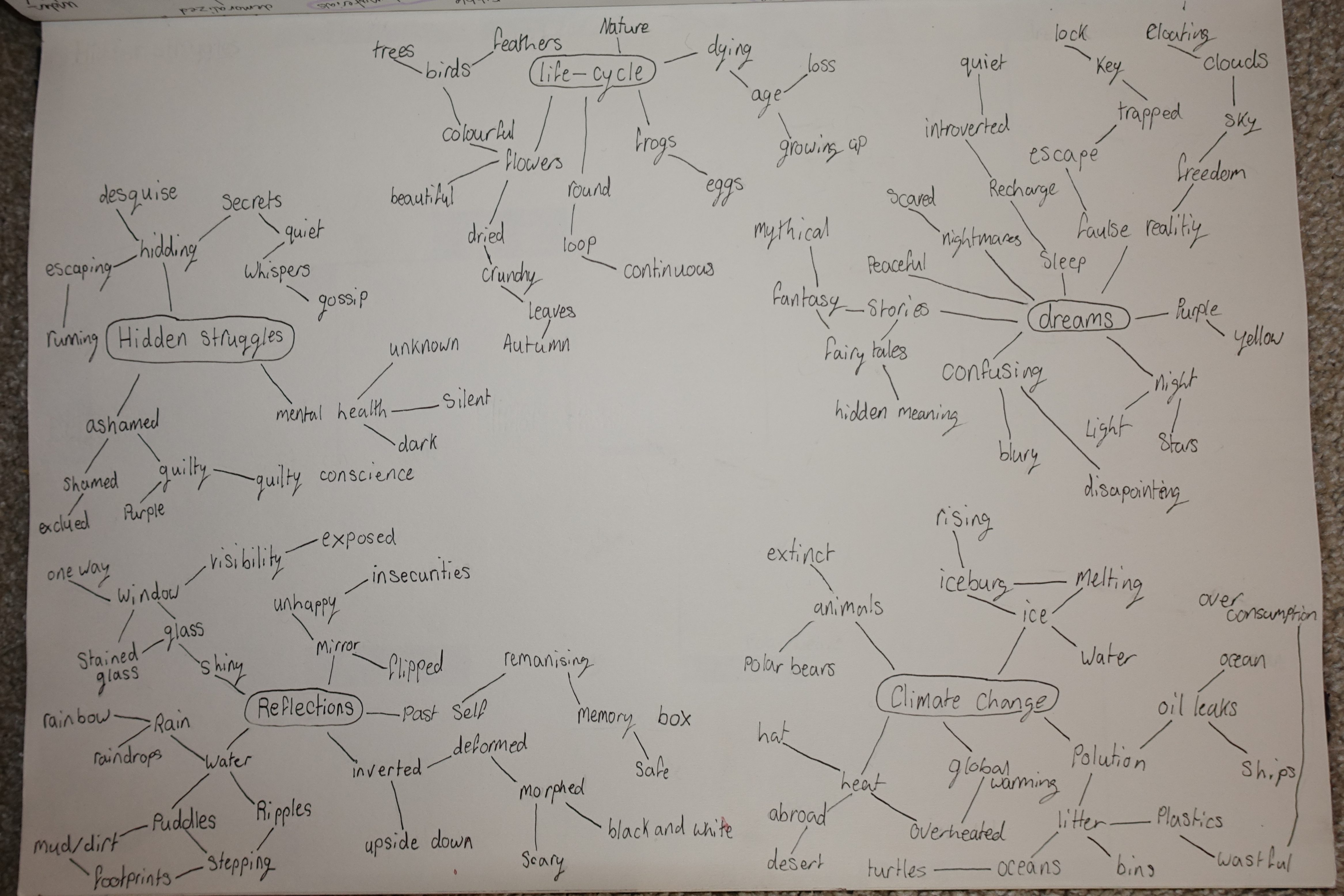
After creating my initial mind map and mood board, I had a lot of favourite ideas, (as you can see in the first few photos) so I wanted to expand on those more. I picked the words I found most inspiring out of my favourites and made a second mind map using only those ideas and then expanding more on them. Doing this helped me to pinpoint what I concept/concepts I wanted my work to be inspired by and though it was quite a journey to get there, I eventually landed on the ideas of life-cycles and our memories. I chose two topics because I was torn between both concepts, I wanted to experiment with both and I thought that I would be able to link the two as they aren’t too dissimilar.
Once I had finished my mind maps and mood board I got a little bit stuck. I had a vague idea about where I wanted to end up, (as in I wanted it to be related to life-cycles and/or memories) but otherwise I didn’t really know what I was doing. I had started thinking about possible mediums or techniques I could use, I wanted to experiment with using 3D materials as well as 2D ones like drawing and painting but I didn’t really want to make a sculpture or a painting so I decided I wanted to find ways of merging the two.
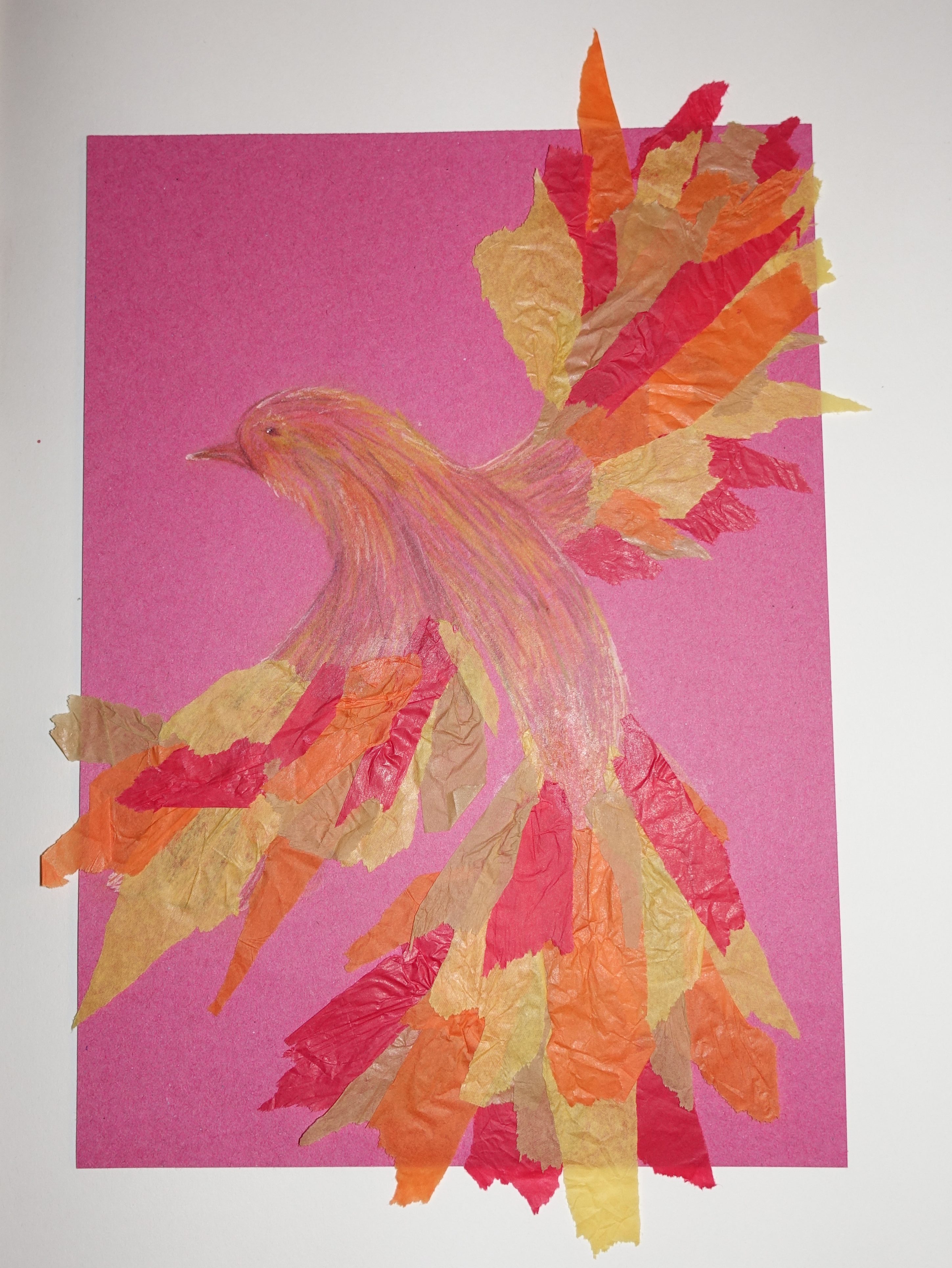
Even after coming to this conclusion I still didn’t know what my next step was so I talked to one of my teachers and they suggested just trying to make something which is how I ended up creating this bird.
I used coloured pencils in yellow, orange, red, brown, green, purple and pink to draw the body using straight and slightly curved lines to create the look of short and thin feathers covering the body of the bird. To start experimenting with combining 2D and 3D elements I decided to use tissue paper to mimic the effect of bigger, longer feathers that make up a birds wings. I ripped some tissue paper into messy strips, using colours that best matched the colouring of the body, and I stuck it down with glue, but only at the ends closest to the body of the bird so that the other side would be free to be moved around so that it could create the effect of the bird coming out of the paper. After the body and wings were completed, I went back in and added some final touches, I used a white pen to add highlights to the body on places like it’s head, beak, back and eye and after that it was finished.
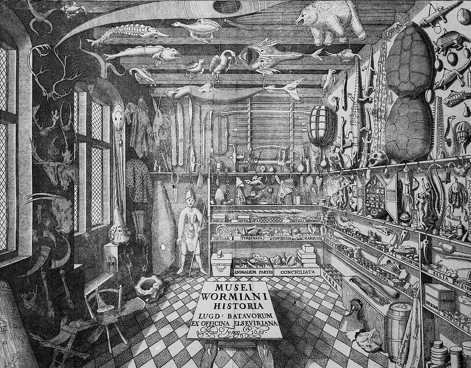
Making this bird helped me to realise the style of work I wanted to explore so the next thing I wanted to do was research. I don’t know of that many artists off the top of my head so I started looking into artists that incorporate 3D elements into their work, though I didn’t find an artist that I found inspiring from this, I did discover something else, cabinets of curiosity. This is a term for a physical space dedicated to collections of strange (or curious) objects normally including items found in the natural world, man made or modified objects, exotic plants or animals and scientific tools. They became quite popular across Europe in the 17th and 18th centuries particularly in wealthier households who’s ‘cabinet’s’ got as big as rooms and were often on display to guests of the house. The reason I found these inspiring is the uniqueness of each persons ‘cabinet’, different collections range in size and they tell you a lot about the person who owns it as you can tell what their particular interests were and you just know that their is a story behind the origins of each object in the collection which is something I really like thinking about. Below are some illustrations of examples of a cabinet of curiosity might look like.
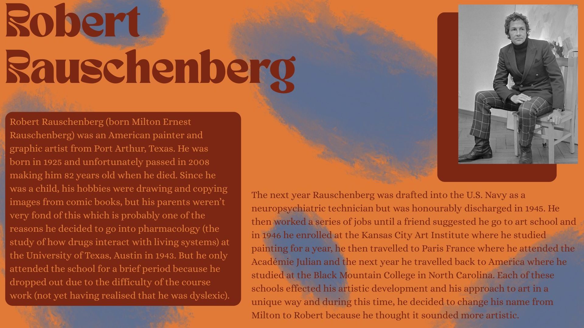
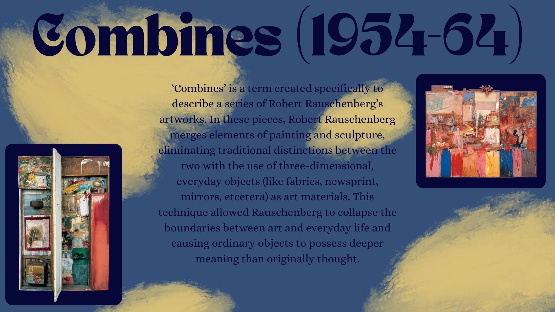
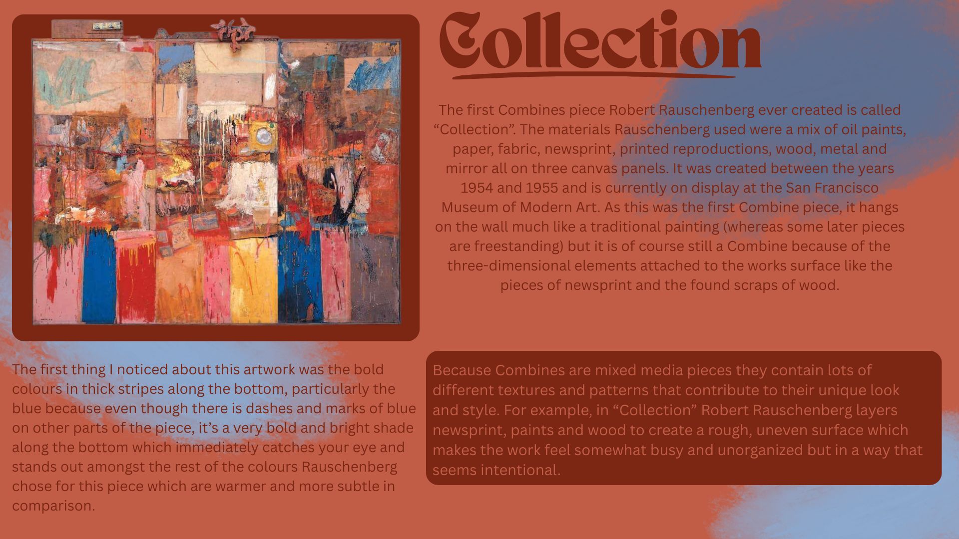
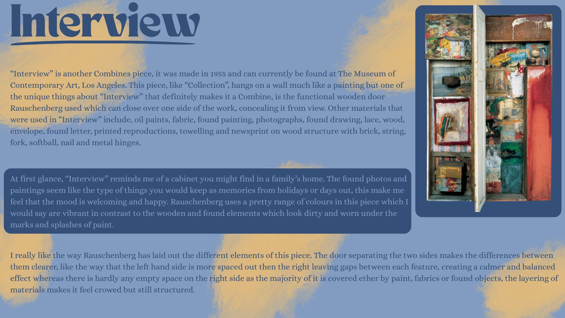
Unfortunately other than the cabinets of curiosity I didn’t find an artist that I wanted to research but my teacher did recommend me some artists based on what I told them about my ideas for my project, and one of those artists was Robert Rauschenberg who used found objects and 3D materials in his work to create depth and make it more interesting to look at. Below is the research I did on him.
When I research I like to start off by looking up the artist or thing that I am researching to see if they have a website or if someone else has made a website dedicated to them. I do this because it helps me become familiar with the subject of my research if, for example, I am researching an artist, I will go onto their website not necessarily to learn about their art but to get to know who they are and what inspired them to do what they do. I like doing this because I think a big part of someone’s art is who they are/were and once you know about the artist and what fuels them you can start appreciating what they create on a different level. I also find it helpful to watch YouTube videos on what I am researching as I find I take in information better when somebody is saying/explaining it to me and it is especially beneficial for me to find interviews of an artist where they are talking about their work because then you are hearing them explain their art in their own words so you can really get into their brain and understand the way they look at art. After learning base information about what I am researching I like to think of specific questions I have and then find out the answers to them. This is because my research is done for me to learn and understand things that I am not already familiar with and I find doing this then writing down what I learn is the best way for me to process the information I gain from doing research. Another way I research is just looking and thinking. I find really looking at a photo of whatever I research to sometimes be more helpful than looking up information about it especially when it comes to forming my opinions on it. Thinking about an image helps me to form thoughts on its appearance, how its colours work, what the textures add to it and what the artist could’ve wanted to express through their artwork.
experimentation:
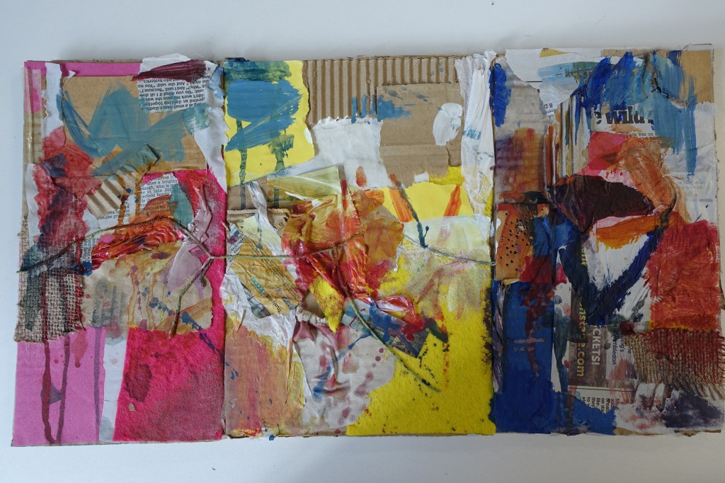
Researching Robert Rauschenberg further inspired me and confirmed that I wanted to start experimenting with 3D materials. Rauschenberg is very unique in the way that he uses 3D objects in his work so I thought trying out his art style by recreating one of his pieces would be beneficial because it would take me out of my comfort zone a little and make me feel more comfortable with using a wide range of materials in one piece of work. I chose to recreate his piece “Collection” which was one of the ones that I researched so I was already familiar with how it looked and what it was made of.
The original work is done on canvas panels but because this was only an experiment, I didn’t feel the need to try and make it as accurate as I could so my version was done on a rectangular piece of cardboard and is on a much smaller scale than Rauschenberg’s is.
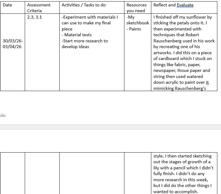
I started off by glueing down different fabrics (like felt and hessian) as a base and then kept layering on top with other materials I found around the classroom, (things like newspaper, cardboard, plastic, tissue paper, card and string) once I was happy with the way the base looked I started painting. I used watered down acrylic paint and experimented with the different types of marks I could make, trying to mimic Rauschenberg’s style. I let the paint drip down, I flicked paint at it and I created squiggly lines of different thicknesses and lengths.
All off this put together created the piece that is shown in the image above. I am quite happy with the way this turned out, it obviously isn’t the most accurate to the original but the point of doing this wasn’t accuracy, it was so I could try out different methods of using materials and to help me develop the ideas I had for my future work on this project which, in my opinion, it definitely did.
Something about Rauschenberg’s work that I really liked was the way he uses such a wide range of items (particularly in his combines), and because a lot of them are found objects, they could have many different meanings depending on the person that is viewing the art. This about his work, in a way, is similar to the cabinets of curiosity, they are collections of strange, random and sometimes meaningful objects and you could say the same about some of Rauschenberg’s art. I wanted to take this idea of using random objects and turning them into art work but in a way that was meaningful to me and my art so instead of found objects I decided to use materials that were related to my past projects.
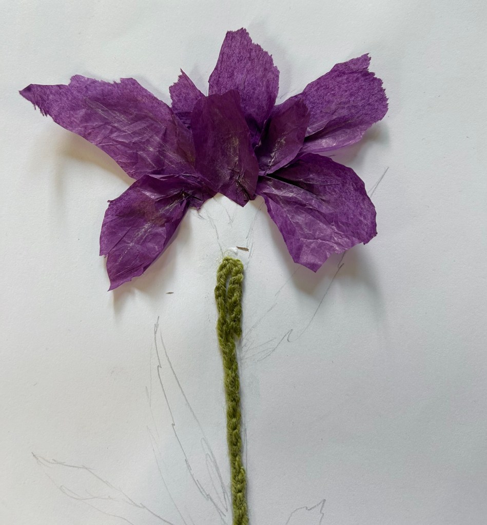
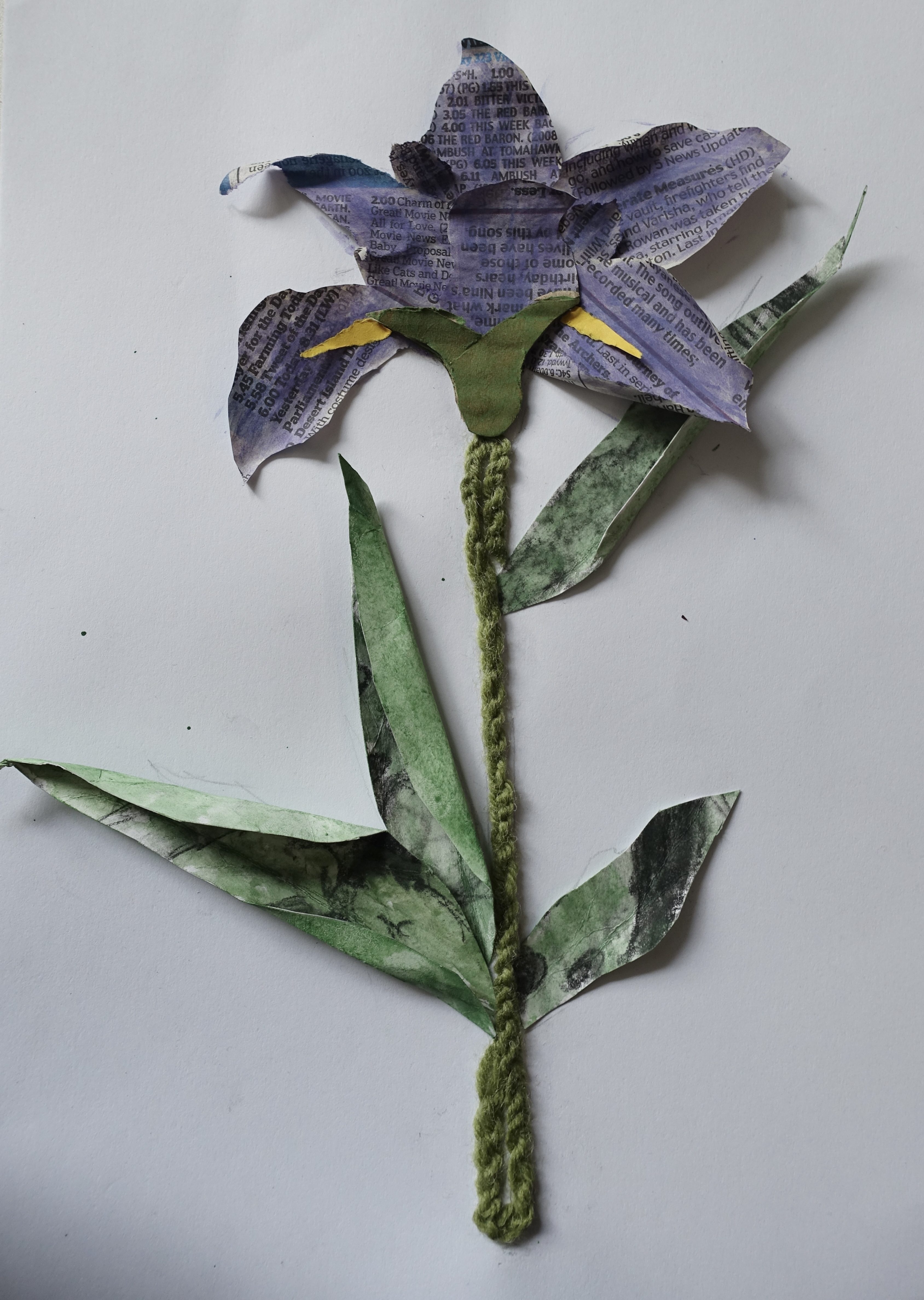
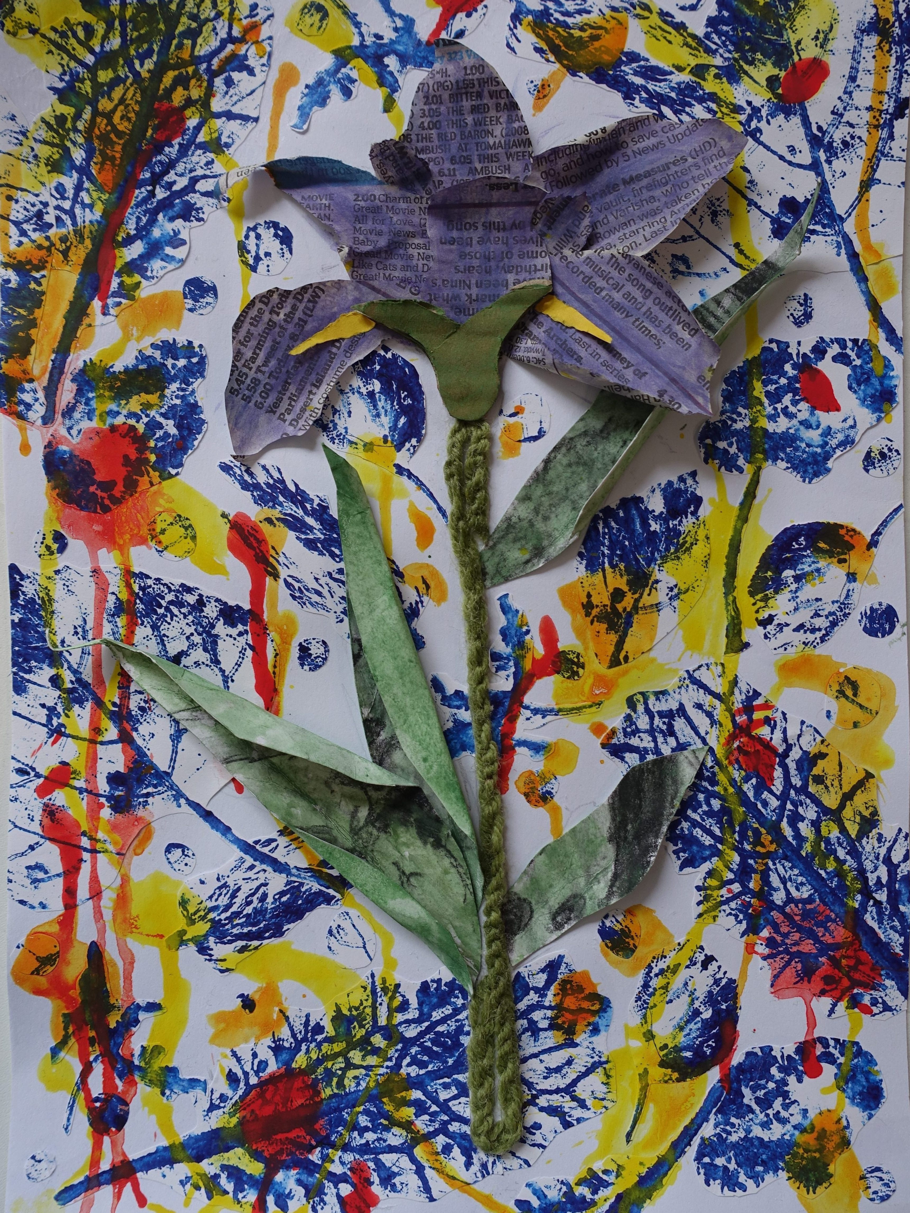
This started off as a materials test for the tissue paper you can see in the first picture above which I really liked the look of so I am probably going to try using it again. I had finished with the petals when my teacher gave me the idea of using objects meaningful to me to create another piece and I really liked this idea so I decided to turn this test into that. The first material I used that was related to my past work was the green string I used for the stem, this was leftover from a group project where we were tasked to create an oversized, sculptural headpiece, me and my group made one that looked like a willow tree, we used an assortment of green string for the willow branches/leaves which is where this material is from. I used the string and turned it into a chain so that it would be thicker and take up more space then I stuck it down onto the page.
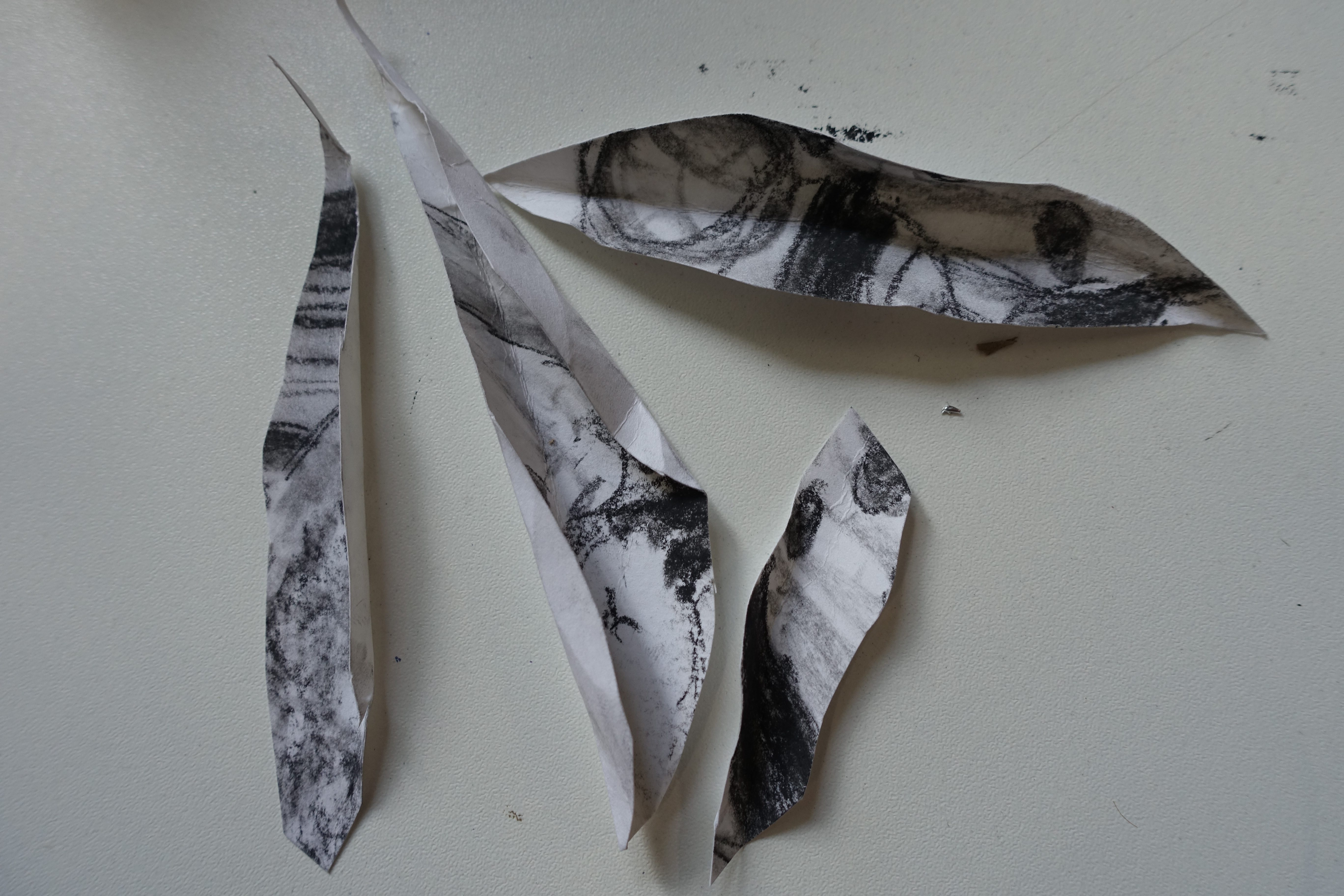
For the leaves I decided to use an old charcoal drawing that I had done near the beginning of the school year to reflect on my improvement and what I’ve learned. I cut it up, shaped the pieces to look like leaves and folded some of the edges to look like my sketch. I used watercolour paint to colour the leaves which I wasn’t sure would work because the drawing was done with charcoal and I hadn’t fixed it so I was worried that it would smudge when I got it wet and it did a little but it was nothing major so I kept going and it worked quite well. After finishing this step I decided that I didn’t want to use the tissue paper for this because it wasn’t a material that really meant anything to me so I took it off and looked for something else to use. I wanted it to be something more flexible than regular paper so I was thinking about using a fabric but none of my previous projects used a fabric that would work well for this test so I ended up using news paper. This has been something I have used in multiple past projects but it is not normally visible, I have used it to layer, to create a more interesting background and as papier mache, so I cut it to the shape of petals and again used water colour to colour it purple. The bud if the flower its cardboard which is another material I used regularly in previous projects, I cut it into the shape I wanted and again used water colour to make it green. As a final touch to the flower itself I used some yellow paper to create the flower’s beard and add a pop of colour.
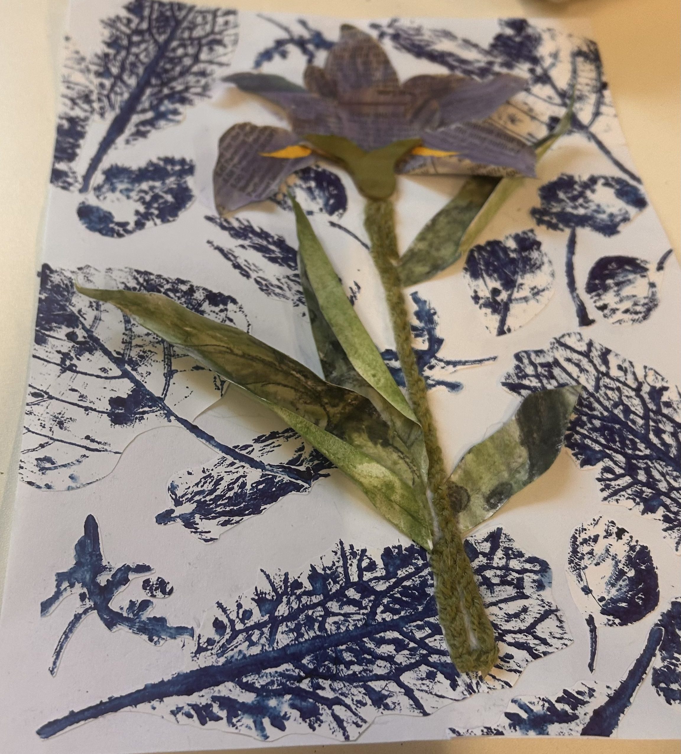
The flower was finished but I didn’t want to leave the background plain. Near the beginning of the year we did a print making workshop where we used things we found outside, like leaves and flowers, and turns them into prints using ink, after we had done this we photocopied these prints so we could experiment with cutting them up and arranging them in different ways. I had some leftover copies from when I did this task so I decided to cut out the shapes of the different plants and stick them down to use as a background. I really liked how this look but thought there was still a few awkward gaps so I cut small circles out from the prints and added them in spaces I thought looked a bit empty.
I was honestly just going to leave it at that but I asked a friend what they thought about it and they suggested that I added some paint to the background as it looked a bit blocky and the paint might make it work together more seamlessly. I thought that they had a very good point so I decided to try adding the paint, I started off with a bright yellow as I thought it would create a nice contrast from the purple of the flower, I then added orange for a similar reason because of the blue that was already in the background, but after they addition of these colours it still looked as though it was missing something so I went back in and added red as well. I wanted to use painting techniques similar to the ones Rauschenberg would use in his work so I used acrylic paint which I watered down quite a lot so that it would easily create splatters and drips like there is lots of visible in Rauschenberg’s work.
I’m really glad I took this suggestion as I think it definitively looks better with the brighter pops of colour in the background rather than just the blue. I enjoyed making this as it forced me to be more creative with the materials I used and made me think about past projects and the ways I have improved since creating the projects related to the materials I used in this piece. I transformed parts of the different things I have made into a brand new piece of artwork, taking one item that started off as a piece as paper which then turned into a drawing which was then cut into pieces to create leaves and who knows what that could be transformed into next, this is one my my favourite things about art, anything can be turned into anything else if you really want it to be, like what Robert Rauschenberg did with found objects in his art, he took an old cupboard and somehow made it into an incredible painting.
I really enjoyed trying out Rauschenberg’s style in my recreation of his work and while I do want to use 3D materials, I don’t want my piece to be abstract so I decided to use similar techniques to Rauschenberg but my own interpretation of it.
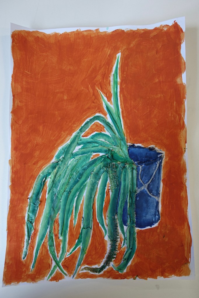
I tried this out by picking an object as a reference, (I went with a plant that was in our classroom) and using 3D materials to create a painting of it. I stated off by sketching out the plant with a pencil on a piece of A3 paper, getting the proportions and positioning of the leaves was a little challenging but after some tweaking I was happy enough with it to continue on with the next step which was to add in the 3D elements.
I went around our classroom looking for materials to use in this piece, I ended up with cardboard, newspaper, hessian, foam, tissue paper, string and small pieces of wood, after accumulating all my materials I went back to my sketch and started laying everything out into the way I wanted it to look. I cut, ripped and folded so that everything would fit how and where I wanted it like how I rolled newspaper into a cylinder to use for the rim of the pant pot or the way I cut the hessian to curve in the same way the leaf did. I also chose to leave some parts of the plant in 2D, like the inside of the plat pot and some of the leaves, to create dimension and cause the illusion that some parts of the plant where closer than others.
When I was happy with the layout of my materials I stuck everything down onto the paper using a glue stick, and once everything was dried, I started painting. I wasn’t trying to make this piece completely accurate to the way that the plant looks in person so I gave the greens of the leaves a blueish undertone to make them more cohesive along side the plant pot. I then went in with a lighter version of that colour to add highlights and dimension where I thought it was needed. The colour of the plant pot is a blue that is similar to how it looks in person but a more vibrant version as I thought it went better with the colour of the leaves, I painted the pot in this shade and again, went back in with a lighter colour to add highlights but also a darker one to try and show the fact that it is hollow. I chose a bright orange as the background colour for this piece because blue and orange are complementary colours and I wanted the plant to stand out in contrast to the background, which I think it does.
Overall I’m very happy with how this turned out, I like the how all the colours I chose look together, I really enjoyed experimenting with using all of these materials in one piece and putting my own spin on Rauschenberg’s techniques. I do like how some of Rauschenberg’s works have a messy look so I tried to mimic that here but I also want to try creating a similar piece, but one that looks neater and more intensional to see if I prefer that look over the one I have already tried out.
Actually starting to create things and get outcomes that I was happy with helped me understand what I wanted to achieve with this project. I really enjoyed using a plant as a reference because I like how each one is a living thing that is unique and different from others even if it’s only a little, a lot like humans. Near the beginning of this process, I decided that I wanted my work to be inspired by life-cycles and our memories, while I do still really like this idea, I think it would be best for me to just stick to the life-cycle side of that, so I had the idea to represent this using flowers. They have always been something I’ve gotten inspiration from so I am familiar with sketching them which I think will make it easier for me to experiment with different ways of expressing their forms because I won’t spend so much time trying to get their shapes or proportions right. So my idea from coming to this conclusion was to express the life-cycle of a flower by creating a piece that shows a flower in it’s different stages of growth.
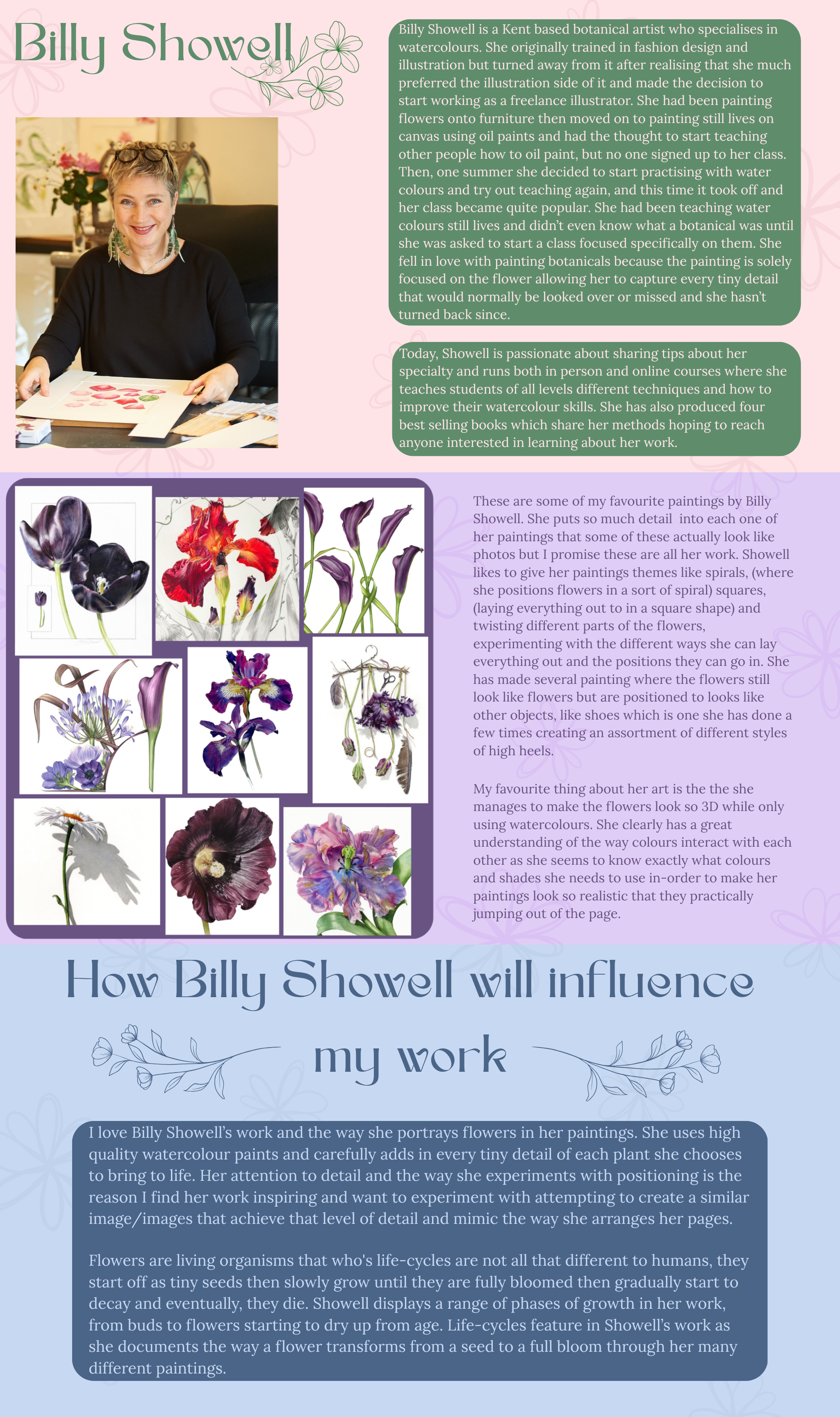
I wanted to start exploring this idea so I decided to find an artist who specialises in florals that I could research to help me define my ideas and further inspire them. Billy Showell is the artist I chose, below it the research I did on her.
I now researched Billy Showell, had a clearer idea of where I was heading, (which I found very exciting because it meant that I could really start to develop my ideas) I wanted to start familiarising myself with the stages of a flowers growth. I went onto YouTube and and found a timelapse video of a sunflower growing from a seed (https://youtu.be/_owPRdbaMdY?si=ozjWKYFoL7GV7Qli) until it had fully bloomed, I didn’t go into this looking for a sunflower specifically but once I saw it I thought it would be a good place to start because sunflowers are quite a stereotypically shaped flower, what I mean by that is they have that distinctive flower shape with the round centre where the seeds are and the petals coming out and around on all sides of it.
I did these drawings with a 2B pencil in my sketchbook. I started off by drawing a sunflower seed in the ground and progressing from there by watching and pausing the video at moments where key changes had happened so I could sketch them out and I ended up with eleven different stages of growth. Doing these sketches gave me a good idea of the stages where the most change had occurred so I know for future which moments are most relevant and if I need to add another or take one or two out.
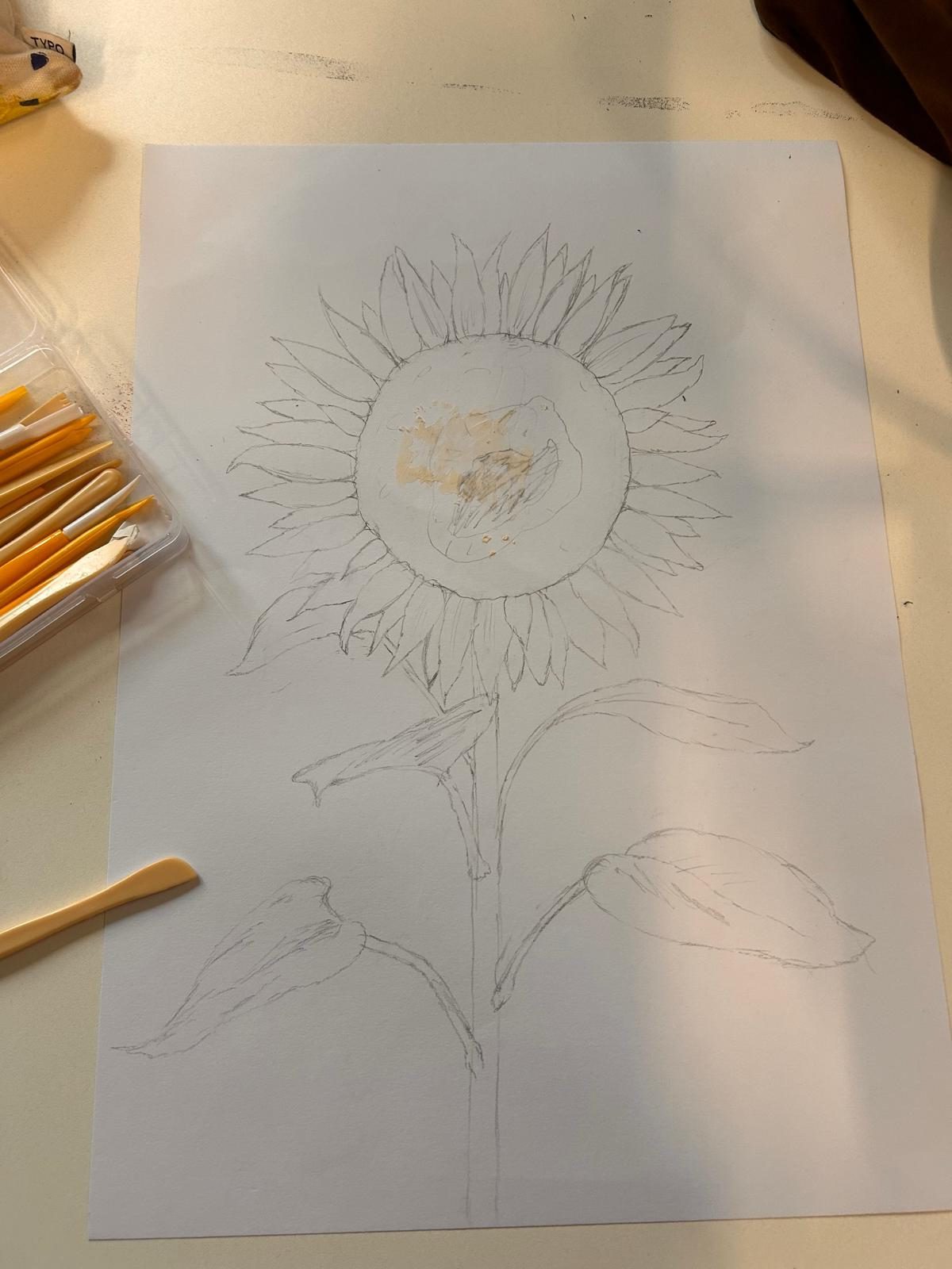
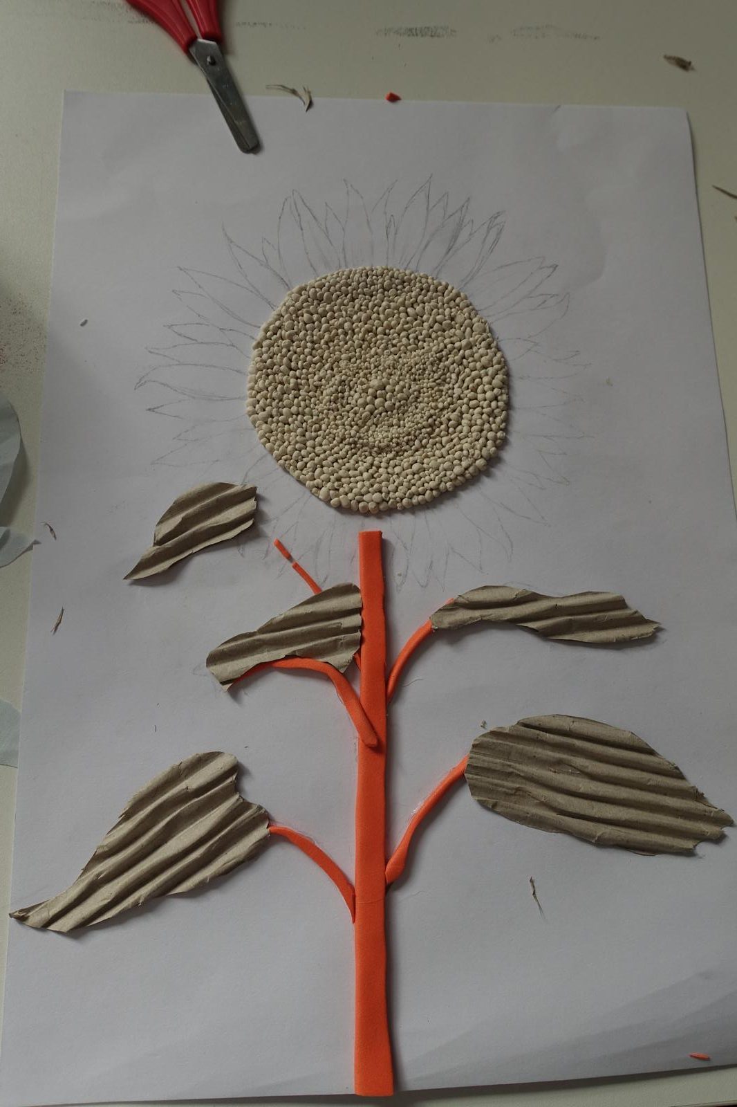
I wanted to further develop my previous experiment where I used some of Robert Rauschenberg’s techniques in my own way using 3D materials and paint to create an image of a potted plant but with the added element of a flower because of Billy Showell’s work. To expand on this I wanted to create another piece where I tried out using new materials to create different textures and appearances in a way that was neater than my previous work to see if I preferred the effect it would have. For this I decided I wanted to stick with the sunflower for a little longer until I thought more about what other types of flowers to use as a reference so, I started by drawing a rough sketch of a fully grown sunflower on an A3 piece of paper with a pencil.
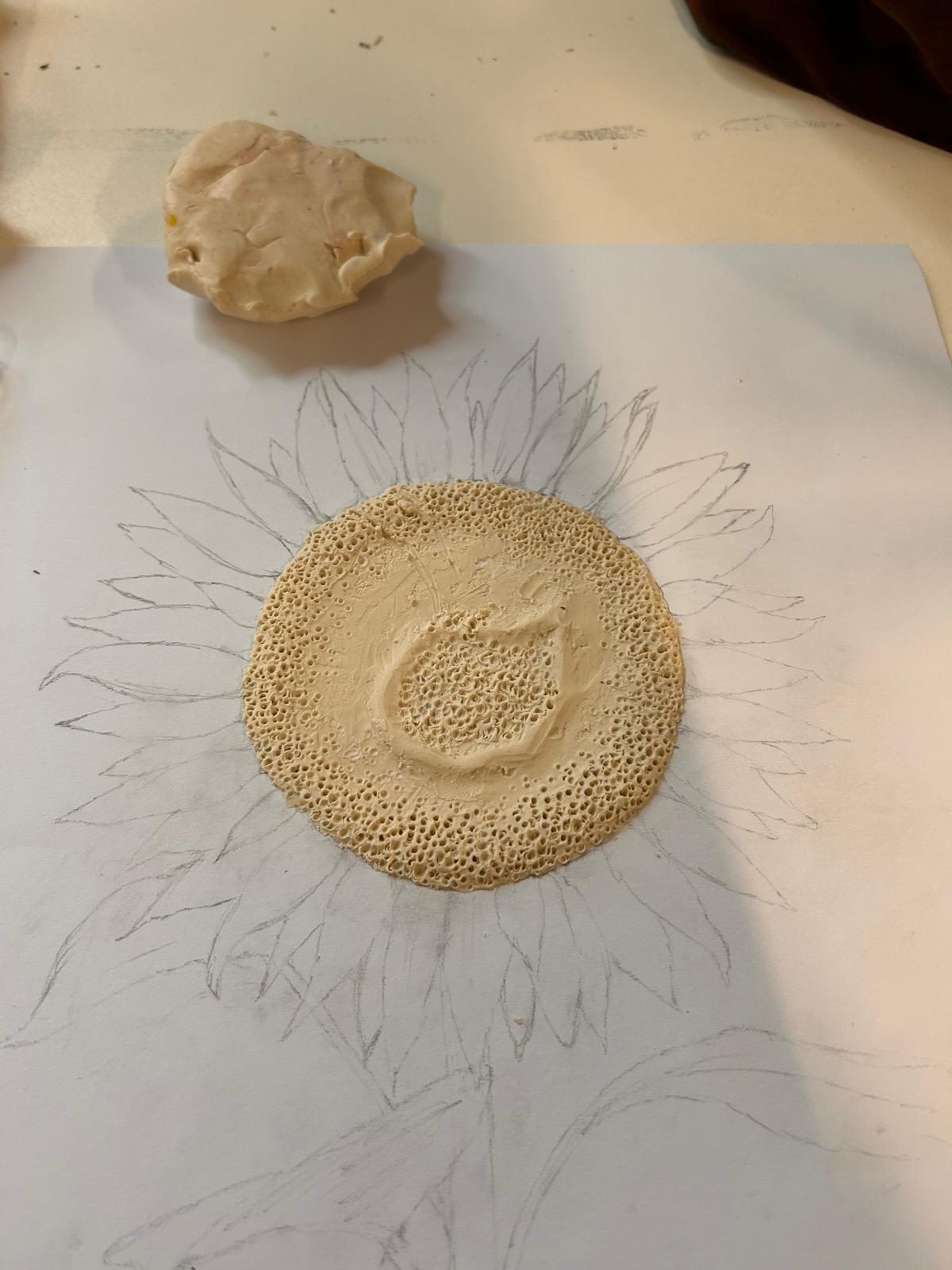
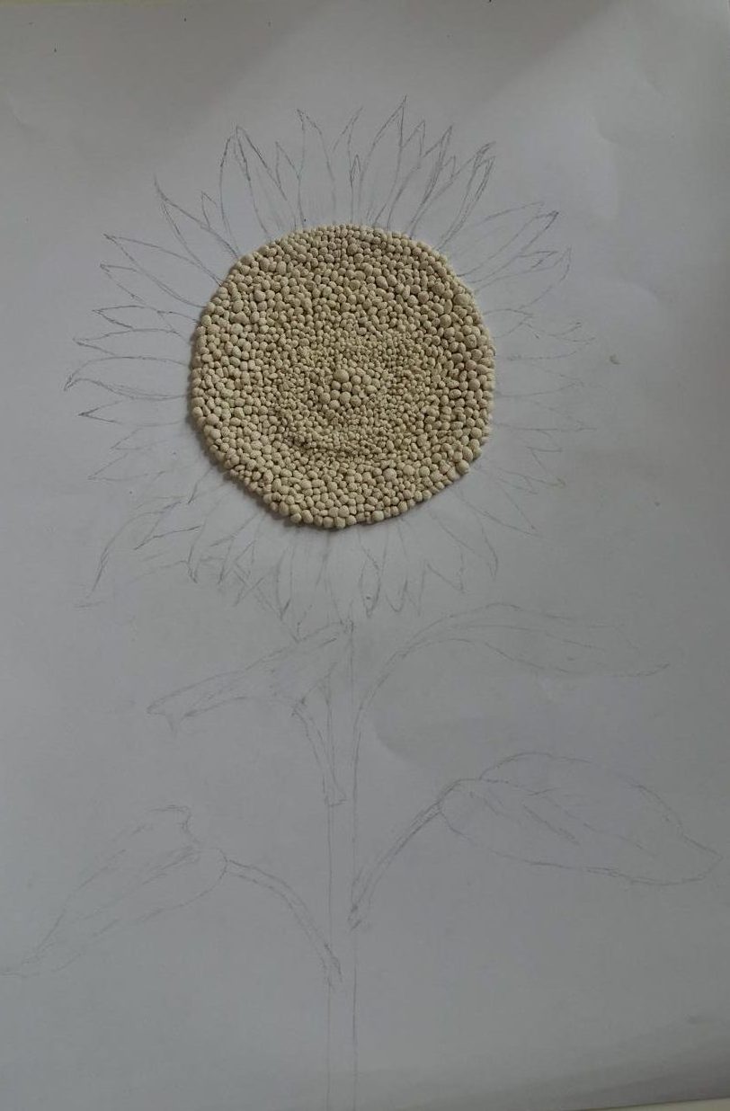
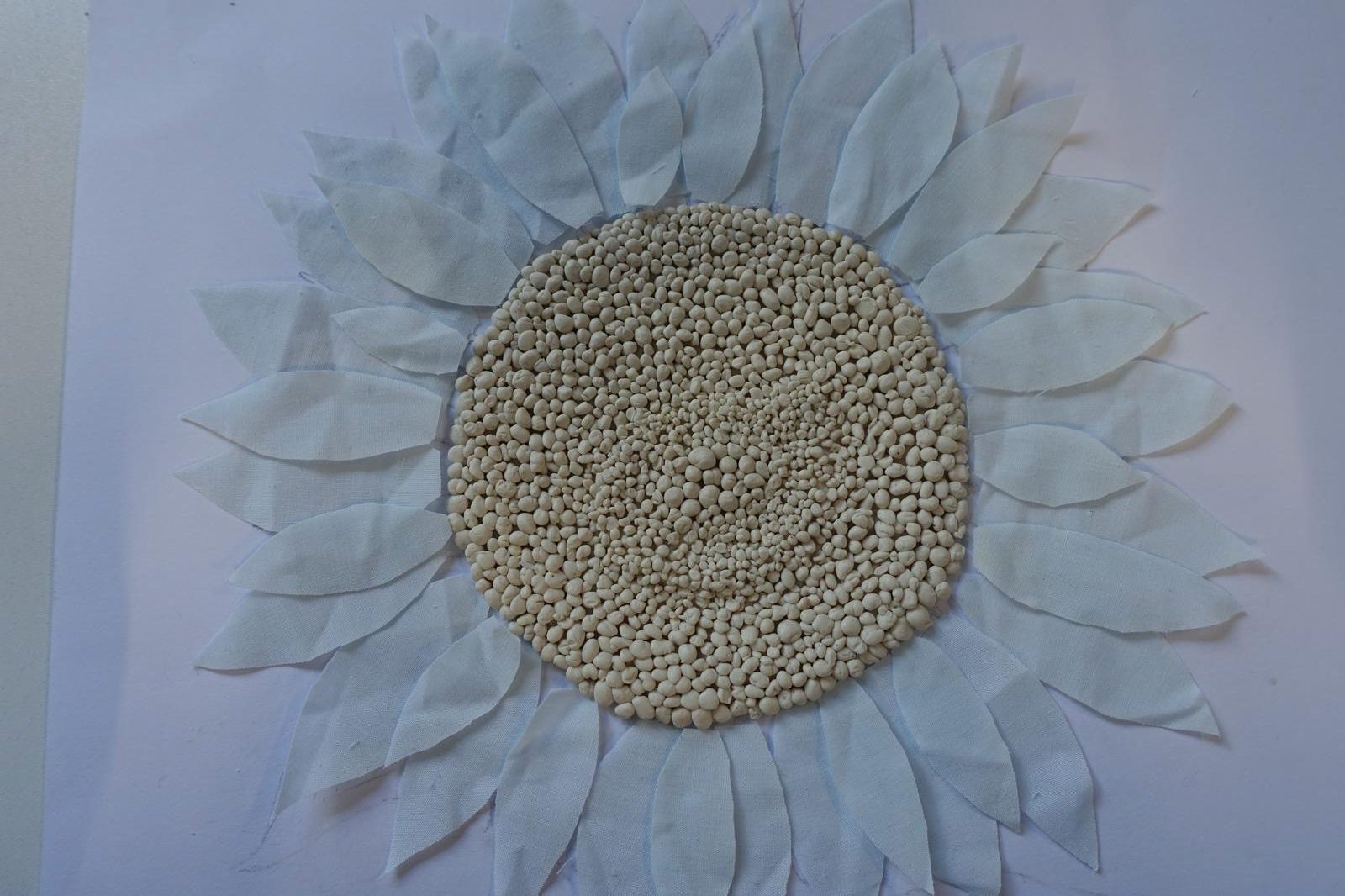
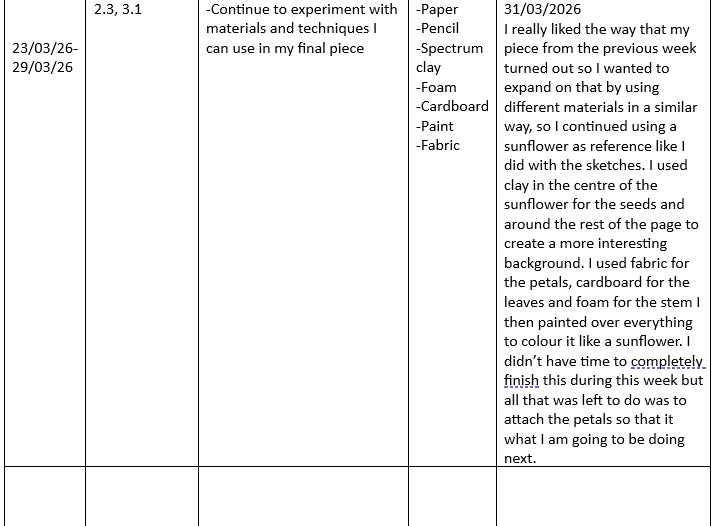
One of the materials that I wanted to experiment with was clay but there unfortunately wasn’t any proper air dry clay available for me to use at this point, so I used a specialists crafts clay instead, which actually ended up working out better than air dry would’ve, as it doesn’t dry out so I was able to make changes later on if I wasn’t happy with how it turned out. I started by creating a thin layer of clay in the centre, then built up a ring in the middle and along the edges to create the head of the sunflower and add depth. Then I used a dotting tool and started forming holes near the raised sections, but when I was about halfway done, I realised that I wasn’t happy with the way it was looking, as seeds tend to protrude out not go in, so I made the decision to take off all the clay and start over a new way. This time, instead of starting with a layer of clay, I decided to from the clay into hundreds of tiny balls ranging slightly in size, which I arranged into the shape of flower’s head. It was a very time consuming process which took me a few hours, but I was a lot happier with the result than I would of been if I had stuck to my original method.
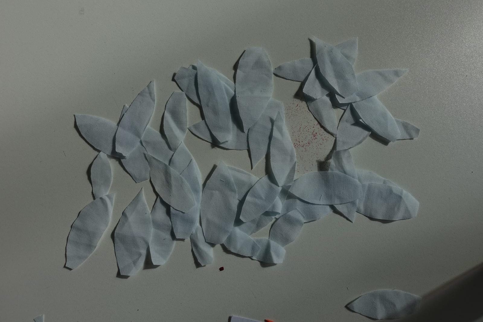
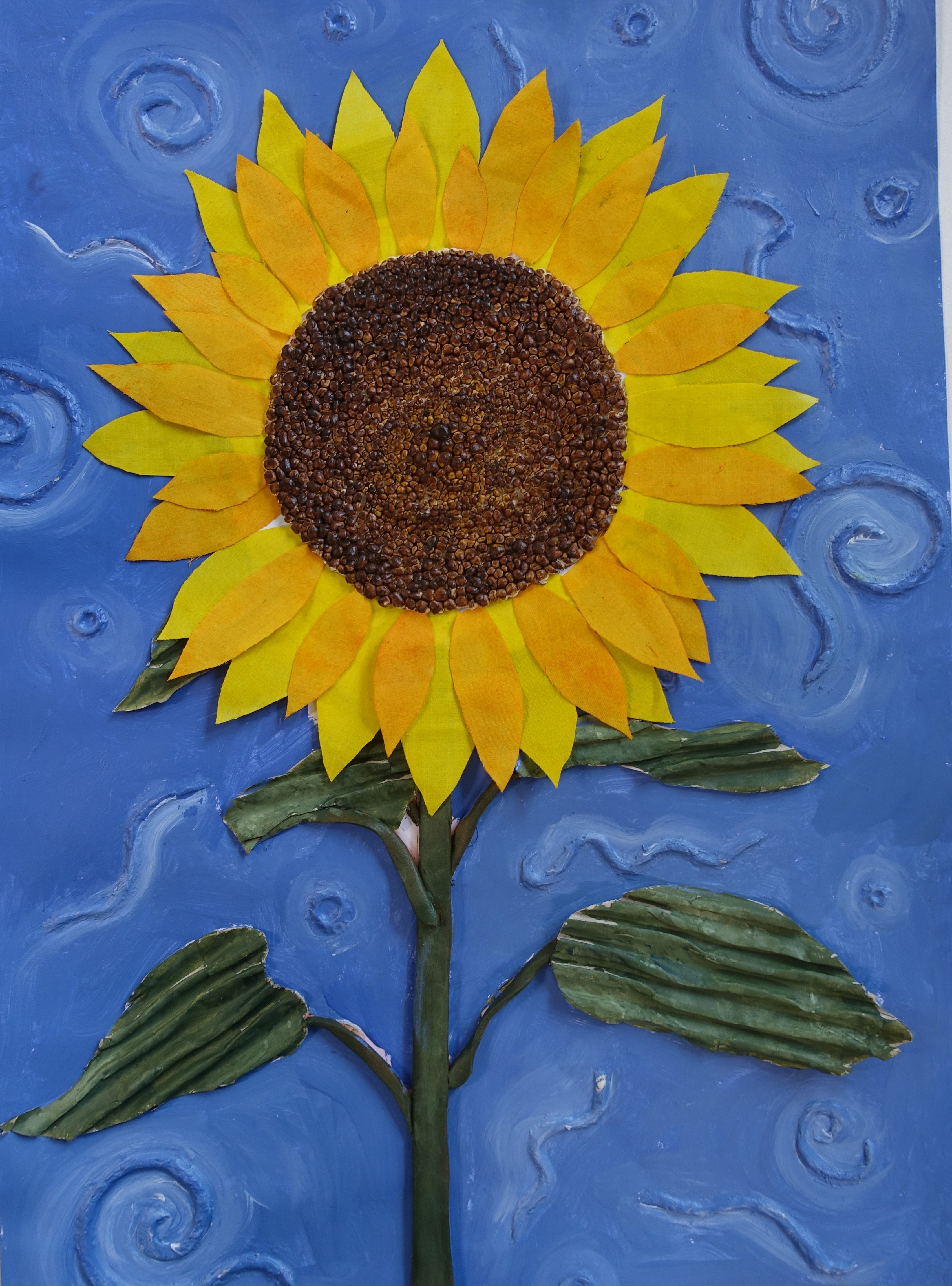
After finishing the sunflower seeds I moved onto the petals. I wanted to use fabric for this because it isn’t stiff like paper but I could still cut it into the right shape without any issues and I wanted to experiment with using it in this way. I found a thin, light blue fabric that I believe was previously part of a curtain, in a light blue colour which was perfect because even though it was not the colour of a sunflower’s petals, it was light enough that I could easily change the colour of it later.
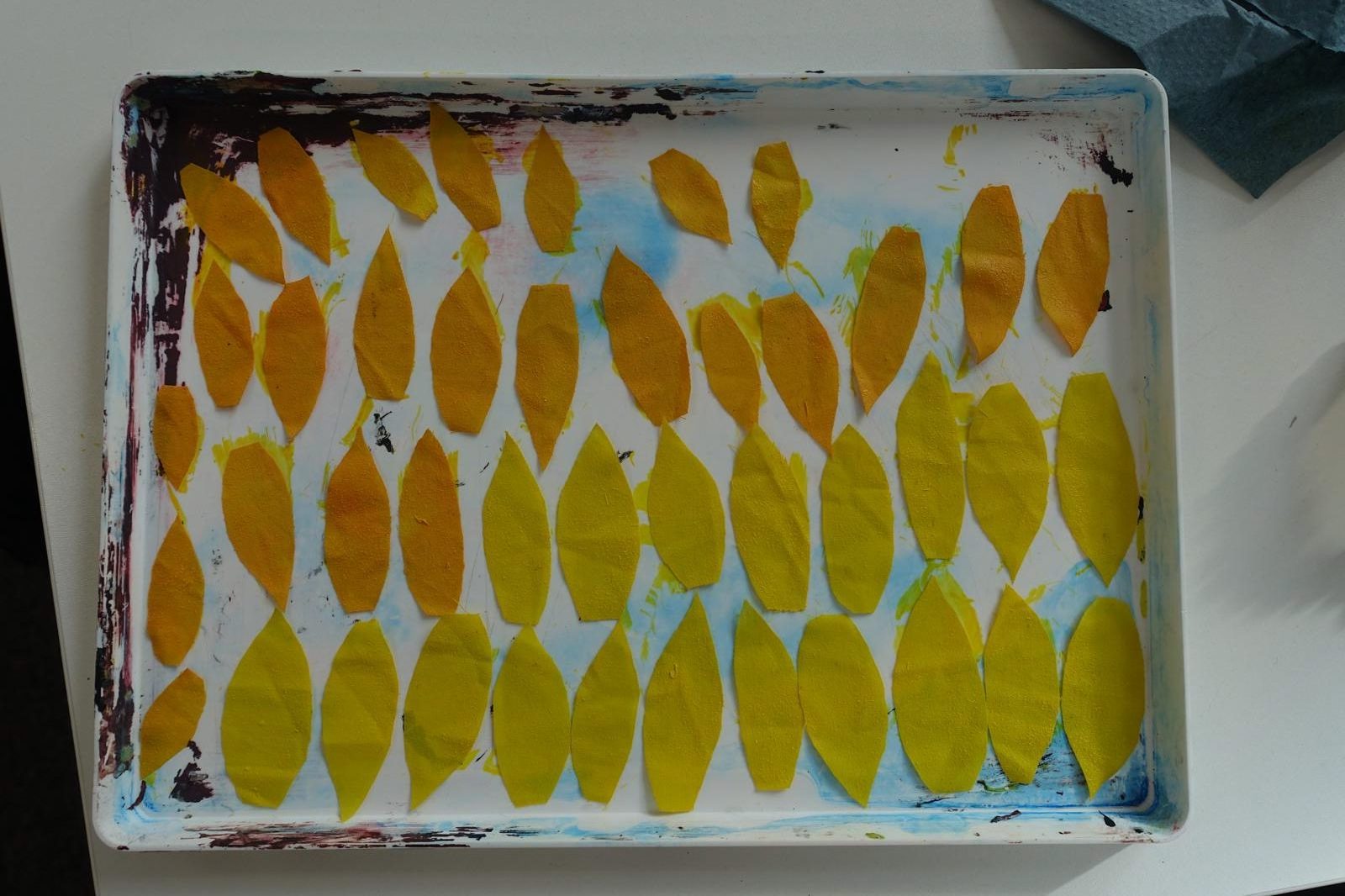
I started by cutting the fabric into the shape of petals, making some smaller or bigger than others, until I had enough to make two layers that went all the way around the seeds. I then needed to make the petals yellow, I did this by mixing the colours I wanted, (a yellow and an orange) using acrylic paint, watering it down till it had a very thin consistency then using a paint brush to add the colour to each of the petals and setting them out onto a pallet to dry.
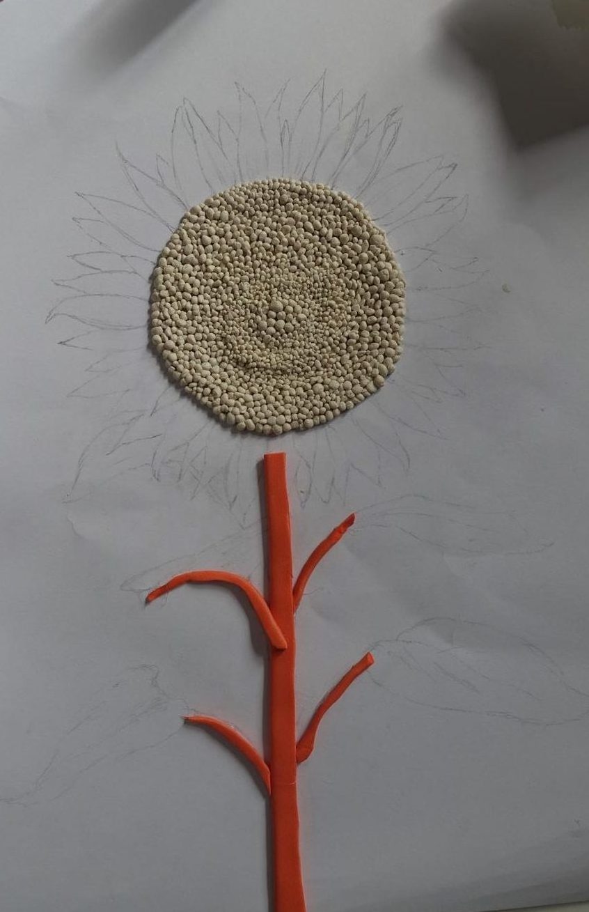
While I let the petals dry I started on the stem and leaves of the flower. I looked for different materials that I could use and found this orange foam which I thought would work well as the stem, so I cut out a long strip of it and stuck it down onto the paper, I then cut smaller pieces as the stems that lead to the leaves. To make the leaves, I was going to use cardboard but I thought it looked a bit plain like that so I took off the first layer from it and underneath was the rippled pattern you can see in the photo above. I then cut it out into the shapes of the different leaves and glued them in place.
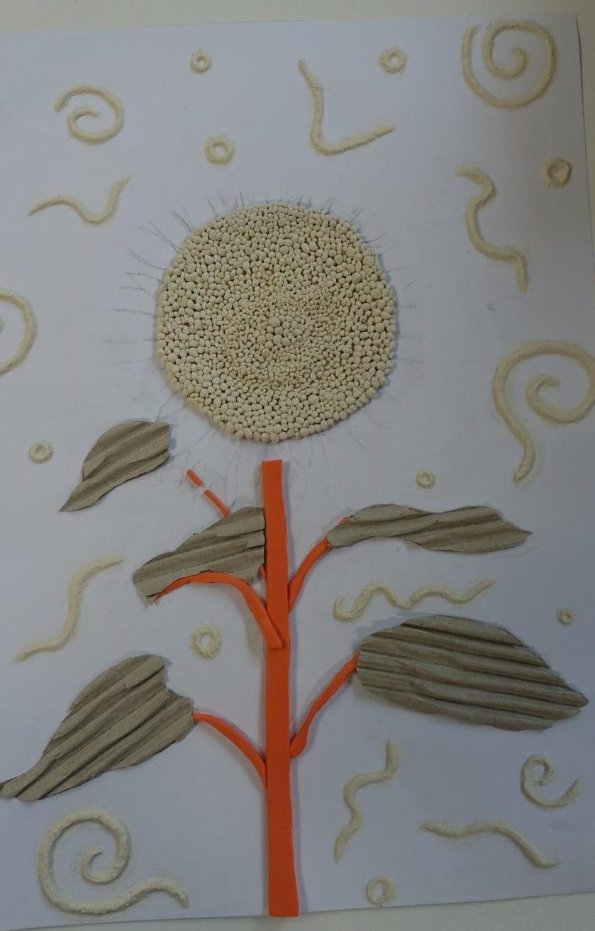
Once I had completed the stem and the leaves I was going to stick in the petals, but I though the background looked very empty in contrast to the rest of the page, and while that would make the flower stand out more, I wanted every thing to be cohesive, for the background to also be part of the art. I got the clay out again and rolled it into thin cylinders which I then arranged into squiggly lines, spirals and circles and stuck them down onto the paper.
The final steps were to paint everything and stick on the coloured petals. I started by painting the head of the sunflower, used a shade of brown which had undertones of yellow to connect it to the petals and I watered down the paint I used for this because I didn’t want it to fill in the texture of the balls I made for the seeds. I then moved on to painting the stem choosing a darker shade of green to make the petals of the flower stand out more. And lastly I painted the background for which I chose a bright shade of blue because I though it went well with the colour of the petals, stem and leaves, around the squiggles and spirals I added to the background, I went in with some white acrylic paint and blended it in to highlight those areas so the background wasn’t just one block of colour.
The way Robert Rauschenberg transforms random objects and unwanted scraps in to art work is what inspired this piece along side Billy Showell’s beautiful representation of flowers. To make this I used old fabrics scraps of cardboard and pieces of foam which I turned into something entirely different and new in a similar way to what he did. I did have a few issues while making this piece but it all worked out in the end result and it creates the effect I wanted it to have. Creating this made me want to keep expanding on the subject of the growth of flowers and their life-cycles, I think it’s so cool the way that flowers just naturally grow and transform from a tiny seed or build into a beautiful blossom in a mater of weeks.
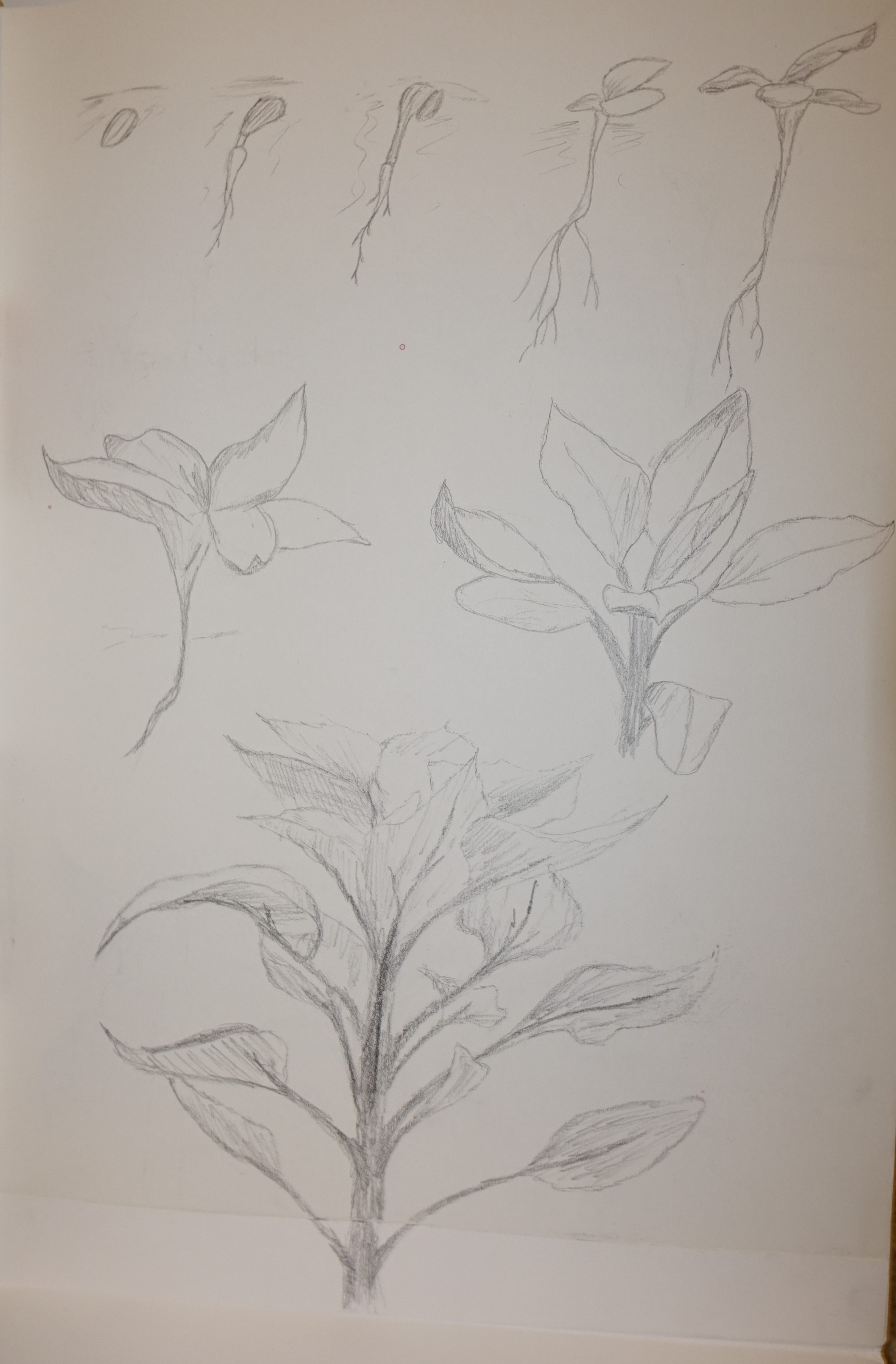
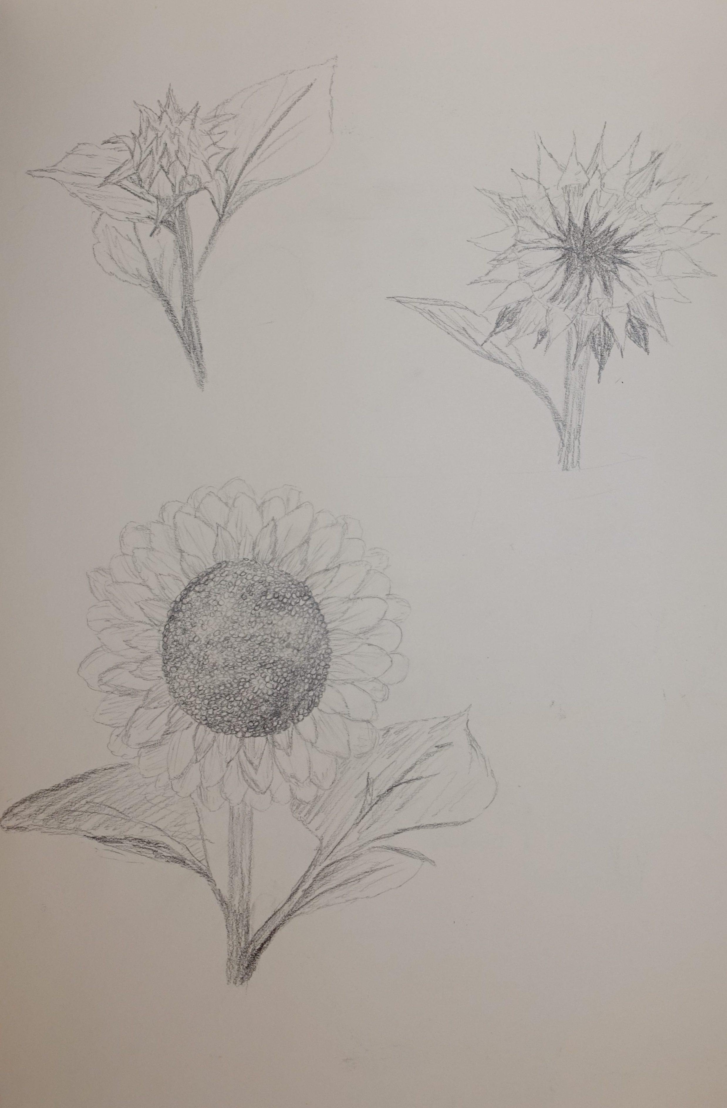
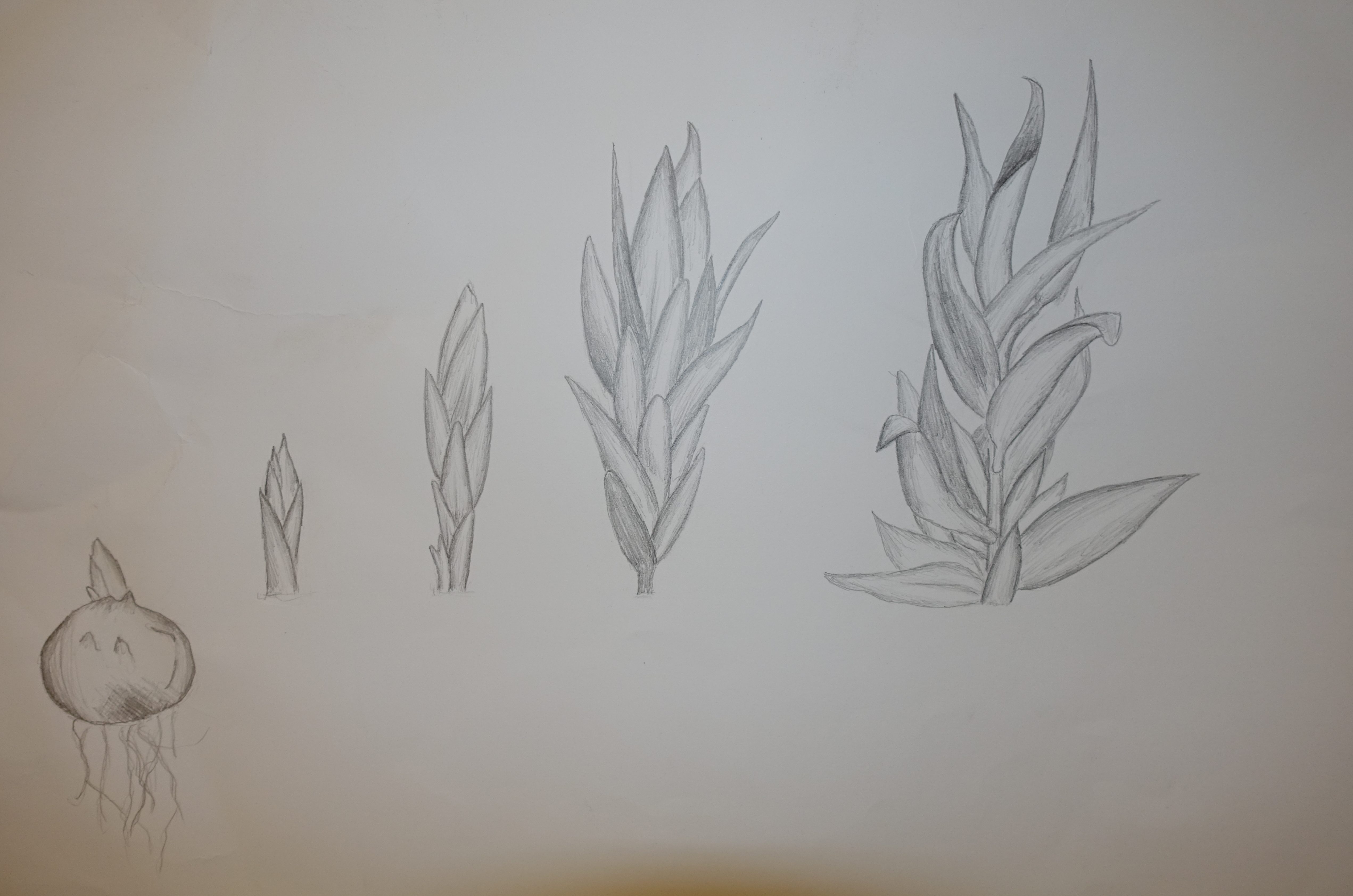
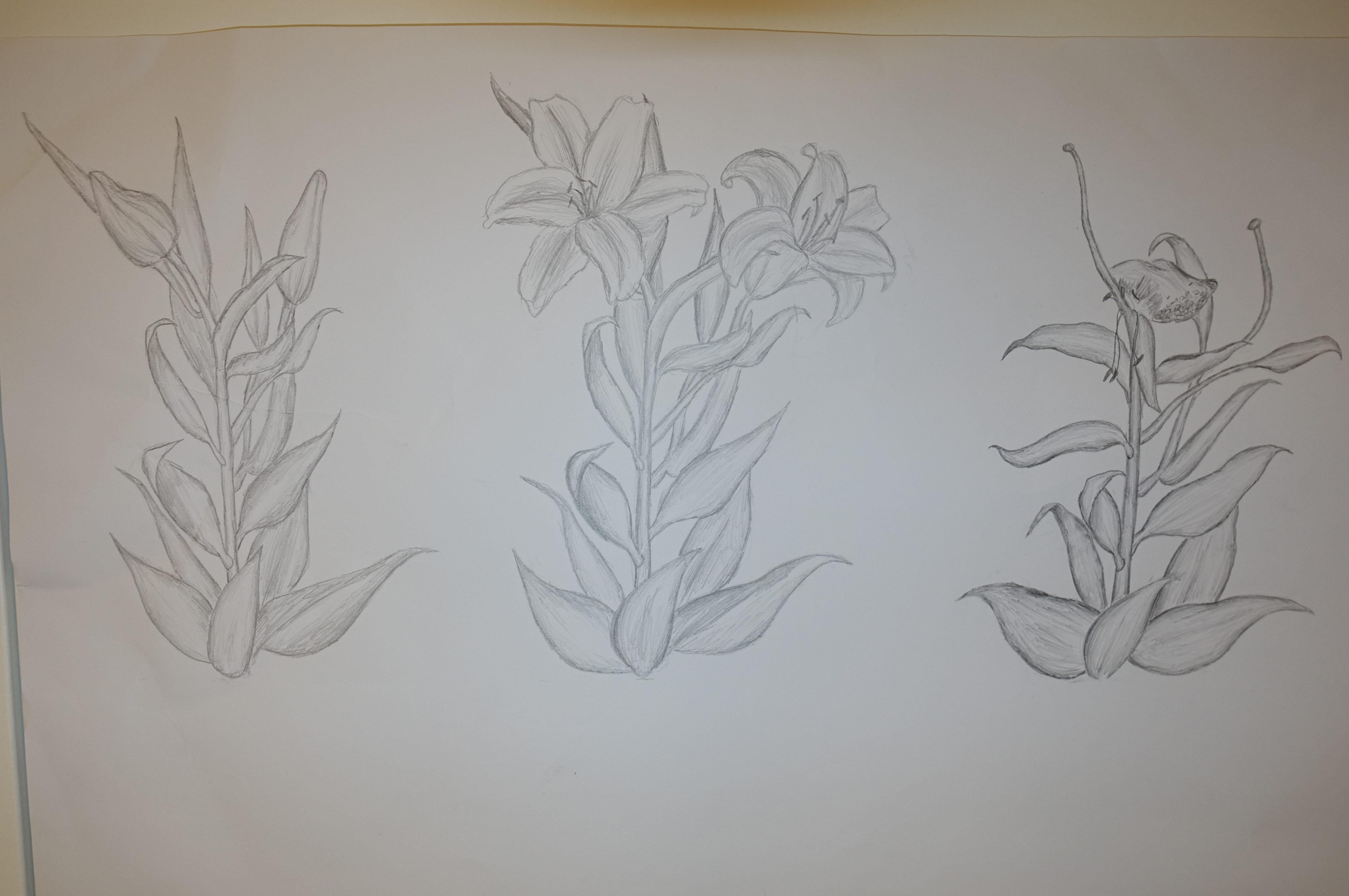
Once again, taking Billy Showell’s work as inspiration, I created some more sketches as I wanted to continue exploring the process of growth in flowers. These are similar to the ones I did of the sunflower but laid out in a line so you can clearly see the changes at each stage and showing what the whole flower looks like, not just the parts that changed. I found another sped up video on YouTube, (https://youtu.be/NU7luJEv4tQ?si=OUOu9X_BKpd0twgZ) this time documenting the growth of a lily, and did the same as before where I paused the video when key changes had happened then sketched them onto an A2 piece of paper, I had to use two sheets because there wasn’t enough room on one for me to get every stage I though was necessary.
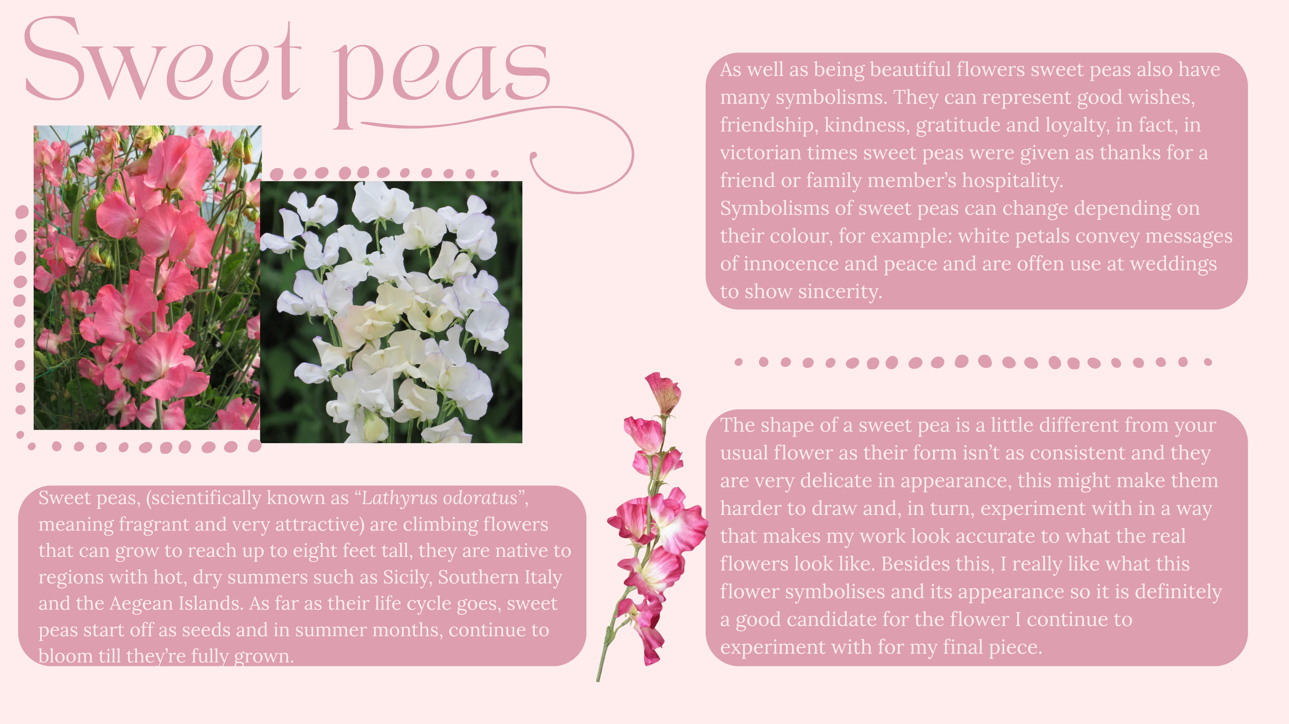
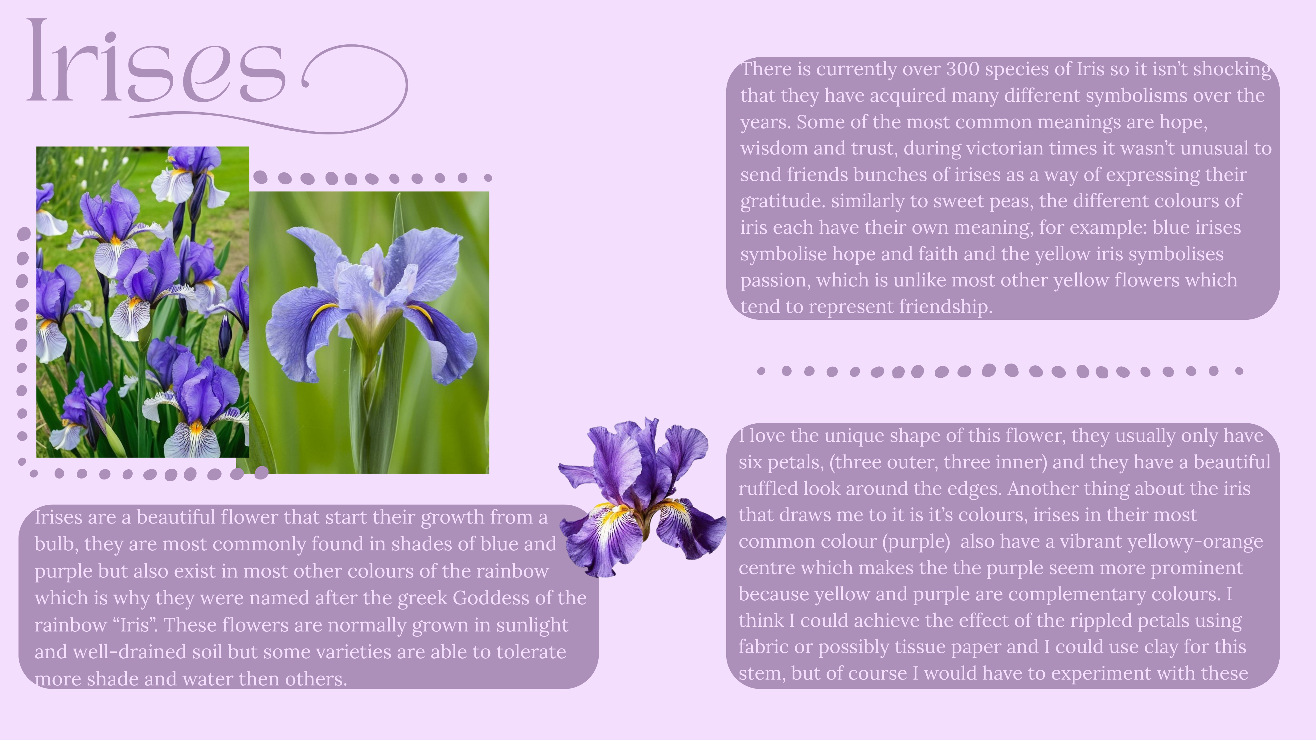
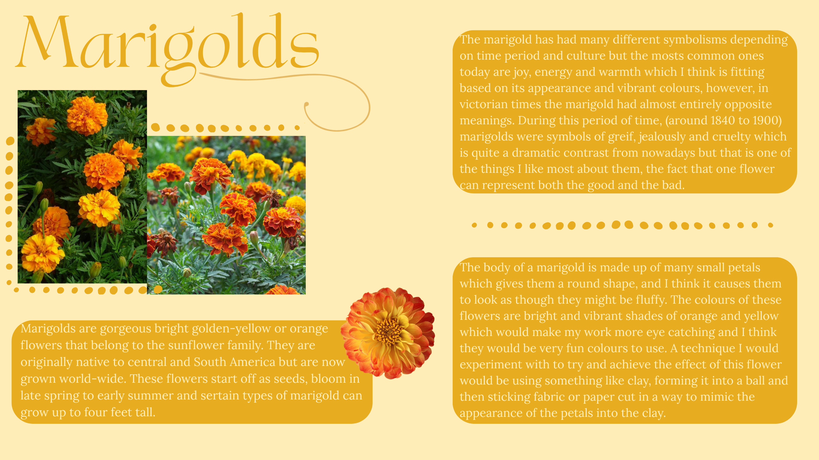
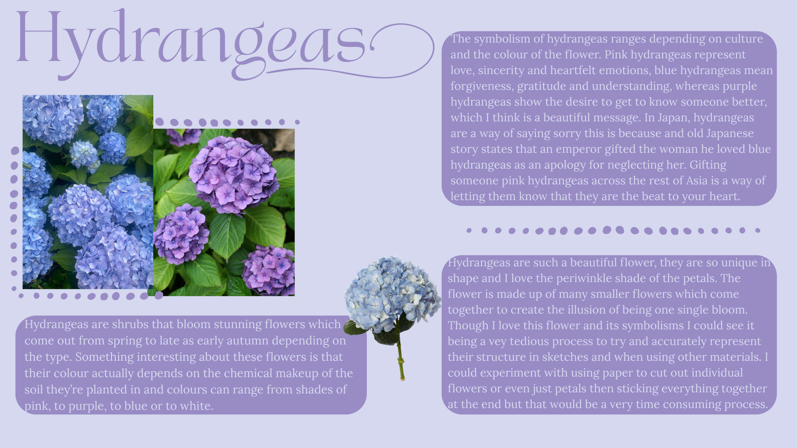
Even though I have been using some flowers I didn’t really know much about them and because flowers are a thing that, depending on the type, have many symbolises and can represent loads of different things, so I wanted to pick a single flower that I could to continue to experiment with, that I liked the look of and that had a symbolism I liked. I decided to do some light research on a few different flowers to learn a bit about them and then pick one to keep working with.
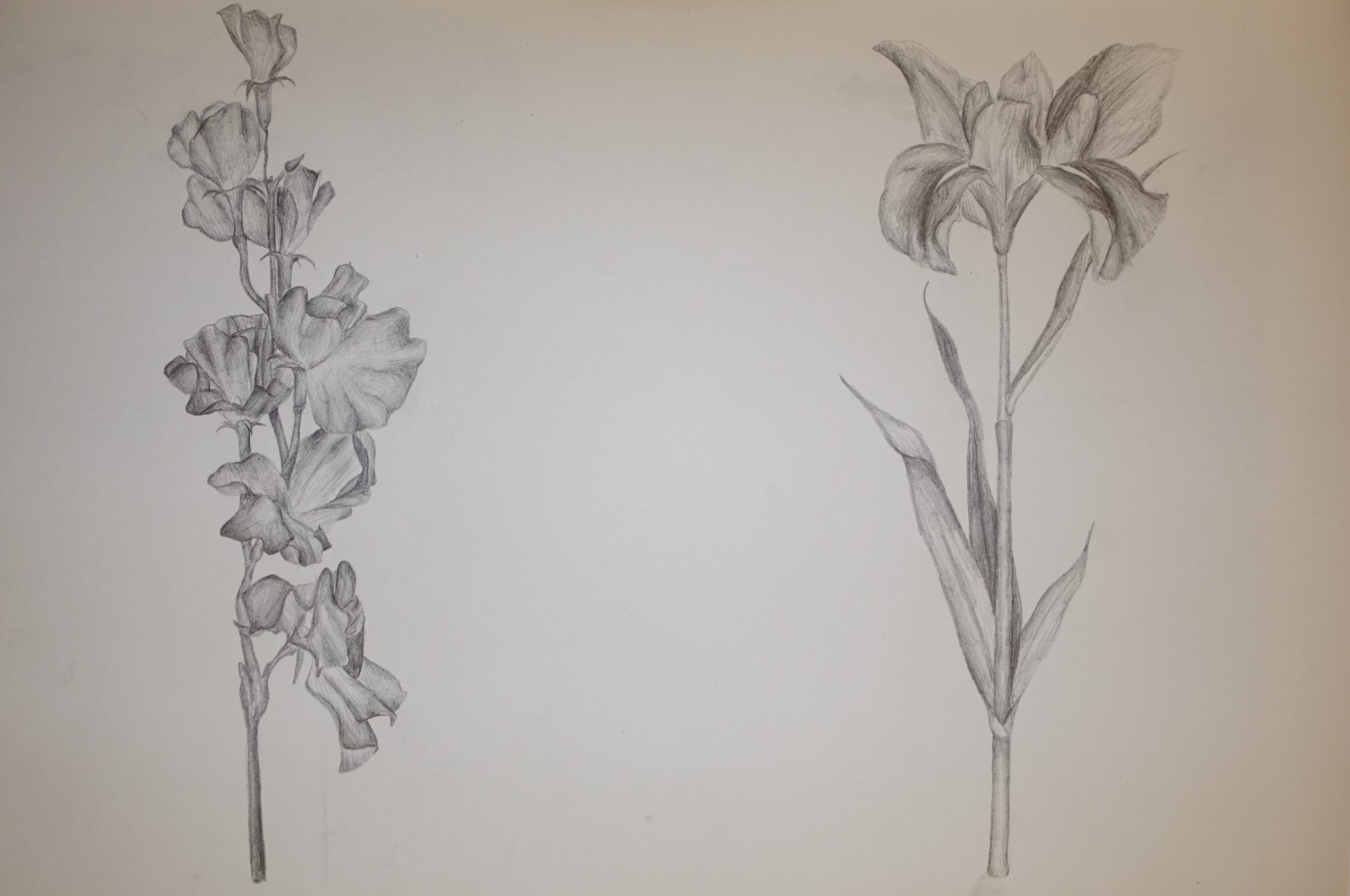
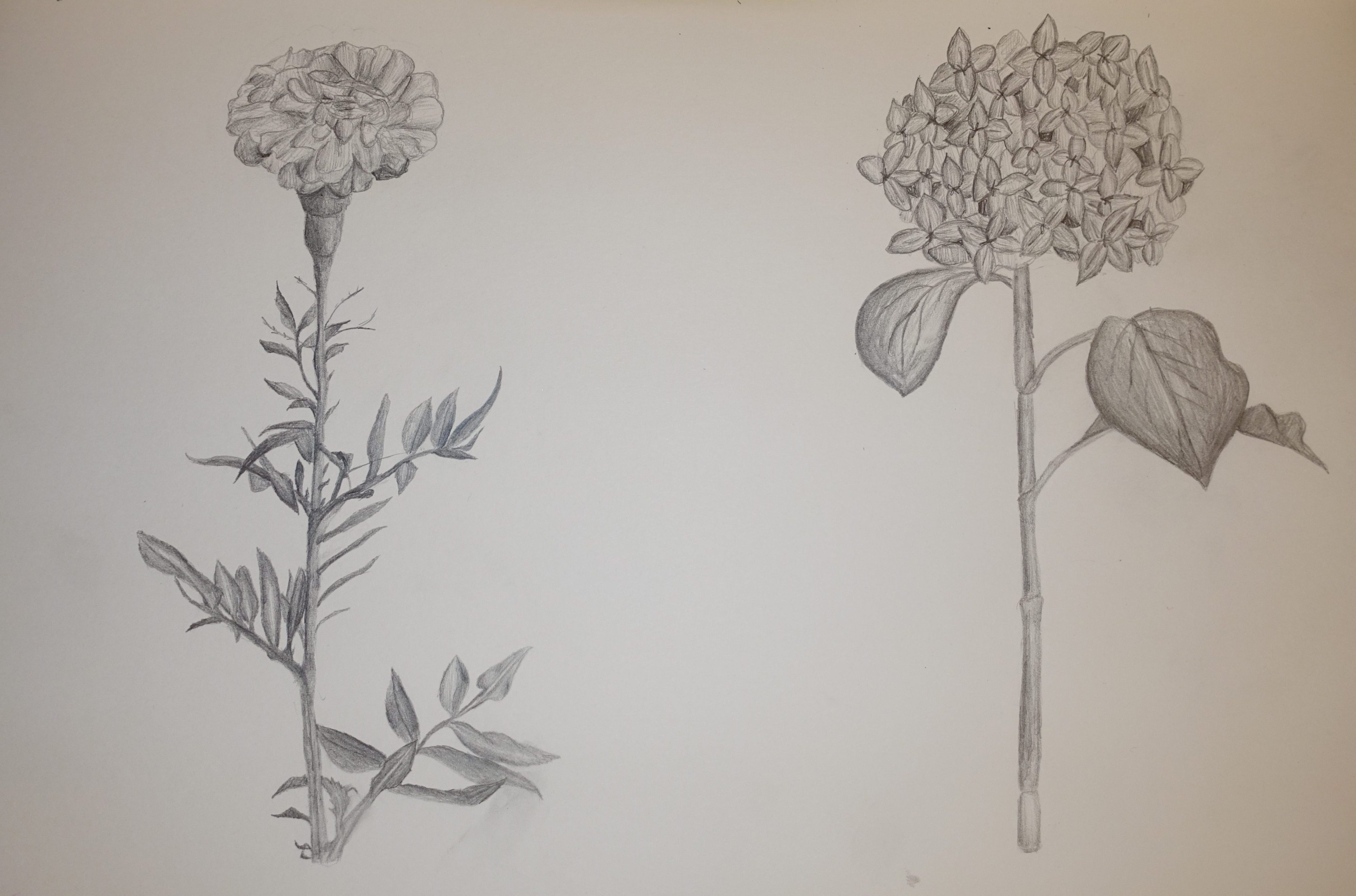
Once I had completed this research I still didn’t have a clear favourite so I wanted to draw them so I could see which one made the most sense for me to continue working with. It couldn’t be one that was too complicated to draw but would still look good and that I would be able to experiment with in lots of different ways. I wanted to express a similar style to Billy Showell in these drawings just not using water colour, in the sense that I tried to make them look as realistic as possible which I think worked out pretty well but definitely worked better in some then others. I did these drawings in my sketchbook using a 2B drawing pencil and I used reference photos that I found on Pinterest.
Doing these sketches did help me decide which flower to choose as drawing the petals of both the sweet and the marigold was quite complicate and time consuming and I wanted to be able to draw quick sketches of the flower to have a base to build onto with other materials and I don’t think I would be able to with these. The hydrangea is a ver beautiful flower but I feel like I would be limited with ways to experiment with creating the petals as there is so many of them, so in the end, the iris was the obvious choice for me to continue experimenting with as I move forwards.
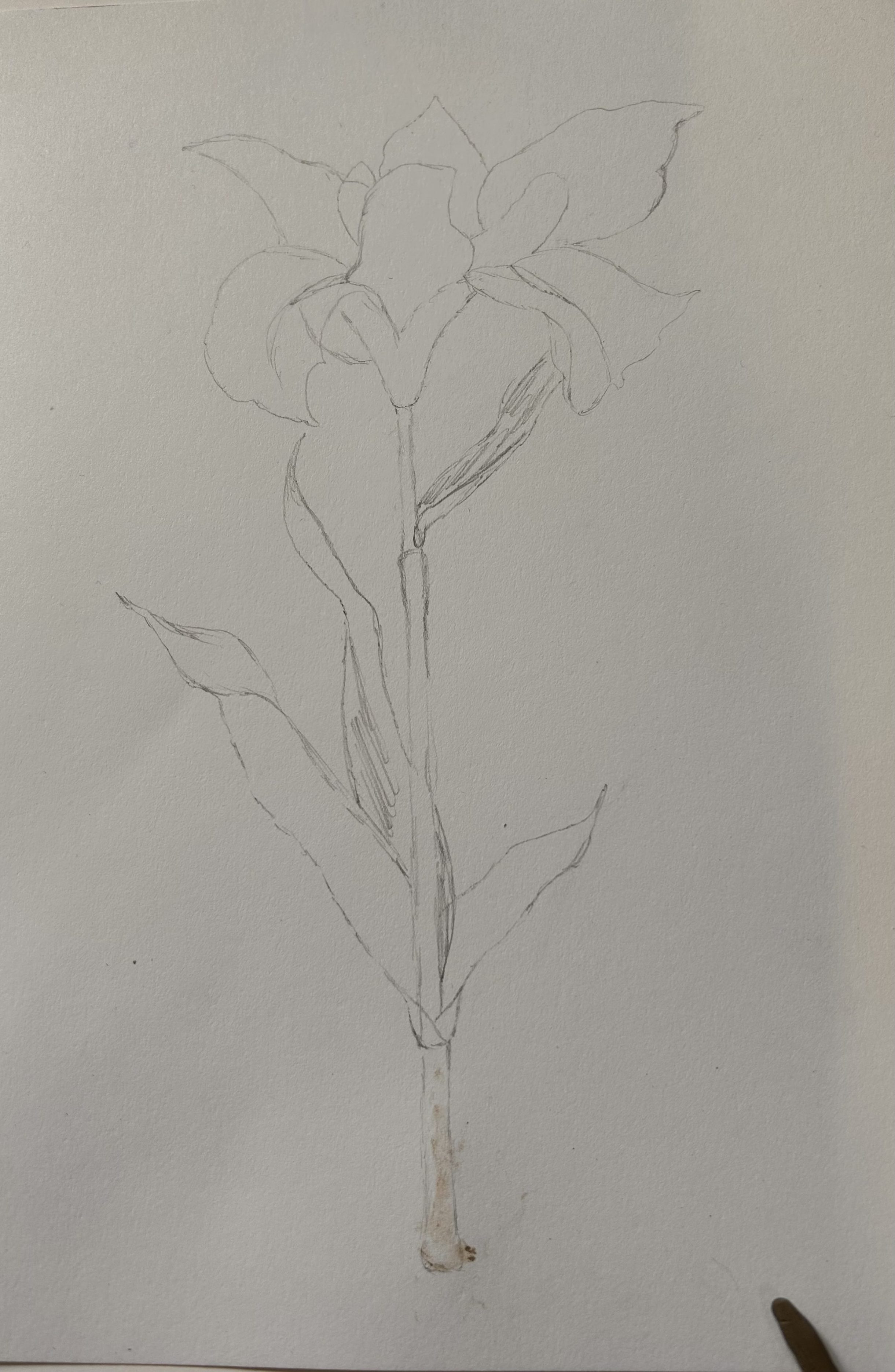
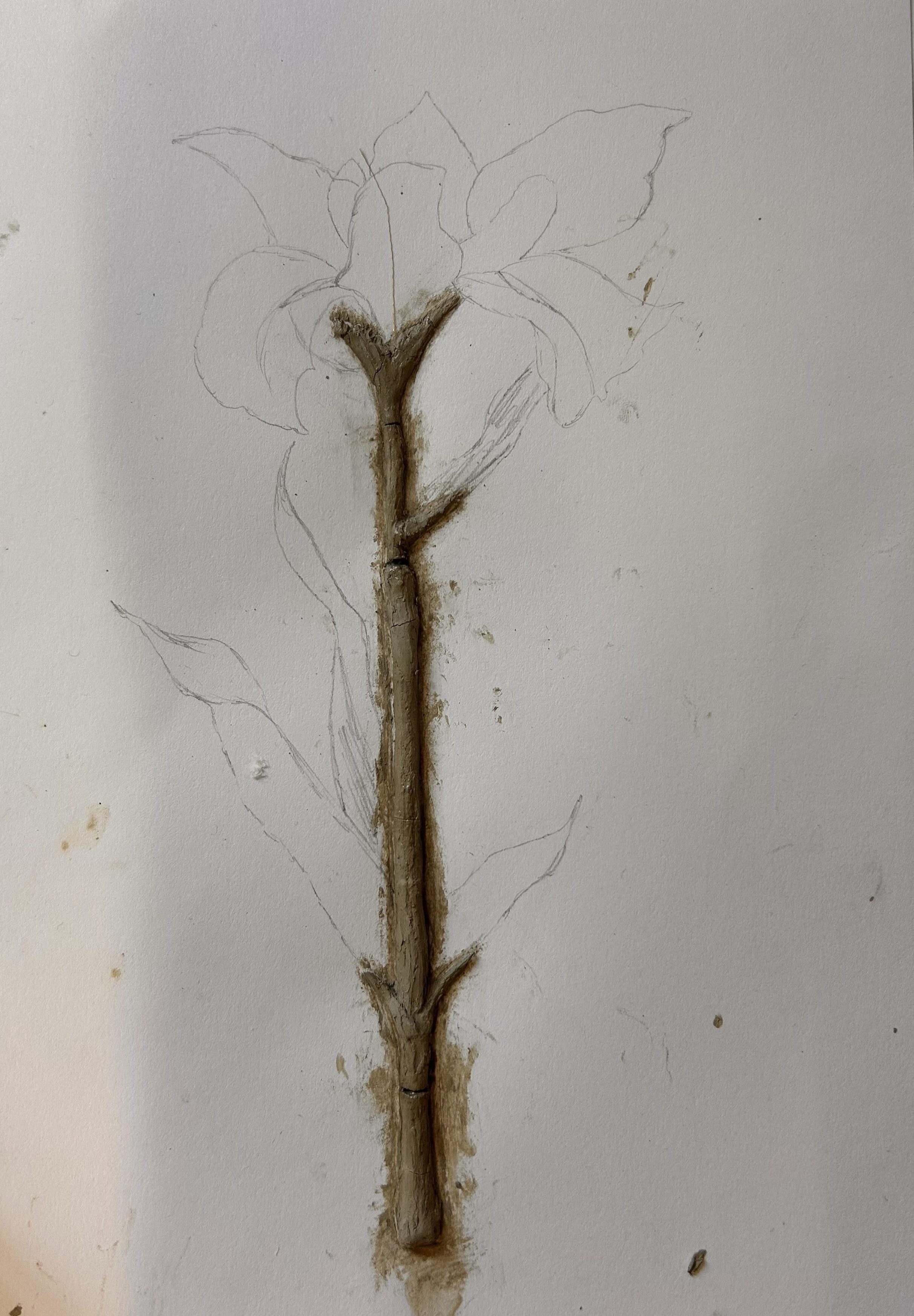
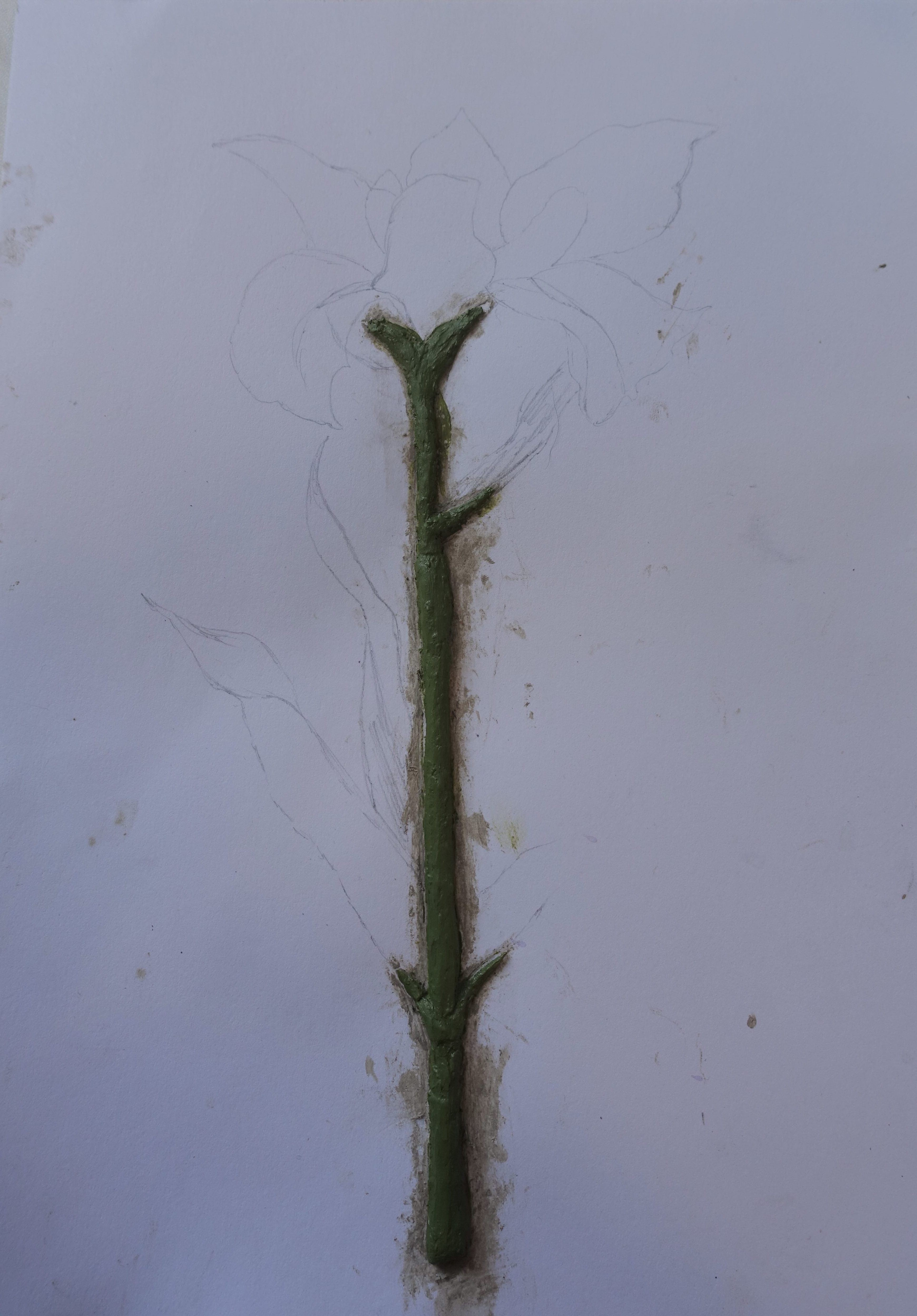
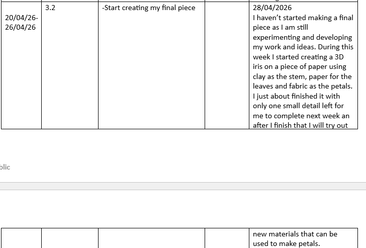
Now I had picked which flower I wanted to develop my ideas around I of course had to experiment with some materials I could use to create it. I started off with a quick sketch on an A4 piece of paper so I would know the layout of everything and then started thinking about what I could use to make it. I have used clay before when I made the sunflower but that was a different type and I wanted to try using air-dry clay so that is what I did. I thought it would work well as the stem of the flower because I could change the thickness and add details that I couldn’t with materials I have used previously.
To make the stem I rolled the clay out until it was the thickness and length that I wanted it to be then tried to press it down onto the paper, the key word is tried because though the clay was saying in place it was not sticking to the paper so to fix this I went around with a clay tool and pushed the edges down then blended it into the paper to try and get the clay to stick, I thought this had worked quite well so I continued with adding in the little details like the areas where the leaves connect and making it thicker in certain places like the base, I then set it out to dry overnight. When I came back the next day I saw that, unfortunately, the clay had cracked and was starting to come off the paper, to fix it I started by mixing some clay with water so it was a paste then putting that underneath and on the edges of the broken pieces, there was still gaps so I filled those in with more clay and let it dry again but it after this is was still falling off. I realised that sticking it down with clay probably wasn’t going to work so I instead decided to use PVA glue, I applied a layer of this underneath and in between all the broken pieces and put a heavy weight on top of it so it would stay down. This time it actually did work so I just used a bit more clay to fill in the gaps, let it dry and then it was ready to paint. I mixed acrylic paint to make a green then painted it onto the stem trying to avoid getting it on the paper.
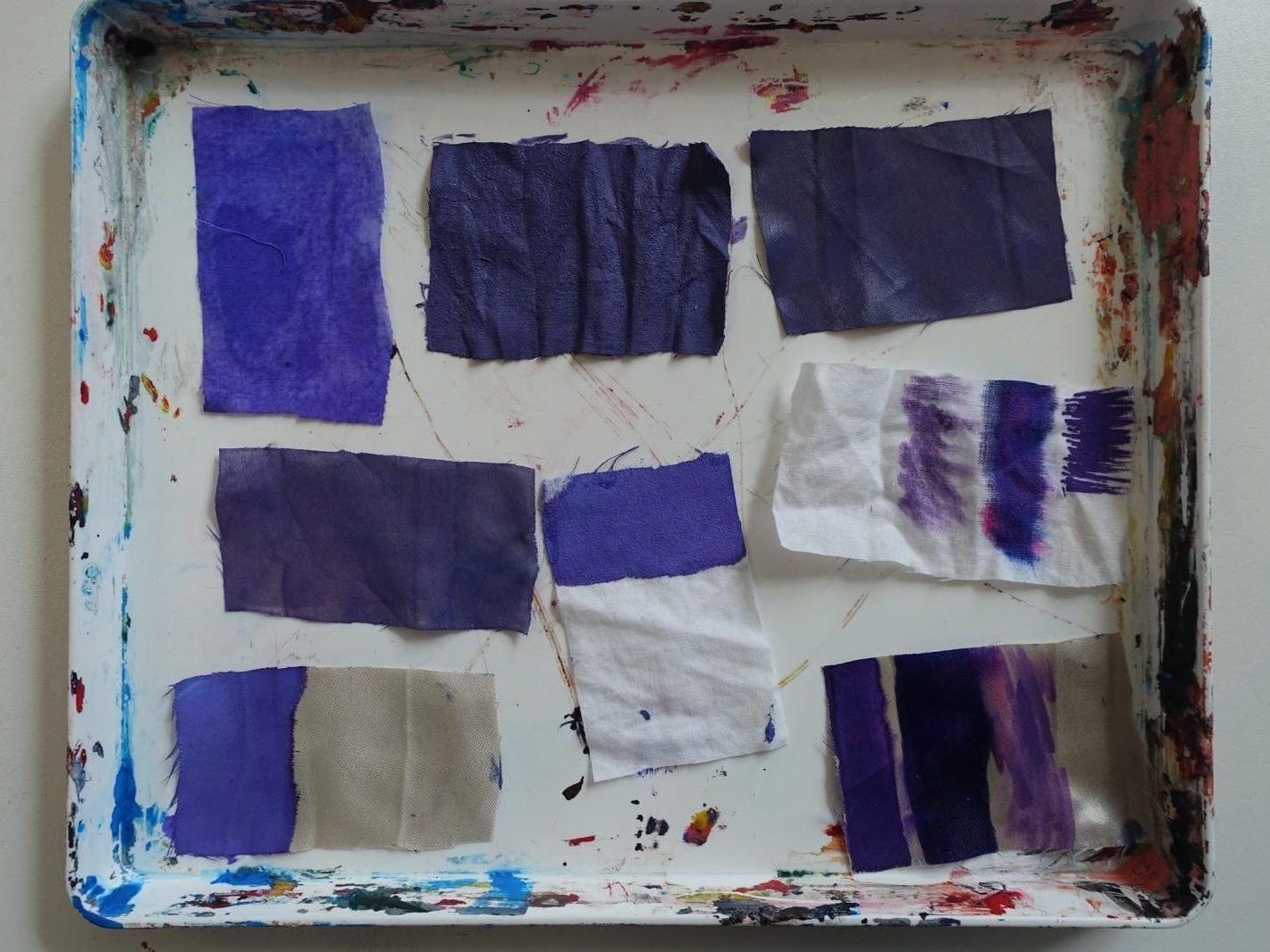
Once the stem was done I moved on to making the petals, I wanted to use fabric for this as it worked really well when I made the sunflower so I though I would try a similar technique with an iris. There wasn’t any fabric that was already purple to I decided to try what I did before and dye a lighter fabric using paint. I found two fabric that would work, a white one that looked like it might be cotton and a beige one that looked like satin. I liked the texture of the satin one more but I wasn’t sure how well it would take the colour as it already had a little so I decided to do some material tests with both fabrics to see what method of changing their colours worked the best.
I started with water colour paint where I mixed the colour I wanted then painted it on to both swatches of fabric, this worked well at applying colour to the fabrics but it turned out a bit patchy. I next used watered down acrylics, I once again mixed the colour I wanted and pained it onto the swatch of fabric, my main worry with this was that even though the paint had been quite watered down, it would dry too stiff. Some other materials I found to dye the fabrics were pens in different shades of purple, one was a paint pen which I just applied to one end of each fabric and the others were felt tips, with those I just drew a strip using each pen on the same piece of fabric. I set all of these tests out on a paint pallet to dry so I could see if the colours would change and how the materials textures would be affected by the colour.
I ended up choosing the satin fabric that had been coloured with acrylic paint as the water colours were too patchy and the pens just weren’t very consistent, the acrylic was a little stiff like I thought it would be but it wasn’t too bad so I thought it would be fine to use.
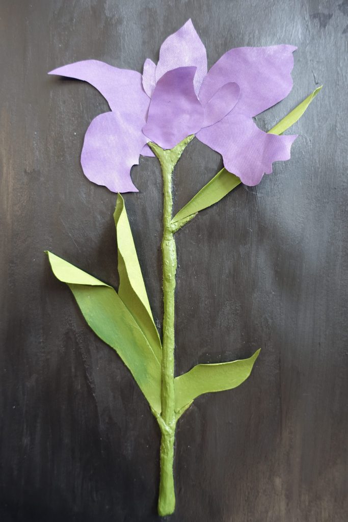
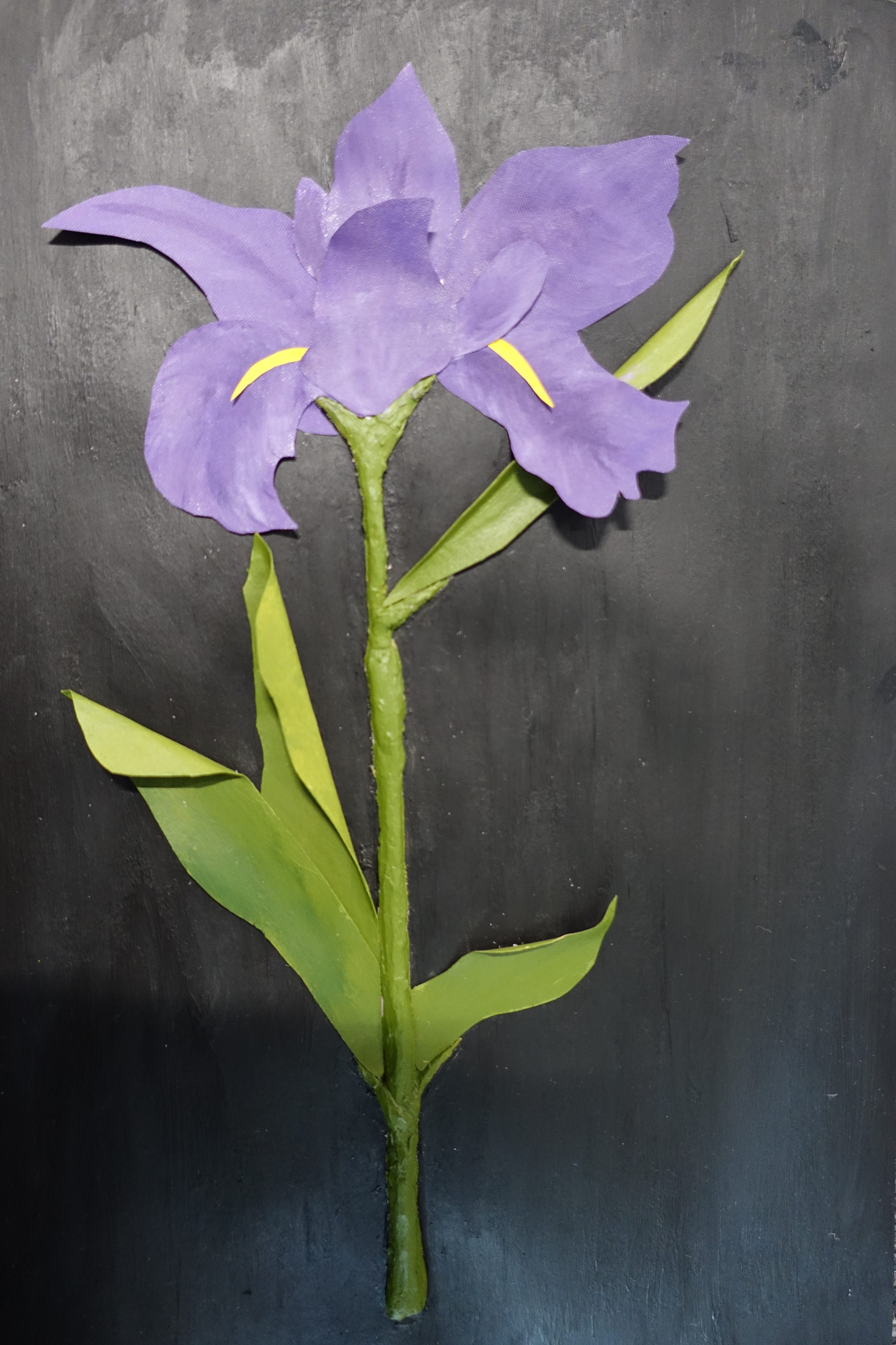
After picking which fabric to use, I coloured a big piece of it and cut it into the shapes of the petals which I then stuck down. Next I needed to make the leaves which I did using card, I thought this would work best because I was able to bend and fold it easily into the position I wanted, I cut out the leaves then painted them a similar shade of green to the stem and stuck the down onto the page. I then painted the background of the flower, I chose black for this as I thought it would make the flower stand out against it being the only colour on the paper. As a final touch, I added in the beard of the flower using bright yellow paper to give it a final pop of colour.
To be honest I’m not very happy with the way this experiment turned out. I don’t thing using fabric for this flower specifically is going to give me the effect I want which is to have the flower look like it is bursting out of the page not just sitting on it which is what is happening with this one. I do however, like the use of the clay, I think is works very well as the flower’s stem and if I can solve the issue of it breaking and not sticking I definitely want to use it again. I think the reason the clay was snapping is because I did this on a piece of paper which isn’t a very strong material, so if I were to do it again I would do it on something thicker like a piece of cardboard so that hopefully it won’t get moved around so much. even though I didn’t really like the outcome, I do enjoy the process of making this type of thing, transforming the materials into something unexpected similarly to what Robert Rauschenberg does, though next time I make something like this I want to use materials that are a bit more random because I think what I used in this piece make it look quite boring and flat which is not what I want to come out of my work. This is only one stage of an iris’s growth but continuing on, I would like to document some of the other phases, like the bulb or once the flower has wilted through different materials and techniques to show the full transformation of a flowers growth from a tiny seed in the ground to a fully bloomed blossom.
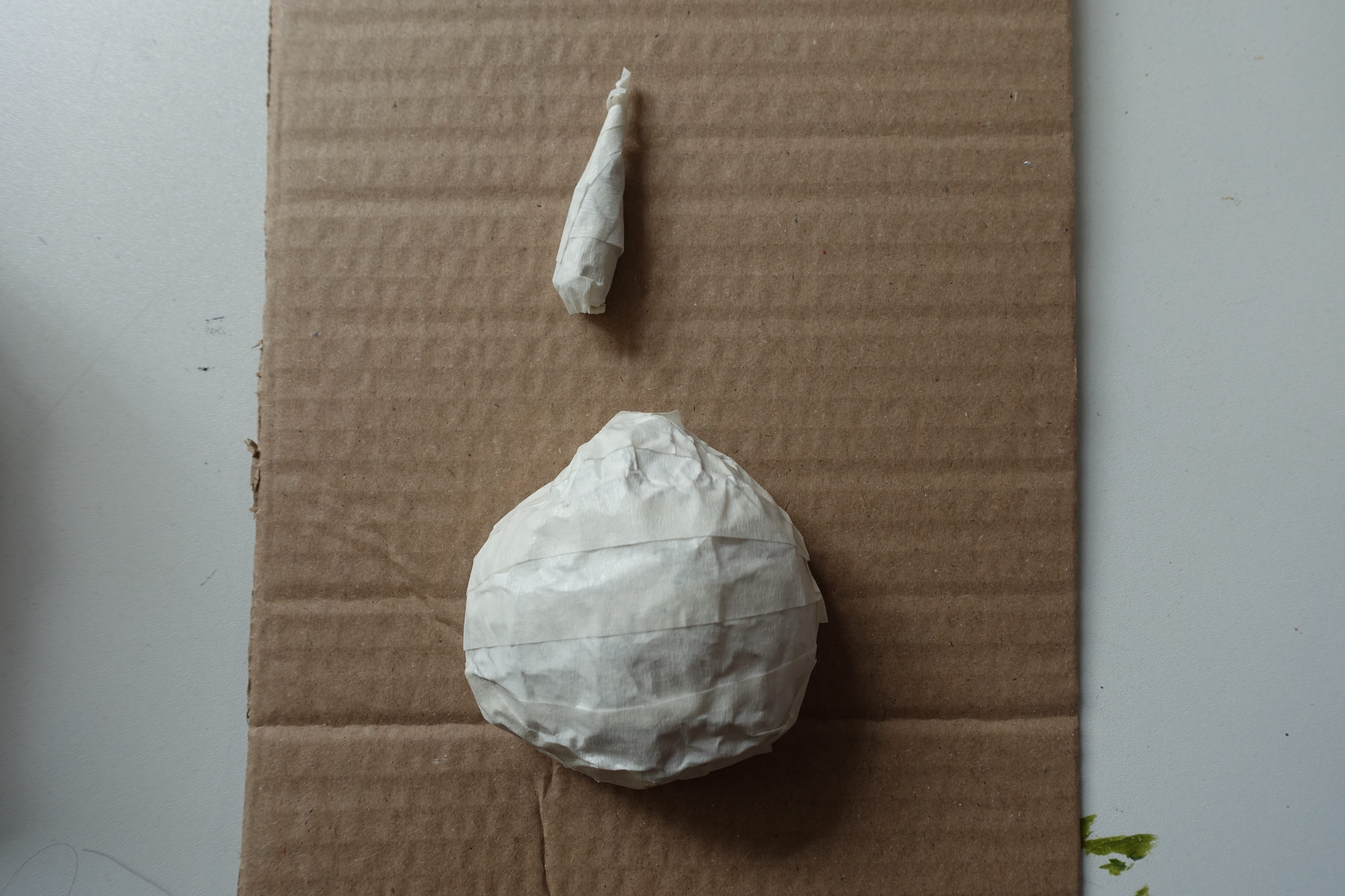
Because the idea I had based on the theme ‘Transformation and Illusion’ was about the life-cycle of flowers but all I have been experimenting with so far is a fully grown flower so I wanted to try out making something where I still use 3D materials in a similar way, only instead of making the iris flower, I make the bulb instead. I started this by using tinfoil to make a ball then flattened one side of it so it would sit nicely on the cardboard I used as a base, I also used tinfoil to create a cone shape to use as the bud coming out of the bulb, I then covered both things in masking tape because I was going to use papier mâché to create texture and even out the surfaces. I started with a layer of PVA glue then stuck on some tissue paper which I covered with more glue, I did this allover the surface of the bulb and the sprout then set it out to dry.
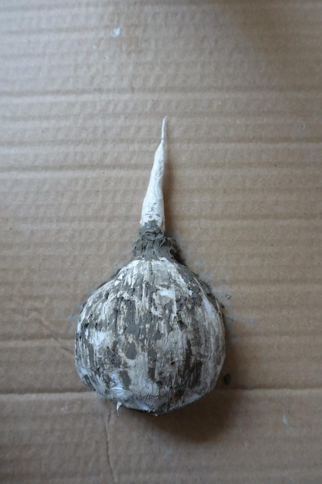
After this was done, I used hot glue to stick the sprout onto the bulb and then the bulb onto the cardboard. I wanted to give it a bit more texture and make the join between the cardboard and the bulb a bit more seamless, to do this I decided to use clay again. I watered down a clump of clay a little so it would be easier to spread then used a rigged clay tool to apply it and create a rougher texture.
The point of making this was to test where or not I actually wanted to explore other stages of an iris’s life-cycle in the future and ways that I could do that which is why I only created the base of it and didn’t add paint or anything like that. I’m glad that this is something that I tried as do like the materials I used and I would like to experiment with papier mâché again, I would definitely continue to experiment with the different stages of an iris’s growth in my work to further explore my theme.
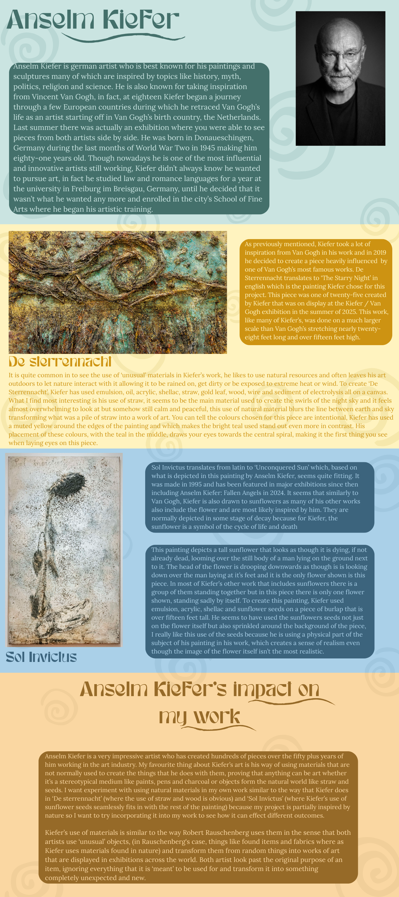
After creating that experiment I wanted to get some new inspiration so I decided to make another artist research page so hopefully inspire my next steps. I chose to research Anselm Kiefer, an artist who often uses ‘strange’ materials in his work.
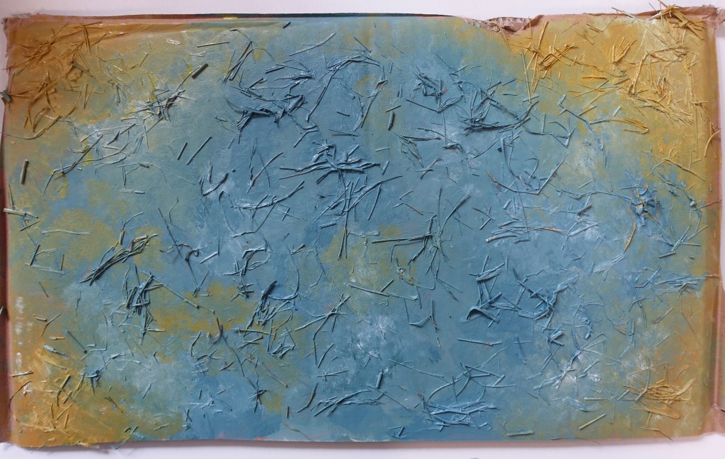
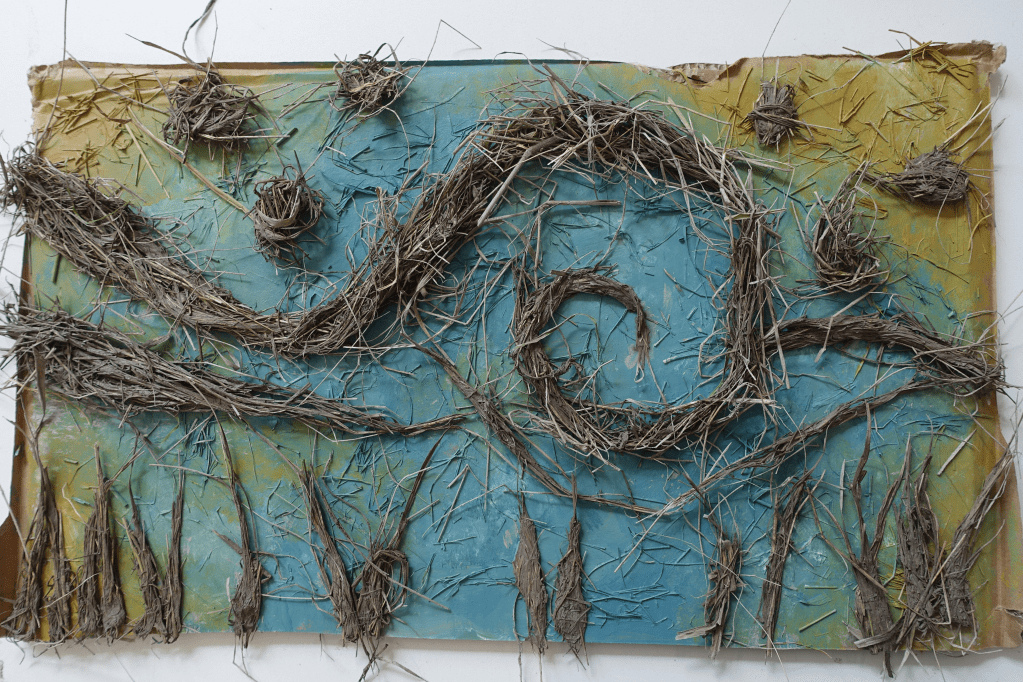
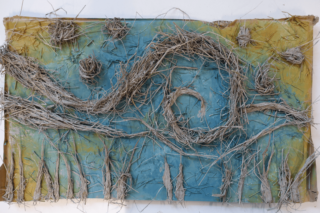
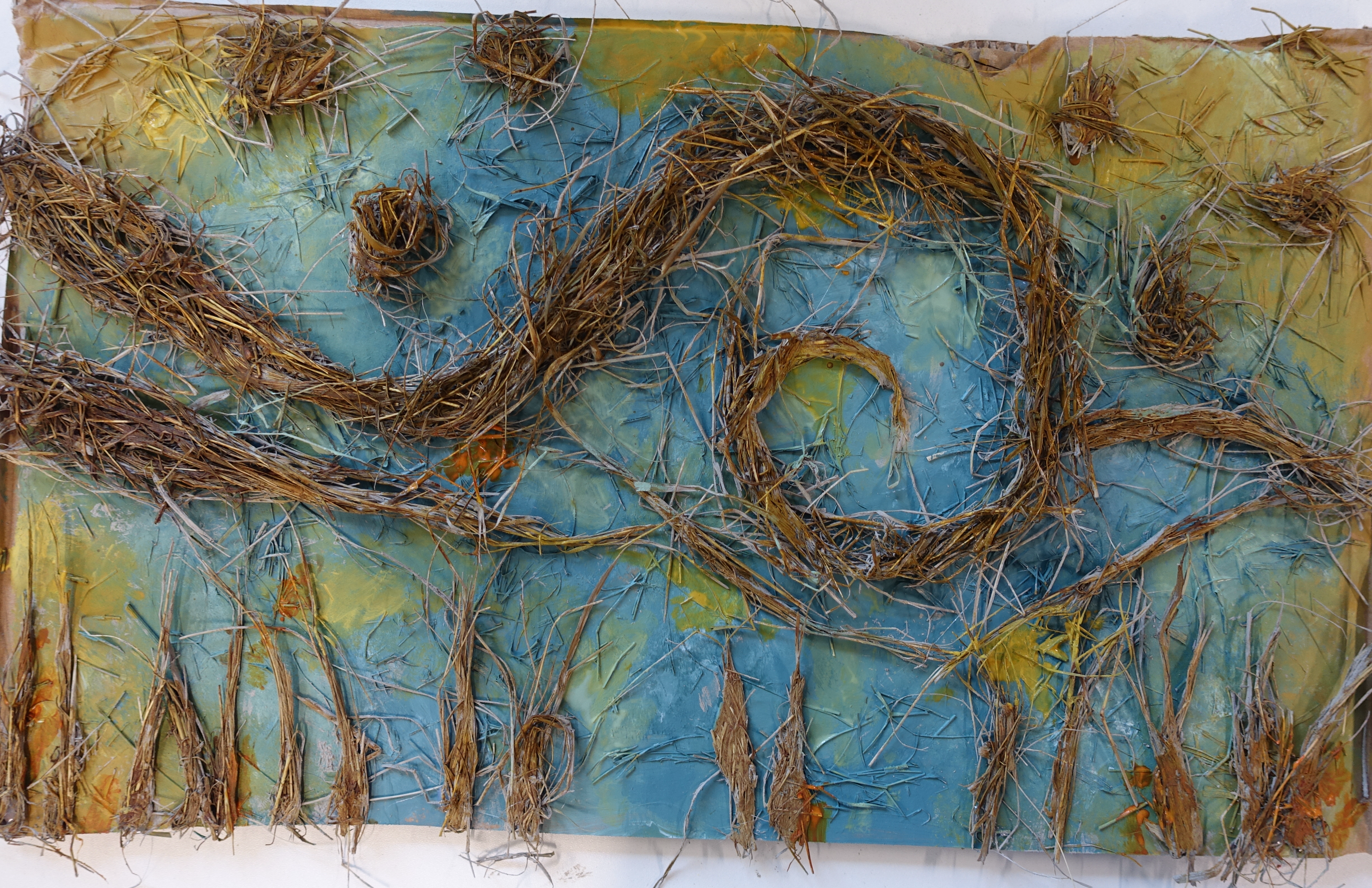
Having recently researched Anslem Kiefer I next wanted to try recreating one of his paintings to experiment with using similar techniques to him and expanding on my theme in the ways that Kiefer does by transforming natural materials into art work. I chose to recreate his painting ‘De Sterrennacht’ which is famously inspired by Van Gogh’s ‘Stary Night’. To do this I started with a base of cardboard, as the original painting is over fifteen feet tall I did my recreation of it on a much smaller scale but I think it still produces a similar effect to Kiefer’s. In this painting Kiefer uses straw to create texture and the swirling patterns seen in the ‘Stary Night’ so I needed to figure out something I could use to create the textures that it creates. My first thought was to use grass instead of straw because since mine was on a smaller scale anyway, it would look pretty similar when I added paint, I told my teacher about this idea and they suggested that I don’t use grass because it would be fresh and might go mouldy and instead offered to bring in some hay that I could use.
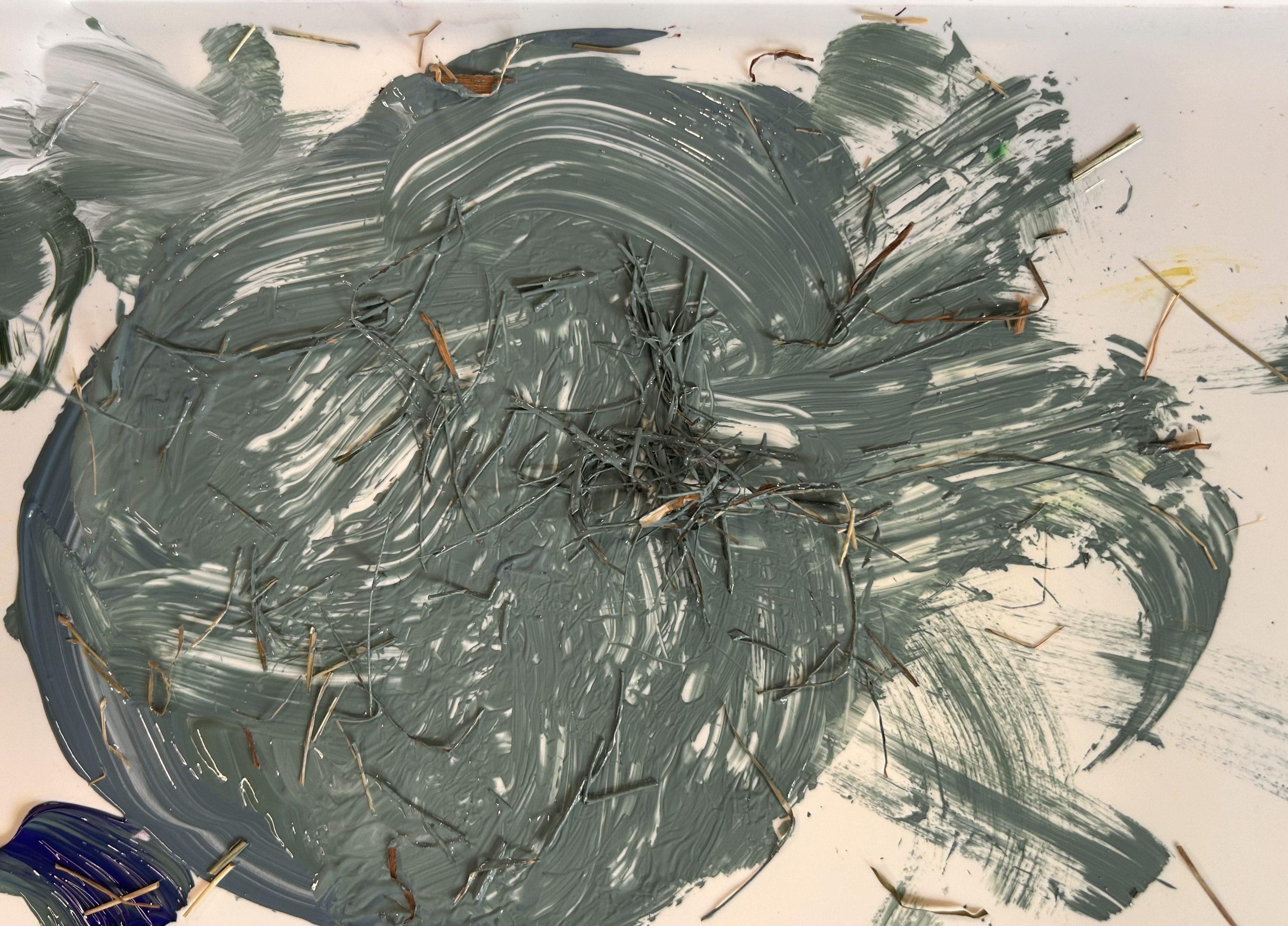
The next thing I did was paint a base coat using acrylic’s, I tried to mix similar colours to the ones seen in ‘De Sterrennacht’, they are a little off but I got close enough. while mixing the colours I looked at a photo of ‘De Sterrennacht’ and realised that Kiefer had not just used straw in the swirls but also in the background, at first I tried to recreate this effect by just adding the hay straight onto the cardboard and painting over it but when I did that the hay did not stick with the paint so instead I cut it up into smaller pieces and mixed it into the paint I was using and this worked a lot better as the hey actually stuck. I added the yellow to the corners and anywhere else I saw it in the original painting, I then also added some white as some spots in the painting are lighter than others.
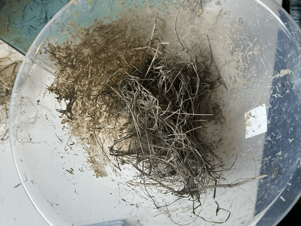
After letting the background dry I started on the main part of this painting which is the swirling patterns made from the straw. To create these in my own piece I started off with taking a clump of air-dry clay which I then combined with water so it was a thick liquid, when I was happy with its consistency, I started to mix in the straw. Doing this actually worked out really well as the clay made it so I was able to shape the hay into whatever shape I wanted without it being a big mess as it was all stuck together.
I took a clump of this mixture and shaped it into a line which I then bent into a swirl and positioned on the background, I then when back and looked at a photo of the painting to see what other shapes I needed to add on. I put in some more lines under the spiral and some smaller ones along the bottom, there is also some circular shapes in the top half of the original painting which I also added to mine. after finishing this step I left it out overnight to dry.
When the everything had dried I saw that the clay hadn’t dried onto the cardboard so it wasn’t attached, to fix this I just used some hot glue to make sure everything was stuck down and wouldn’t easily fall off. For some reason I didn’t think about the fact that the clay would dry to a lighter colour than it is when it’s wet but I was planning on adding some more paint at the end any way so all I was doing was adding more then I had originally planed. I watered down some acrylic and painted over the hay with a shade of brown that was similar to the colour in Kiefer’s painting, I then went back in with an orange and a yellow and added some splotches of both because there is some in the real painting.
|I’m happy with how this came out as I think it’s a fairly accurate representation of Anselm Kiefer’s original work and I did really did enjoy adding the element of nature into my work through the use of hay. Not necessarily hay but using other natural materials is definitely something I would like to continue to experimenting with as the subject of my work is flowers and their life-cycles so this would be a good way to further link nature and art. Kiefer’s art is similar to Robert Rauschenberg’s as they both use ‘unusual’ techniques in their work to transform materials, (in Kiefer’s case, natural materials) into art that you would not normally expect to see which is another thing I am trying to incorporate into what I am doing.
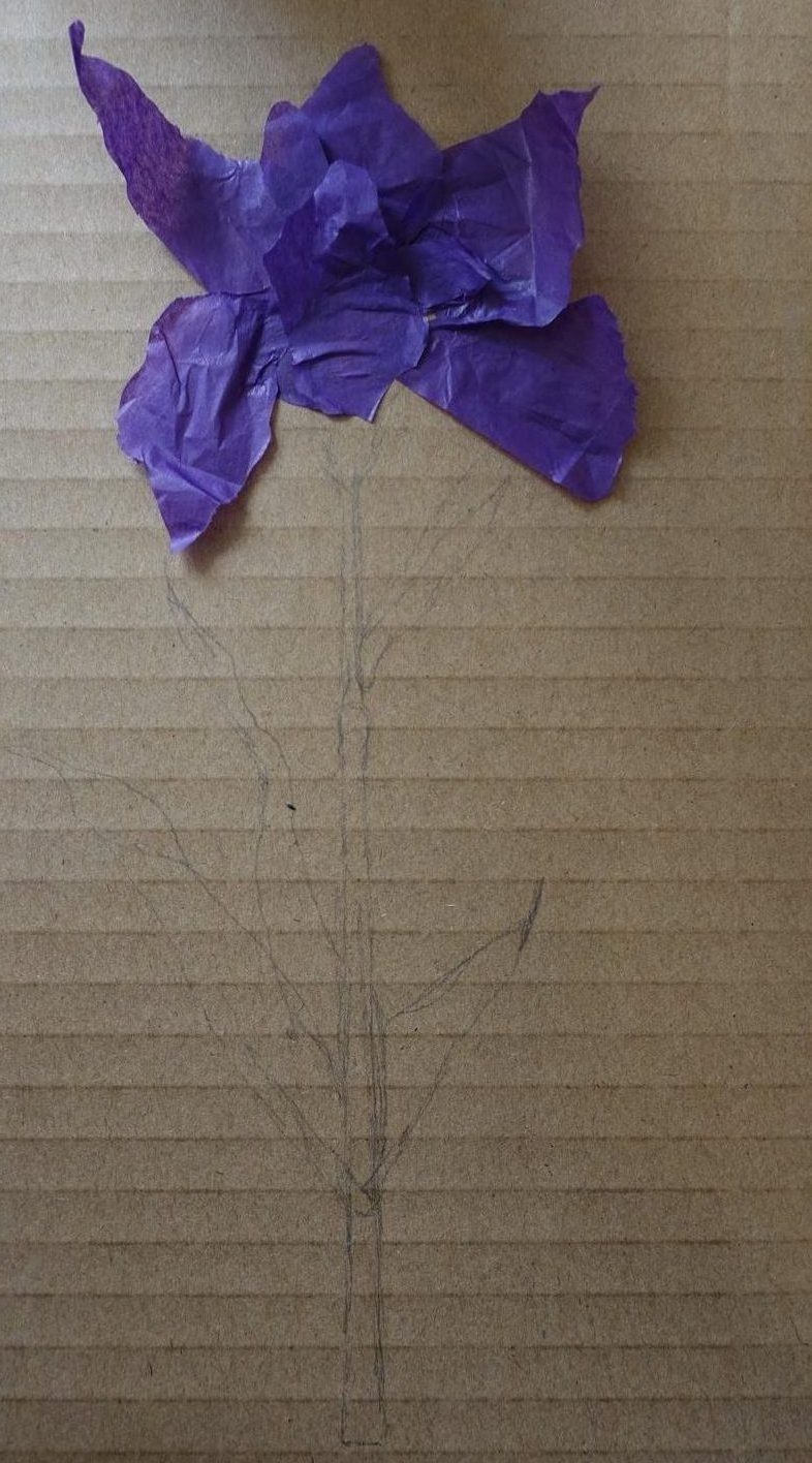
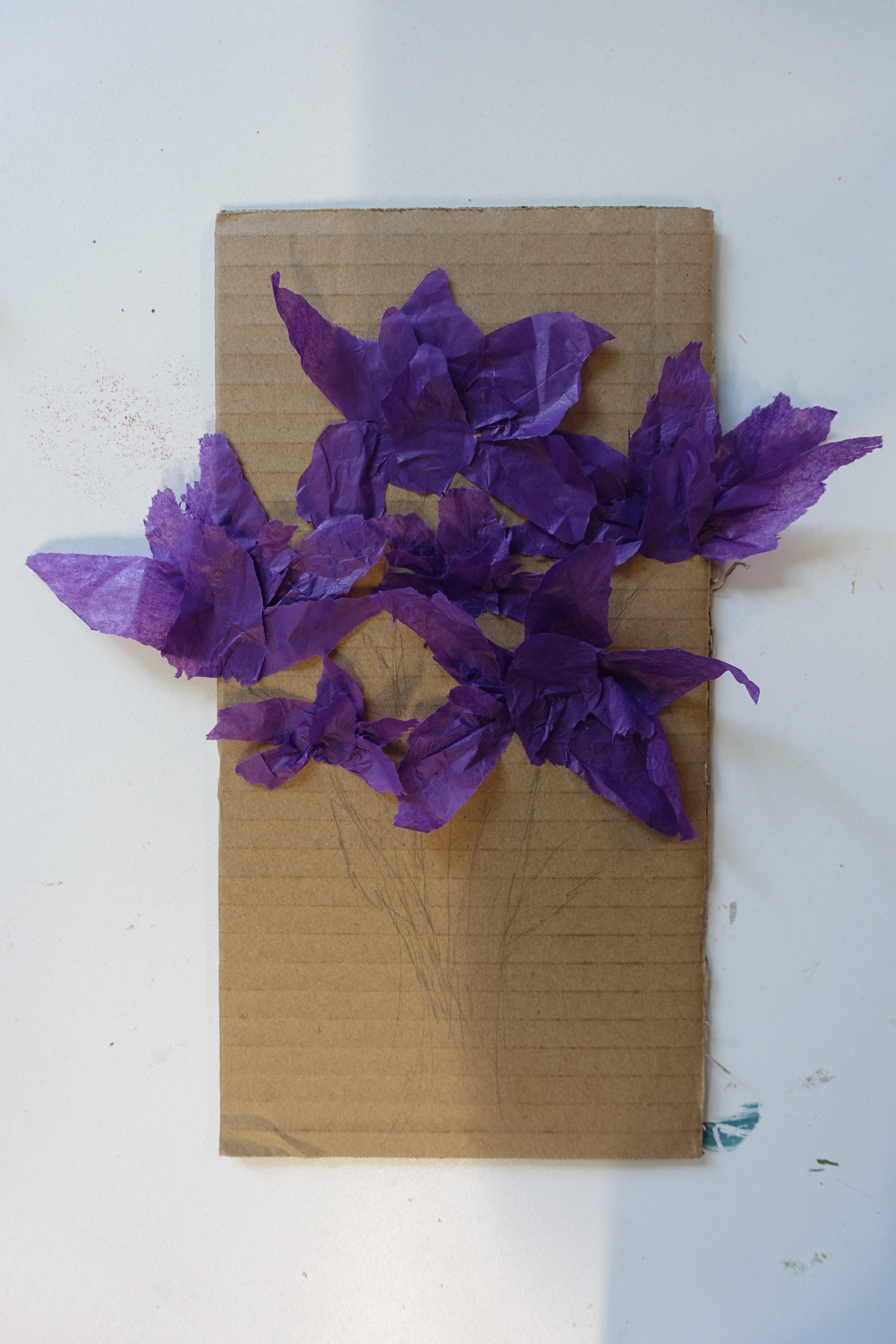
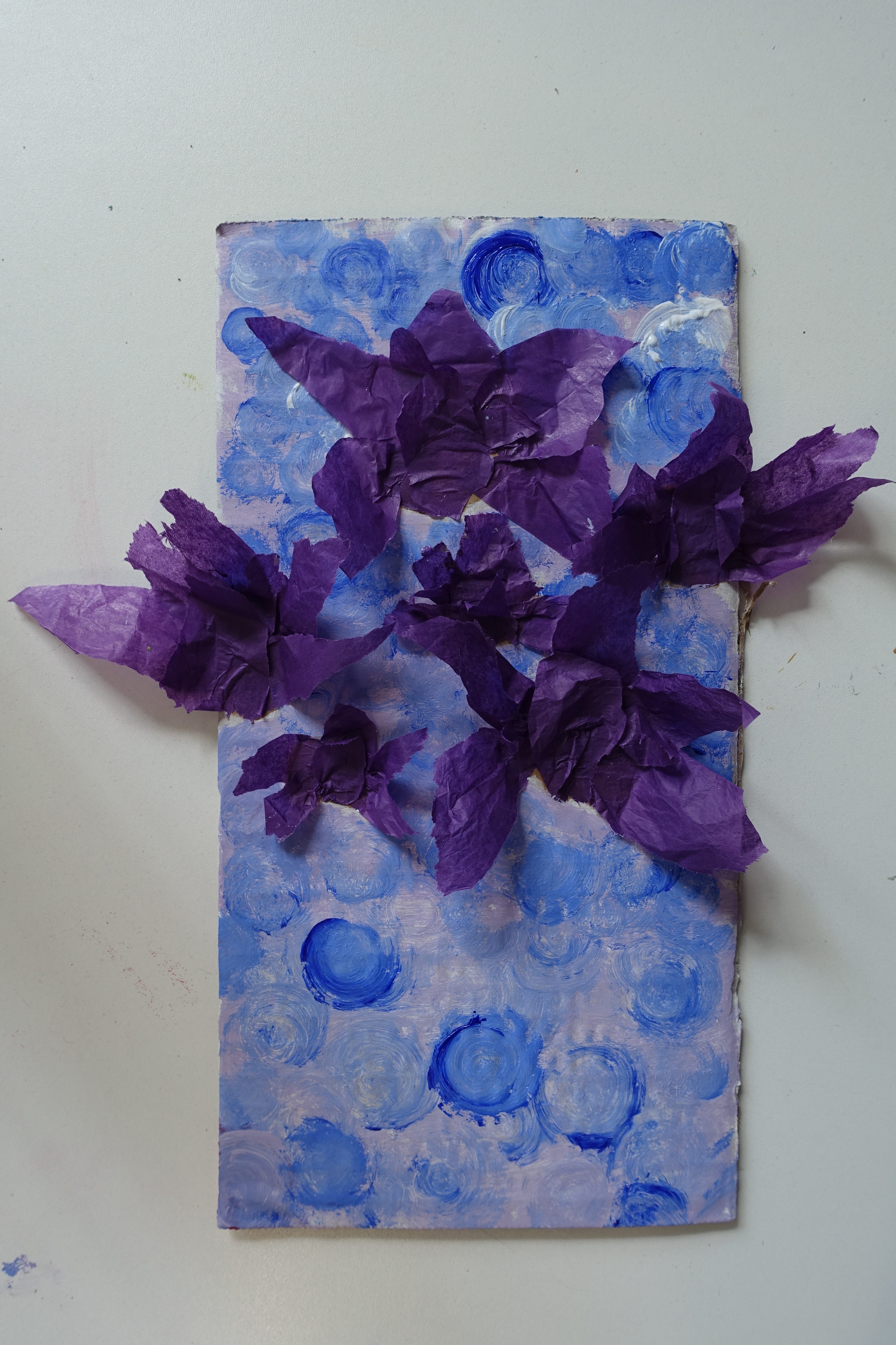
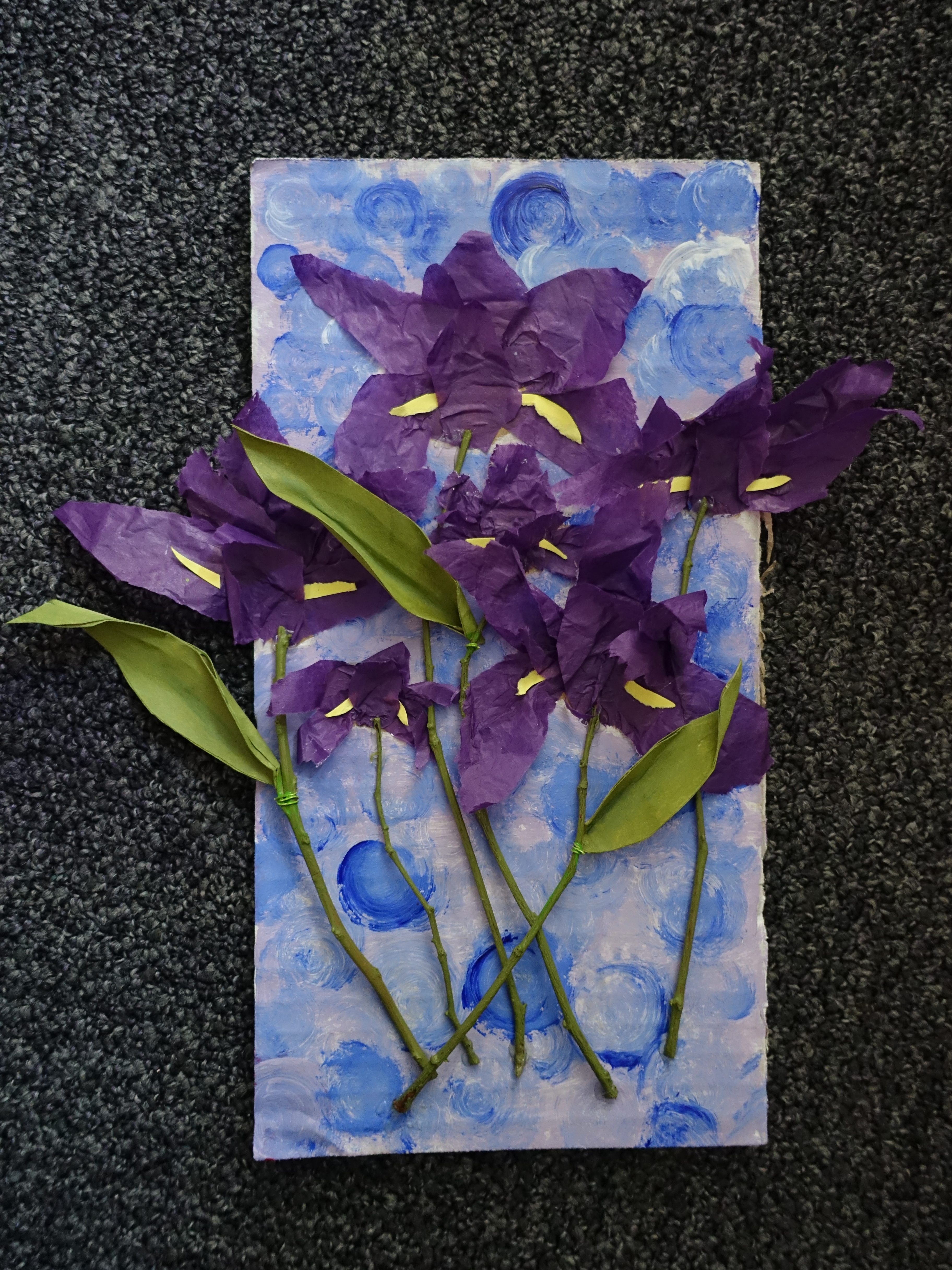
Now that I had recreated Kiefer’s work and used natural material in the way he does I wanted to try incorporating it into my work in my own way. I started by sketching out an iris flower as a reference onto a piece of cardboard as last time I used paper which wasn’t very strong so my work kept on cracking. to make the petals I knew I wanted to use tissue paper as I had tested it before and I really liked the outcome but I had to change it so I wanted to try it again. I cut out the shapes of the different petals but tried to make them look messy as I think it gives the flowers a more natural feel. I stuck the tissue paper down to the cardboard and I was going to leave it at that and start on the stem and leaves but I realised that a lot of my other work consists of a single flower on some kind of background so I wasn’t really pushing myself outside of my comfort zone as much as I could be and I think it’s hard to improve if you don’t try different things. I decided to take some inspiration from Billy Showell and play around with my layout, so I started adding more flowers to the cardboard not really knowing where I wanted to go with it, instead of cutting these new flowers I mostly ripped them into the shape I wanted to make them seem more wild and sporadic.
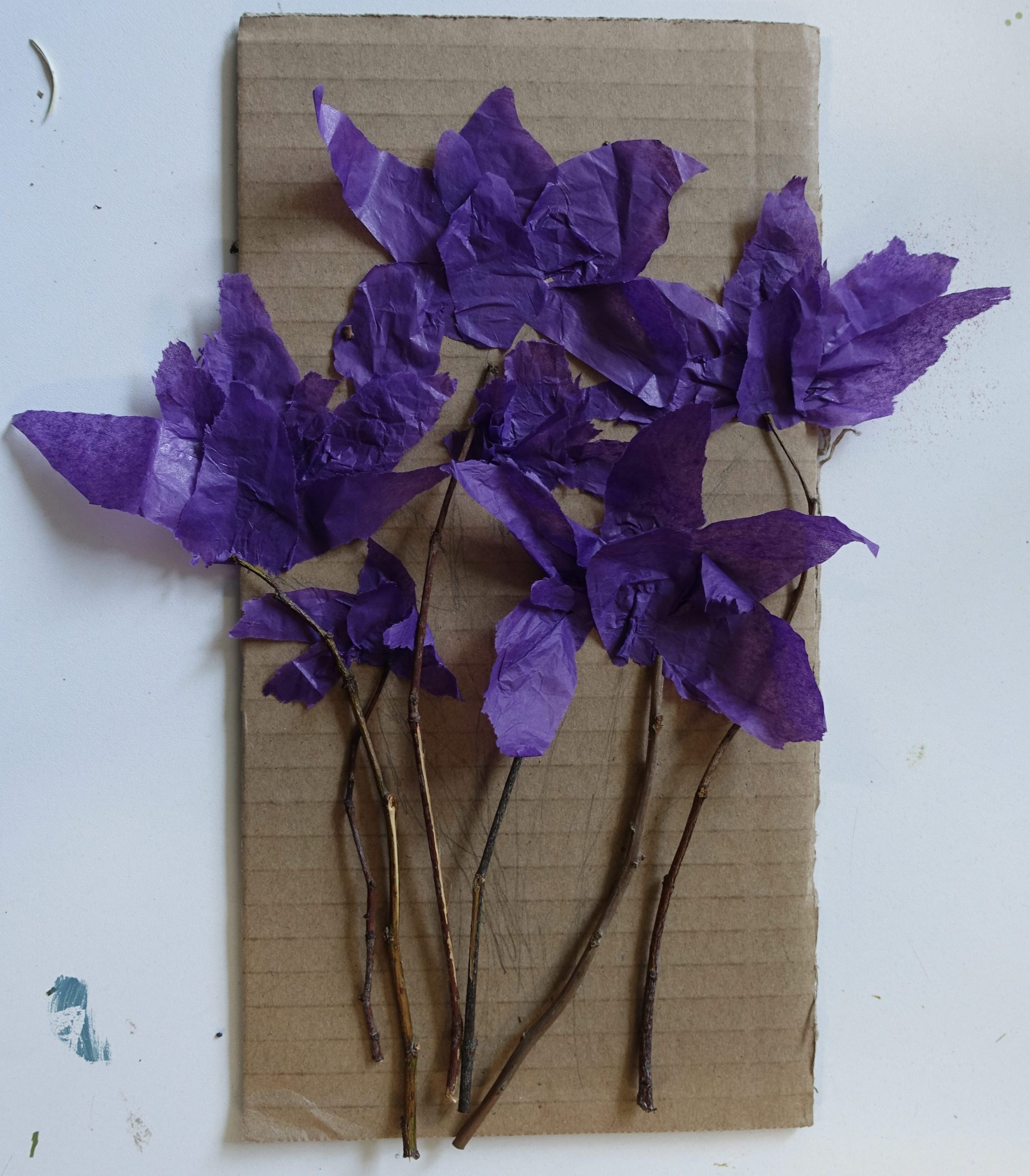
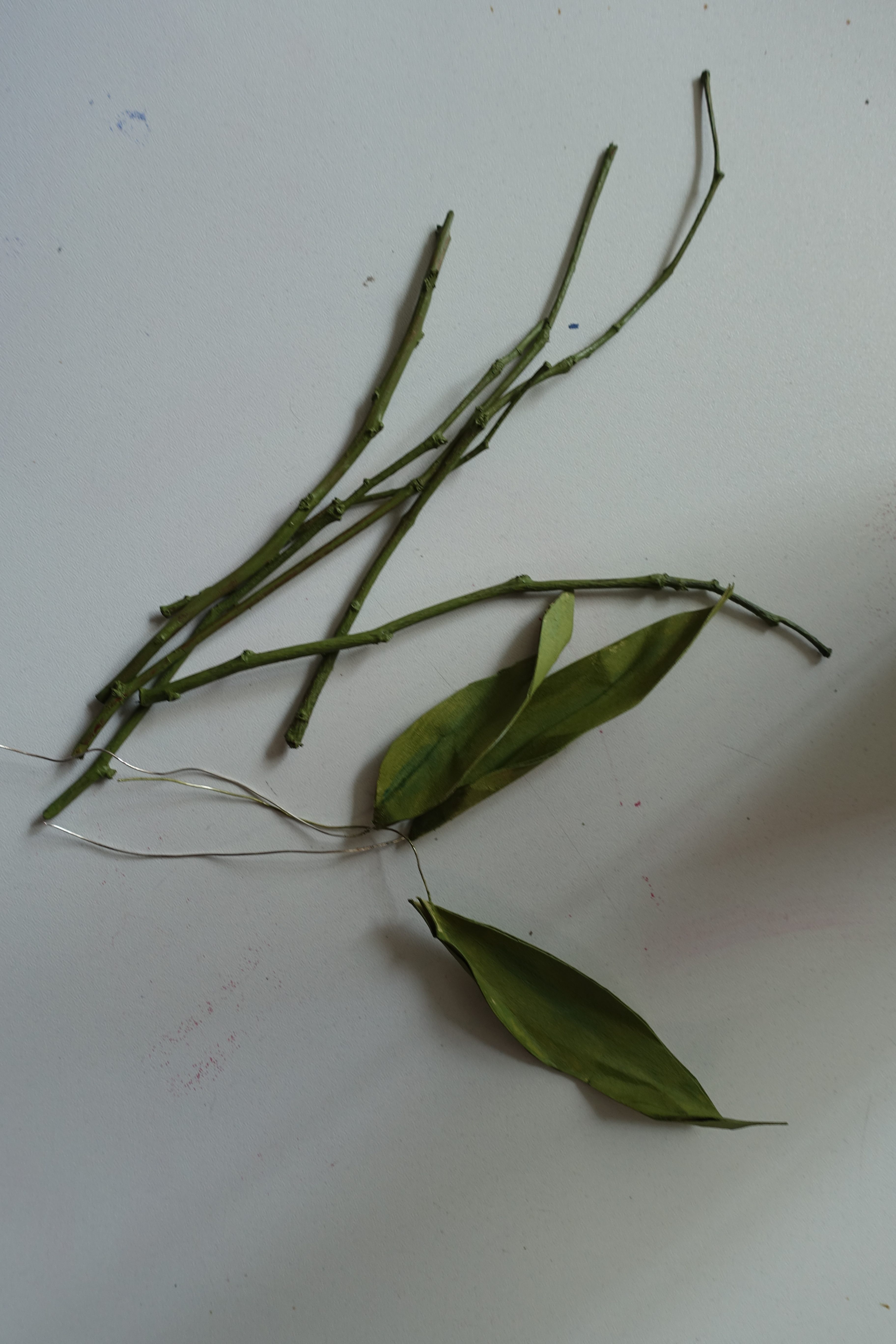
I wanted to add an element of nature into this piece but at first I wasn’t sure what material I was going to use for this, I debated using leaves or maybe hay again but I thought that if I used leaves I might have similar issues to the ones I would’ve had if I’d grass last time and I don’t think that hay would work well in this context. What I ended up using was thin twigs that I found outside on the ground which I thought would work well as the flowers stems.
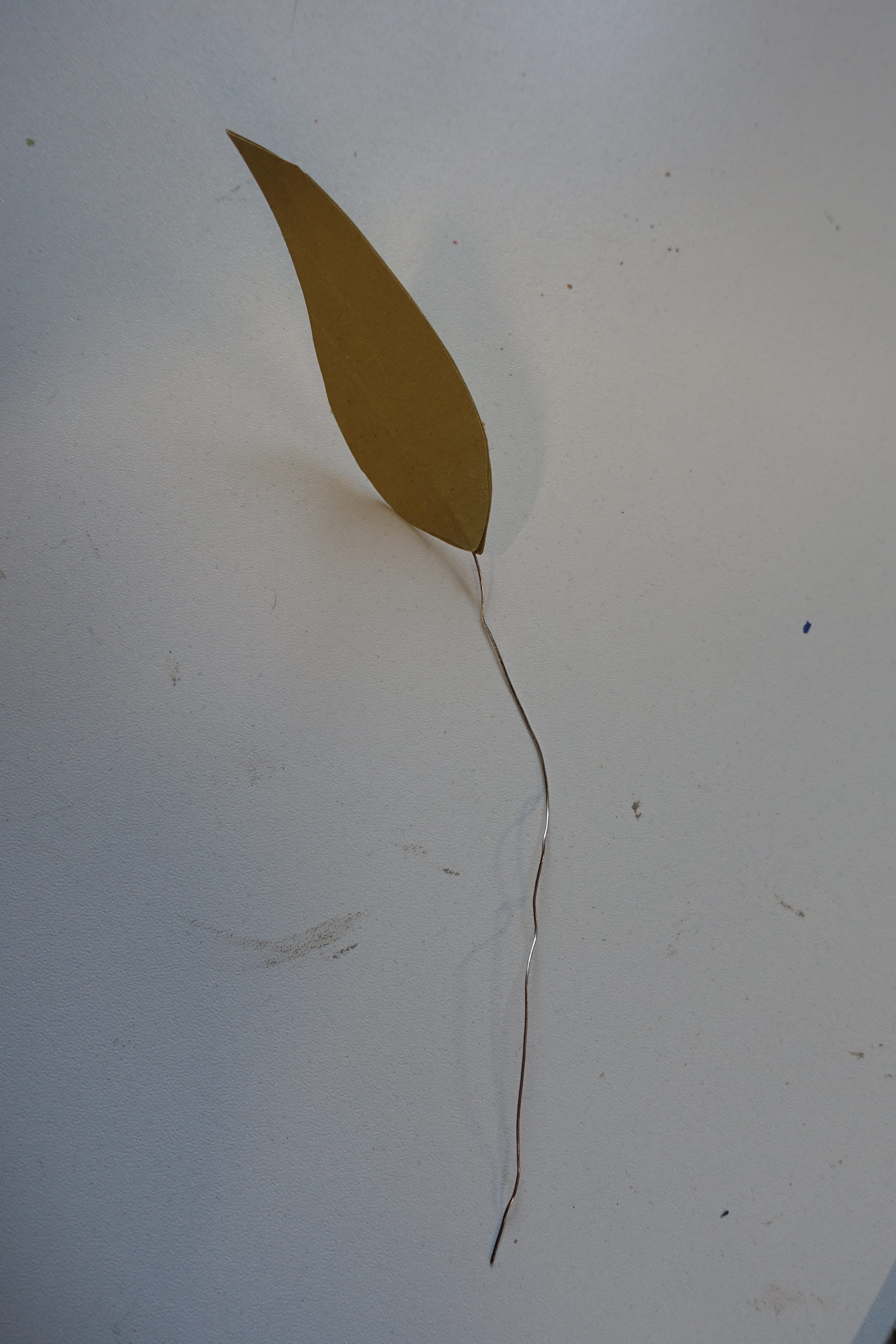
for the leaves I wanted to try something I hadn’t used before but I couldn’t decide on a material to use so I asked a friend if they had any suggestions and they offered me some spare wire that they had leftover from what they had been working on. I really liked this idea as I though it would be make it so I could bend the leaves into whatever shape and position I wanted. To use it I cut out paper into the shapes of the leaves, I made two of each leaf then glued them together around some wire then, once they were dry, I folded some of the edges to make them seem more real.
After this I was done with making all of the 3D elements so the next thing I did was start painting. I used acrylic paints to colour the leaves and stems the same shade of green so they would blend into each other when they were put together at the end. I then moved onto painting the background, I started with a light periwinkle colour which I didn’t really like as I don’t think it goes very well with the shade of purple that the tissue paper is so to cover it up I used some blue paint and used my paint brush to create lots of circles with the paint. I probably should have done the background first as it was quite hard to get around all of the flowers but I am happy with how it turned out in the end.
I added yellow paper to the flowers to make the beards and then when all the paint had dried I stuck down all the ‘stems’ with hot glue the wrapped the wire of the leaves around some of the sticks to add them on, using the wire didn’t really do what I was expecting it to, actually it didn’t really do anything because the paper could already bend and stay in the positions I wanted so using the wire was kind of pointless but I am still glad I tried it.
Overall I am happy with how this piece turned out, I’m glad I experimented with using multiple flowers as I think it looks a lot more natural than just having one. I liked using a part of nature in my work, which I initially did because of Anselm Kiefer, I think it makes it feel more real even though it does not look realistic at all. This is almost completely opposite to Billy Showell’s work but is still very much inspired by her through her concepts and the way she displays her flowers in unique layouts which I tried to express in this piece by using multiple flowers and slightly layering them to make them seem more natural.
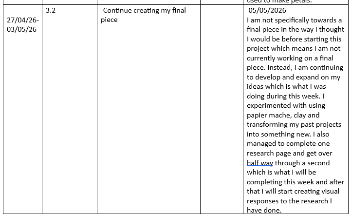
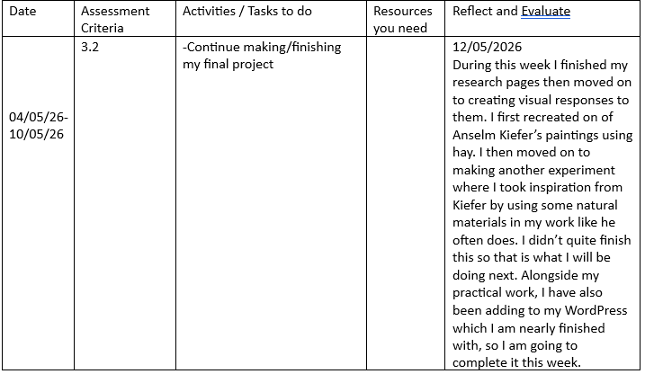
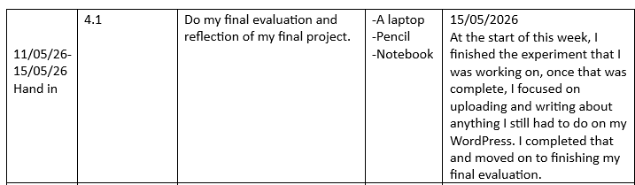
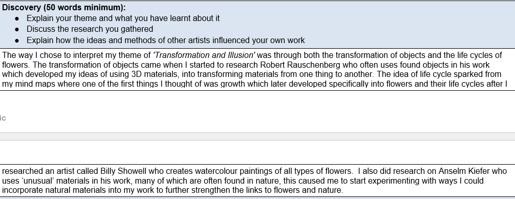
I did a lot of different experiments and research which helped me to develop my original ideas of life-cycles and memories down to just life-cycle then, into flowers and the changes that occur as they grow and die. If I were to continue developing these ideas I would take some more inspiration from Robert Rauschenberg and Anselm Kiefer by starting to incorporate more objects that aren’t stereotypical art materials into my work, things like pages from books, dried flowers, stones, photos and any other random bits and pieces I find because I want to explore how anything can be transformed into art if your willing to try it, which is something that has been proved by Rauschenberg, Kiefer and so many other artists. I would also want to try creating something on a bigger scale as currently, none of my work has been bigger than an A2 piece of paper, so I want to experiment with what I could do with a bigger canvas, possibly creating the entire life-cycle of a flower in one piece using different materials to express how change effects everything and everyone.
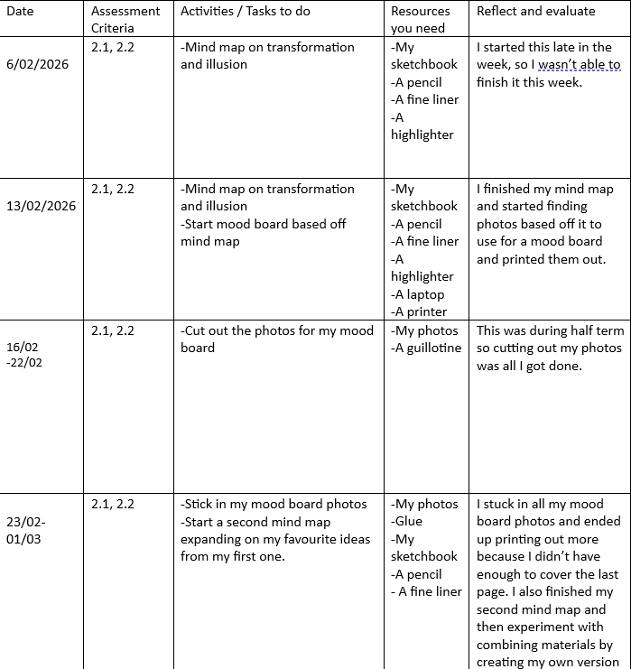
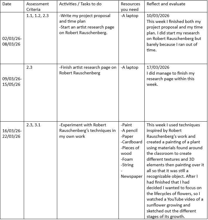
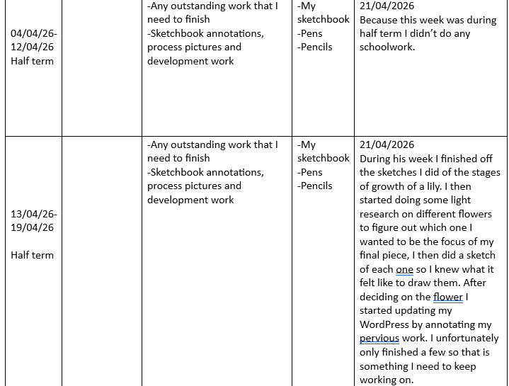
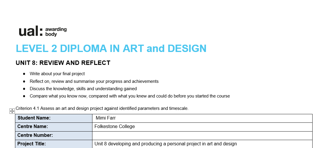
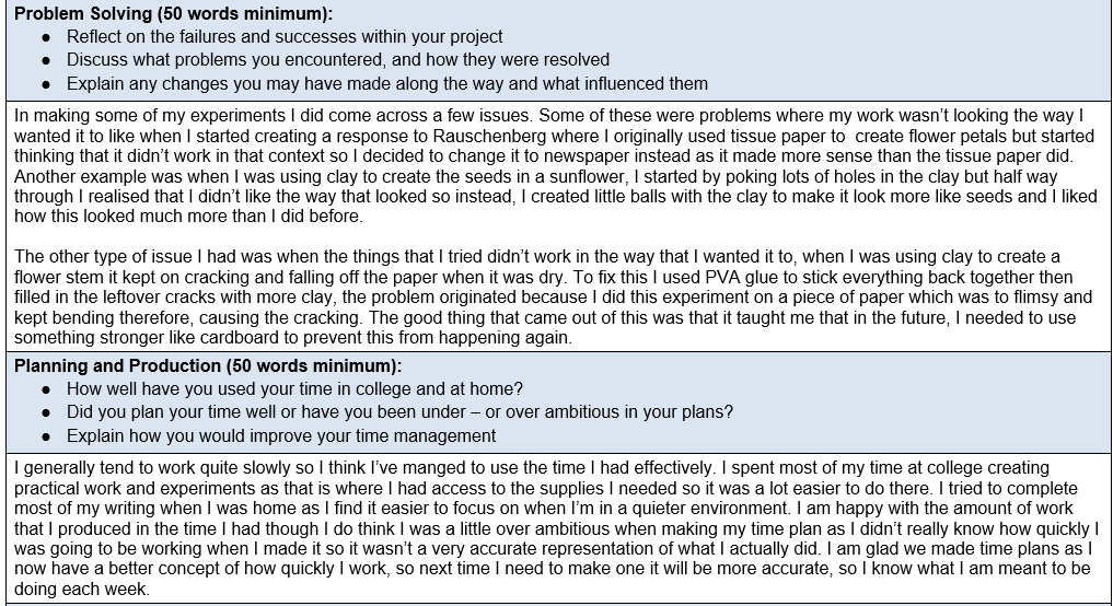
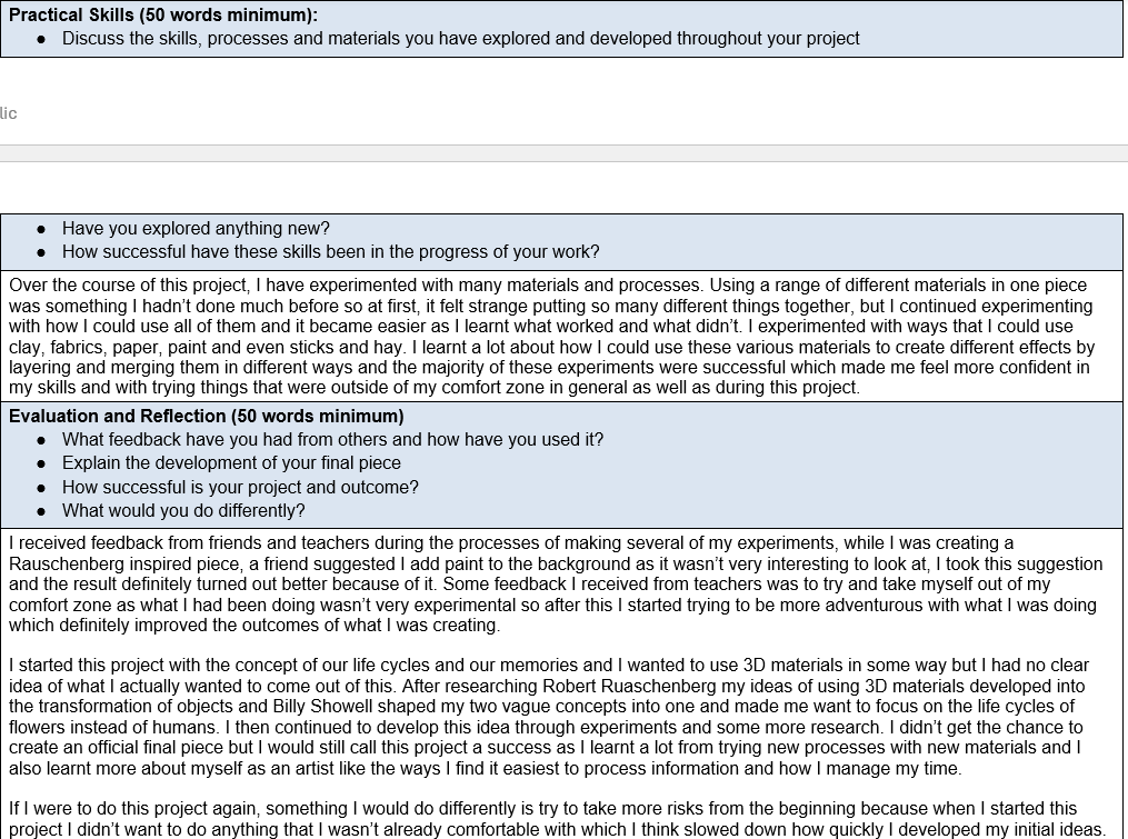
Attached below is my time plan and unit 8 evaluation