Tim walker
Tim Walker is a British Photographer, he regularly works for Vouge and Love magazines and is best recognised for his signature fairy-tale inspired style. Many of his photos include things like, oversized props and ‘strange’ concepts.
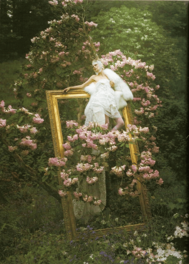
This is a photograph taken by Tim Walker for a 2007 Vogue Italia editorial. It captures British model and designer Stella Tennant in a beautiful garden scene surrounded by greenery and lots of blushing pink flowers. She wears a strapless dress made up of many different layered fabrics including some which are transparent, all the materials are in a bright white which creates a dramatic contrast against the darker greens of the background. Along whit the dress, Stella wears a lacy scarf around her head and carries what looks to be a fluffy fur coat, all of her accessories are also in shades of eye-catching white making her the focal point of the image.
The most interesting part of this image is the oversized, golden picture frame that Stella is posing on. It makes the image feel like something out of a different world where people are tiny and picture frames fall from the sky. The photo has a slightly blurry look to it almost someone has smudged their fingers all over the camera lens which makes the viewer feel like their in a dream and the strangely sized frame adds to this effect.
The way that stella is positions on the photo frame makes it seem like she is deeply in thought and the way half of her body it still inside of the frame makes it seem like she was once the art in the frame but has somehow escaped the canvas and doesn’t quite know what to do now. This whole concept feels like something out of a strange dream.
I really like this photo and definitely want to take some inspiration from this shoot to use in our own for example, Stella’s absent minded positioning makes the image feel less staged which I really like. And I love the dreamy editing style so I definitely want to try recreating that.
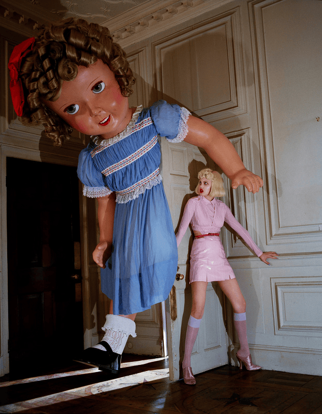
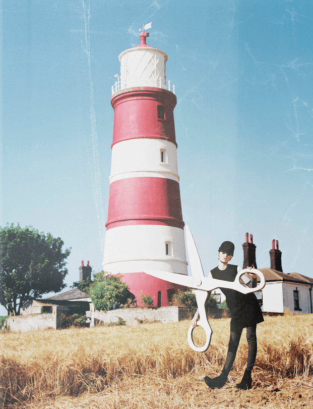
Oversized props are very common in Tim Walker’s photos, he uses them in a way that makes his models and the rest of the scene seem tiny, almost like toys, in comparison.
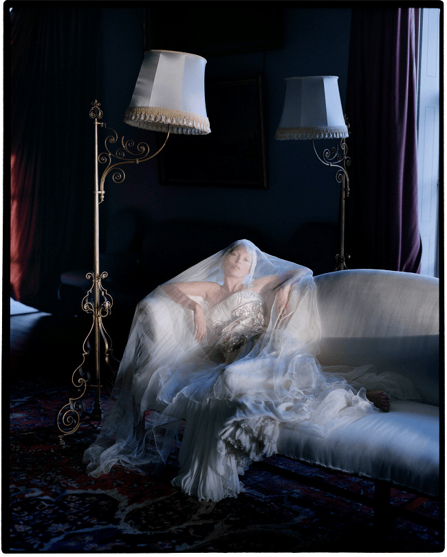
I really like the way the sheer fabric has been used in this photo, is makes the model seem ghostly which I really like and would like to try in my own photo shoot.
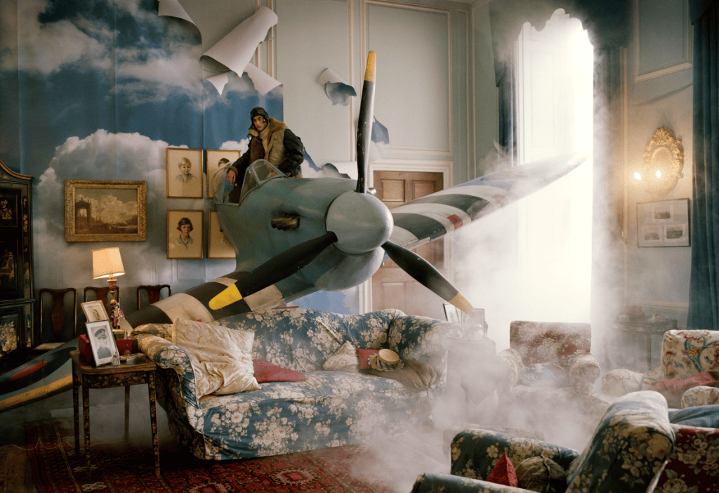
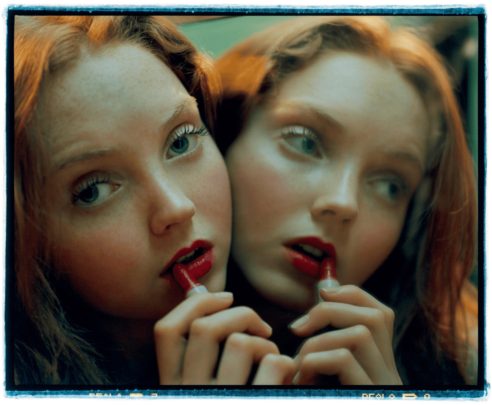
I love Walker’s use of a mirror in the photo the right, it makes the image feel trippy and strange which I really like. It also makes me think of way that a photo with a mirror could be edited to look like a reflection has come to life.
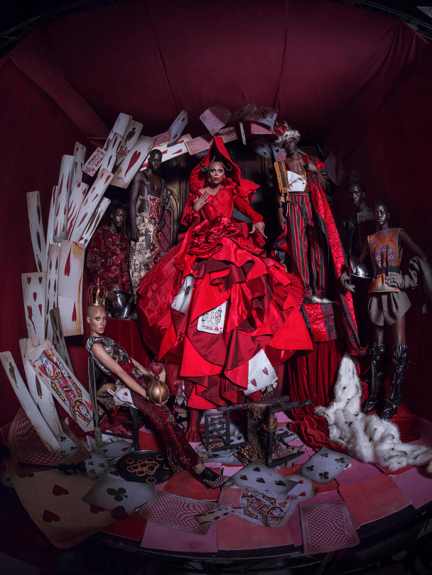
This photo comes from an Alice in wonderland inspired shoot Tim Walker did for the 45th edition of the Pirelli Calendar in 2018.
This image features RuPaul dresses as the Queen of Hearts, the outfit consists of a bright red dress which has the shape of a ball gown and features different shades, textures and lots of interact folds and ruffles, embedded in these you can see a few oversized playing cards poking out tying in
the dress with the background. In the image along with RuPaul there is several other models who are dressed up in outfits fit for a queens court but all in more muted tones then the ones worn by ‘the queen’ so they blend in with he dark background, they are all positioned behind which shows her importance as she is the centre of the photo.
I love the clear theme of this photo and how Walker has used dark lighting and bold colours to make the “queen” what immediately catches your eye. I also really like the use of the playing cards and how they are scattered around and look old and damaged. I’d really like to experiment with using cards and darker lighting in our own Tim Walker inspired shoot
Tim Walker Inspired Shoot
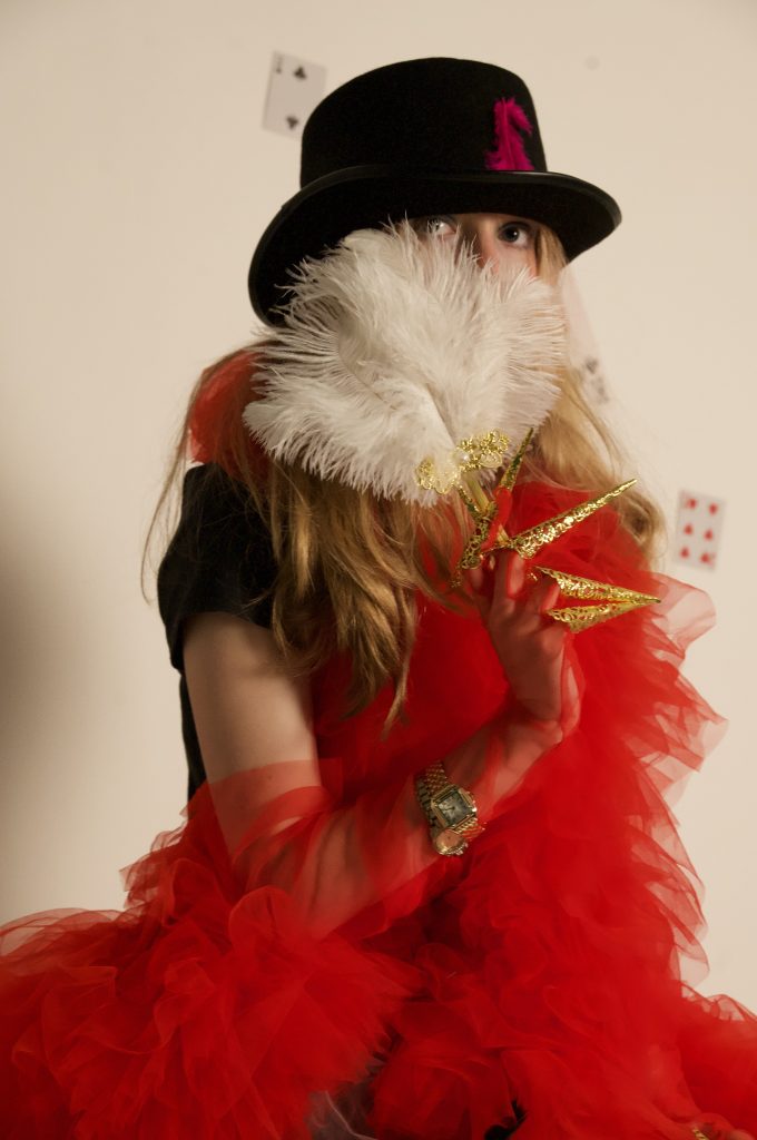
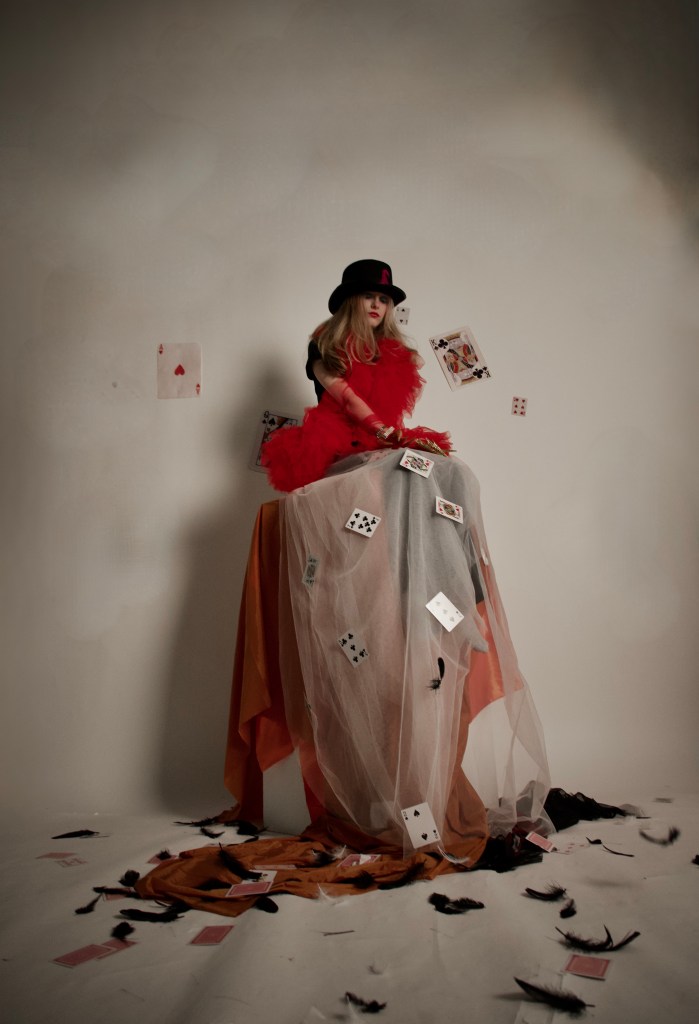
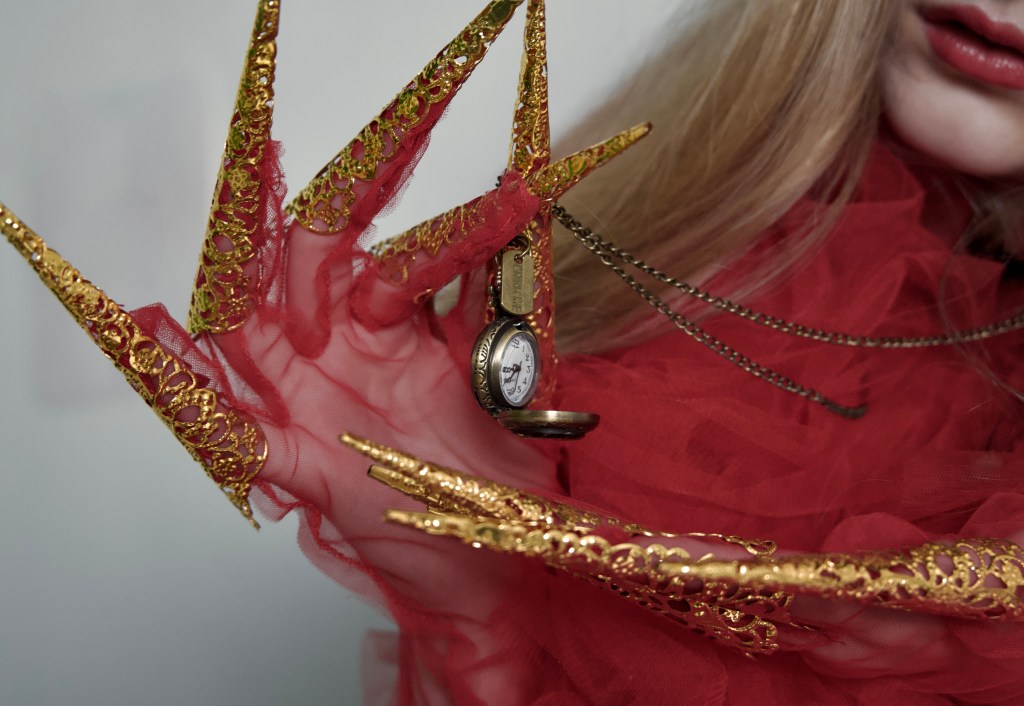
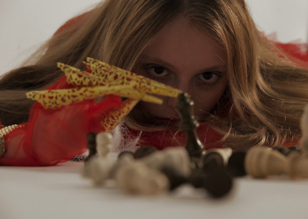
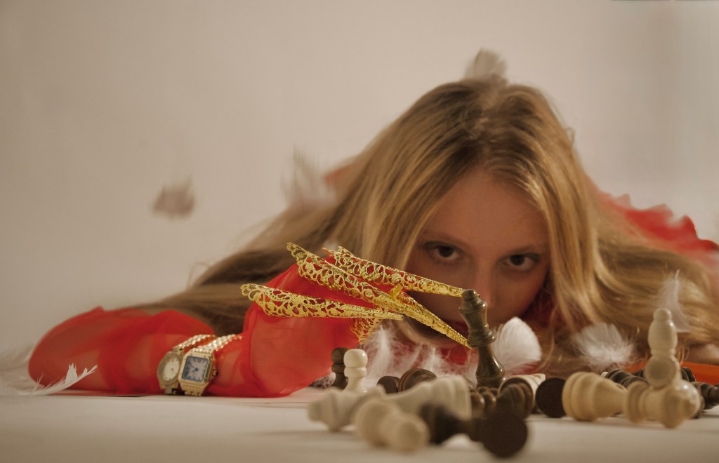
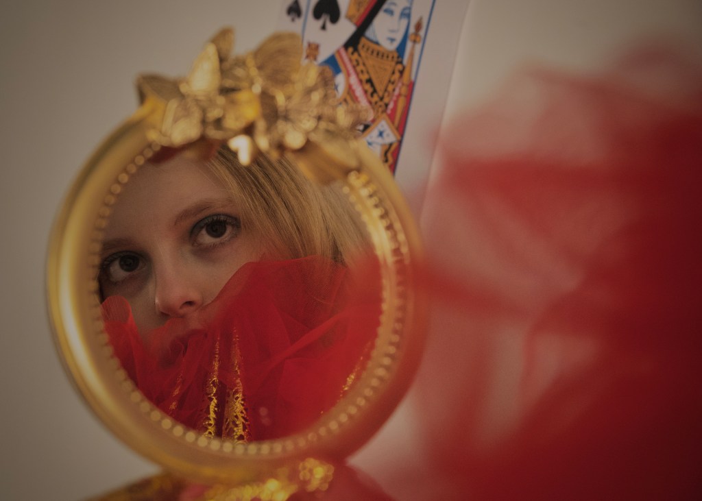
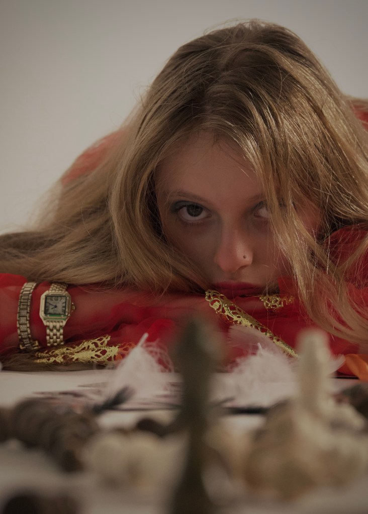
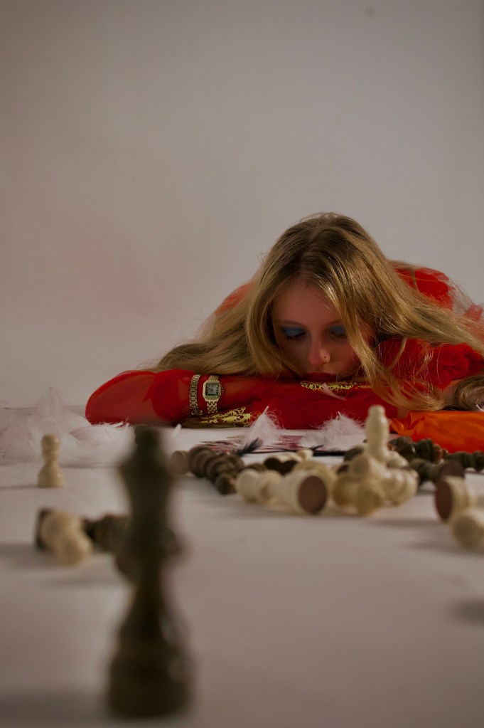
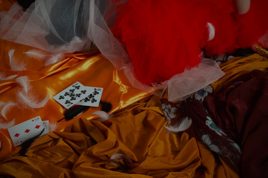
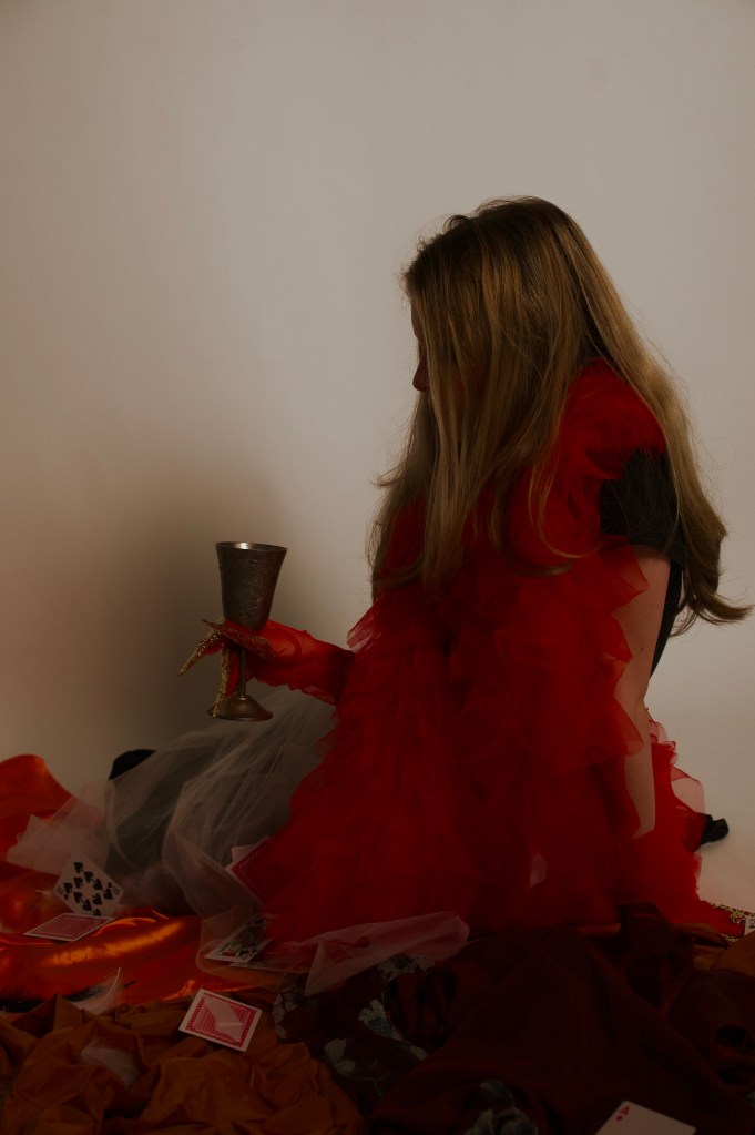
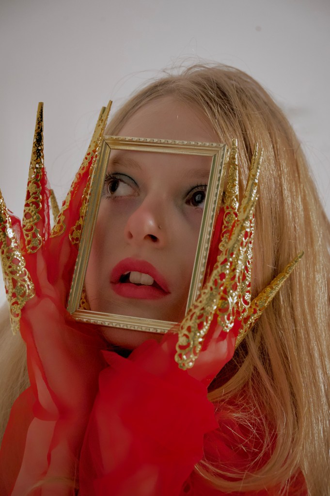
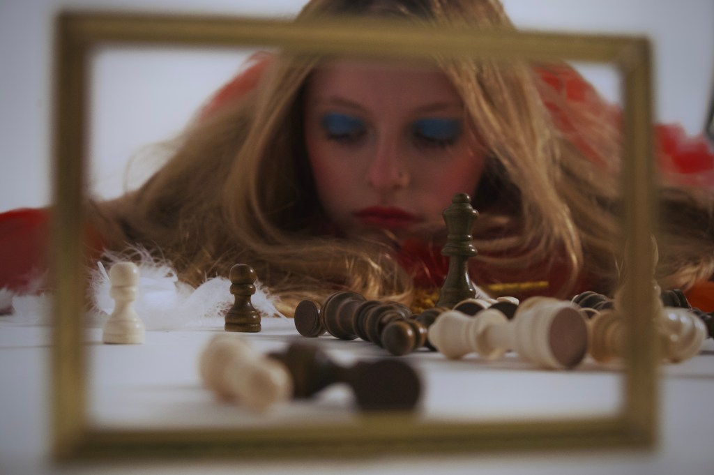
These are some photos we took during a Tim Walker inspired shoot, we wanted them to feel similar to his Alice in Wonderland shoot so we used lots of props including fabrics, feathers, playing cards, etc to make our photos more visually engaging and interesting.
Kirsty Mitchell
Kirsty Mitchell is a fine art photographer, she draws inspiration from her past careers in fashion design and costume making to produce photos of strange and beautiful worlds. Every part of her one of her photos is real so it takes months to create every prop and background featured in her work.
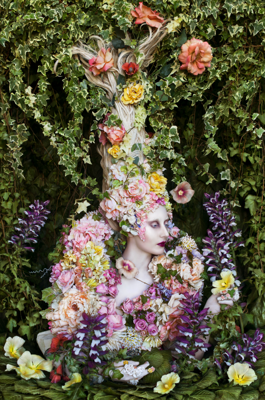
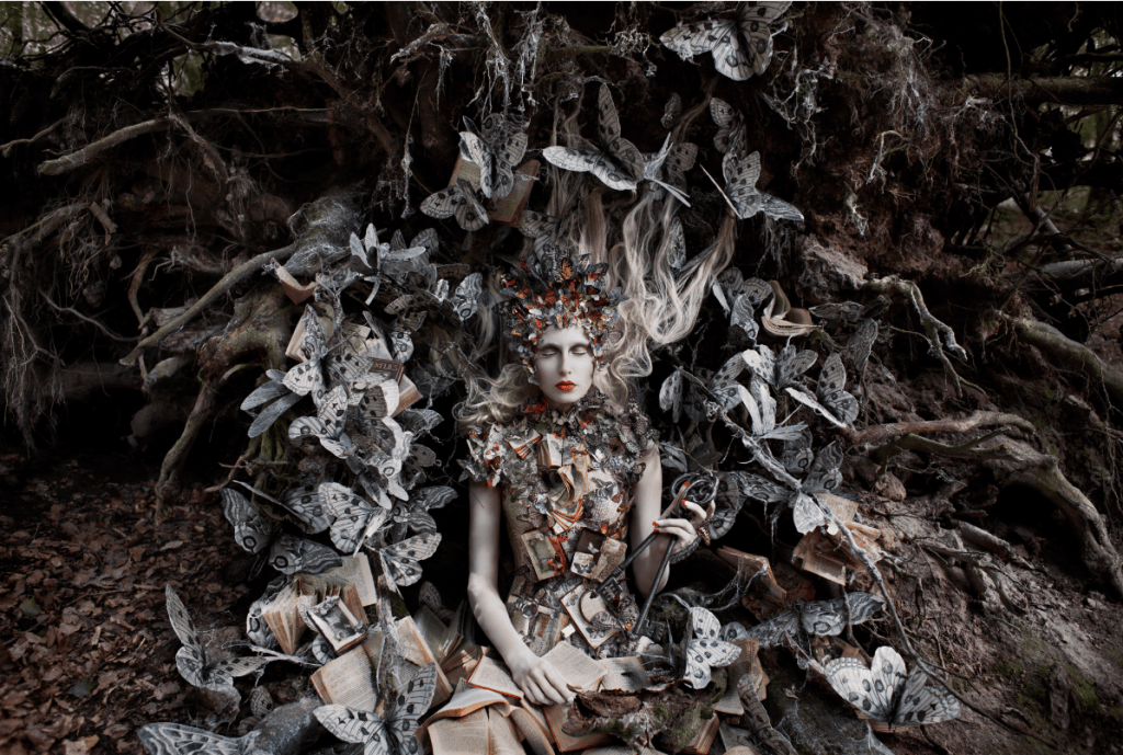
This is a photograph taken by Kirsty Mitchell as a part of her wonderland collection in 2014, it is called The Secret Locked in the Roots of a Kingdom.
It depicts a woman’s upper-body covered in flowers and leaves, her hair looks like it defies gravity by growing naturally upwards, intertwining with the leaves growing down from the top of the frame. The woman herself is very pale but her eyes and cheekbones have been dramatically contoured, creating visible contrast in her skin tone.
I like how Mitchell has used lighter coloured flowers around the body of the model as they kind of blend in with her face and hair making them subtly stand out but as they get further away from her, the flowers get darker and brighter in colour, starting to fit in amongst the greenery.
The way that the flowers are most dense around the body of the model and start to spread out as they get further away from her. This makes it seem like she is the reason the flowers are growing, as if wherever she goes flowers grow in her path.
I really like the many different textures created by the leaves and flowers as well as the contrast in colour between the model and the background in this photo. Its makes it very visually engaging for a viewer and is something I would like to experiment with.
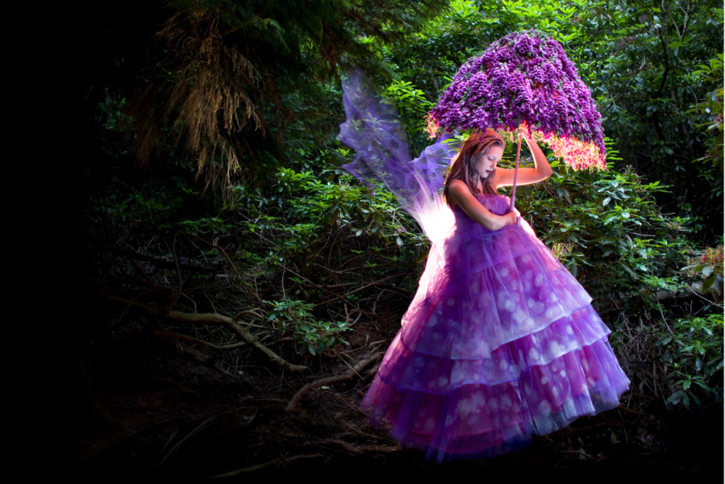
I really like how the composition and colouring splits this shot in half, the light coming down from the trees on the right illuminates the bright purple of the models dress and the bright green from the leaves which creates contrast between the colourful right side and the dark left.
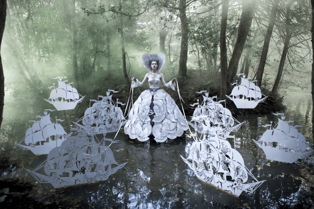
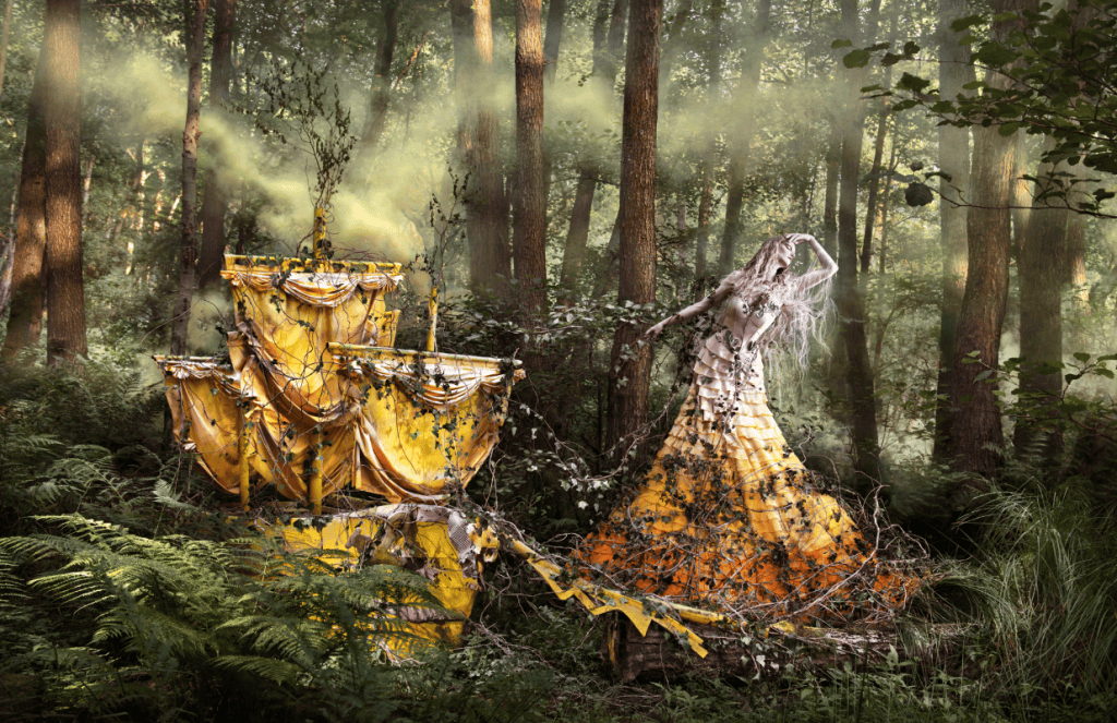
This is another photo taken as apart of the ‘Wonderland’ collection called, ‘She’ll Wait For You in the Shadows of Summer’. It depicts the image of a woman in a small clearing of a forest, surrounded by tall trees and dense foliage. She is wearing a full-length dress, which is sleeveless with a skirt made up of many different layers of ruffles in a gradient that starts from the colour of the models skin tone and ends in a bright orange. On her left is a smaller version of a full sail boat in a bright shade of golden yellow, though it is half buried in the shrubbery surrounding it and is becoming overgrown as there are vines climbing up the mast and sails of the ship.
These vines have also started to grow off the ship, reaching out to the woman on the right, linking the two focal points together. The way Mitchell has used colour to match the dress to the pale colour of the models skin gives the impression that the colour is fading out of the dress, and it will eventually all be that same light shade. This removal of colour combined with the vines starting to cover the dress makes it feel like the model is slowly being turned into a statue. Her pose is sad and dramatic, she looks as though she has been searching for someone or something taking her ship to find it, but has crashed into this magical forest destined to be searching for all of eternity.
I really like Mitchell’s choice of colours in this photograph as the green of the background and shades of orange and yellow that are the subjects of the image are complementary which makes the brighter shades pop out, highlighting the important details.
I love the way Kirsty Mitchell’s photos feel so otherworldly and magical, each photo tells a unique story and gives you a new view of the world she has managed to create in the process of shooting for this collection of images. I would really like to experiment with ways of creating similar effects in future work through colour, props and composition.
Campaign Planning – Audience & Message
Use the prompts below to help you plan your Junk Kouture campaign.
Your Message
• What issue are you raising awareness of?
The issue we are raising awareness of is littering.
• Why is this issue important?
This issue is important because littering is becoming a bigger issue and I don’t think enough people are aware of the effects it is and will have on our planet.
• What message do you want your campaign to communicate?
We want our campaign to highlight how common of an issue littering is and what it’s effects will be.
• What do you want people to think, feel or do after seeing it?
We want people to feel sad or disappointed in how much litter we create and make them want to act on this issue.
Target Audience
• Who is your campaign aimed at?
Our campaign is aimed at people who litter or people who aren’t aware of the severity of this issue.
• What age group are they?
I’d say the age range of people in our target audience is around 14-16
• What are their interests?
Sports, art, movies, reading, fashion, media, music.
• Where might they see your campaign? For example, Instagram, TikTok, YouTube or posters.
I think most people in the age range would be most likely to see our campaign if it was posted on social media platforms like TikTok and Instagram.
• Why is your message relevant to this audience?
Our message is most relevant to this audience because they are the people who the littering issue and climate change in general will affect the most.
• What might catch their attention?
What might catch their attention is a strong header that immediately says what our campaign is about and also the use of bright colours to make it stand out.
Audience Profile
Create a profile for a typical person in your target audience. Consider:
• Age
15
• Interests and hobbies
Drawing, fashion, music
• Lifestyle
Social, fairly active
• Social media they use
TikTok, Instagram
• Their current attitude towards your issue
Not really aware of the issue, unbothered by it.
• What might persuade them to change their behaviour or take notice
Something that would change their behaviour or force them to take notice would be sharing information about the negative impacts of littering.
Existing Campaign Research
Find one existing campaign that you think is effective or relevant to your idea. Consider:
WWF – Plastic Pollution
• What is the campaign trying to communicate?
The campaign is communicating the serious problem that is plastic pollution and why we need to stop it.
• Who is its target audience?
People who want to learn more about plastic pollution or people who didn’t know it was an issue.
• How does it use photography/video, text, colour and imagery?
The campaigns website contains photos of plastic in places like the beach the ground and in the ocean. It also has simple headers which then underneath goes into details about plastic pollution, and the sites colour scheme is fairly simple.
• How does it make the audience feel?
The photos of the plastic in familiar places makes the problem relatable to the person viewing the site which will make the audience feel that the problem is more real than originally thought.
• What makes it effective?
The simple colours of the text and text boxes on the site allows the main focus to be the visuals of the plastic so that the audience can really see the problems.
• What ideas or techniques could you take inspiration from without copying it?
I like all the visuals of the plastic as it forces the audience to see the problem for themselves, so I’d like to incorporate some of those into our campaign. I also like the was the text is quite simple as it allows the message to be shown through the visuals.
Your Campaign
• Will you create a photography or video campaign?
We would like to create a photography campaign.
• What will you photograph or film?
Alongside images of our Junk Kouture outfit, I’d like to photograph images of litter in public places to show that it effects all areas.
• What style will appeal to your audience?
Easy to read, (no long paragraphs) bright colours, instantly engaging.
• What mood or emotion do you want to create?
We would the mood of our photo be sombre and sad and we would like to create sympathy from our audience towards our environment.
• How will your creative choices help communicate your message?
We can use different angles and lighting during our shoot to highlight certain details which communicate our message
Junk Kouture
The Junk Kouture competition was founded by Troy Armourbegan in Donegal, Ireland, in 2010. Their goals since the start has been to give young people a creative outlets to explore their ideas while also encouraging them to think about waste and how it affects our environment.
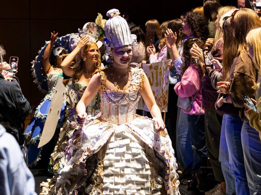
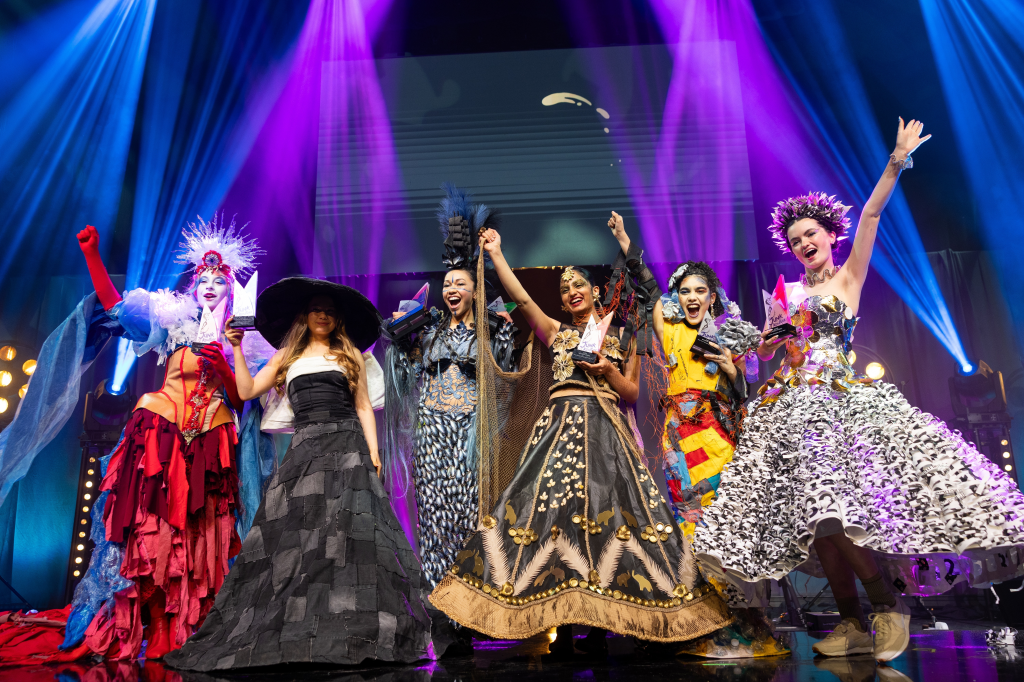
The competition has been running for the past 16 years and have had a great impact on young people all over the world as over 80% of students have reported Junk Kouture as their favourite lesson and many have also said it has increased their self confidence.
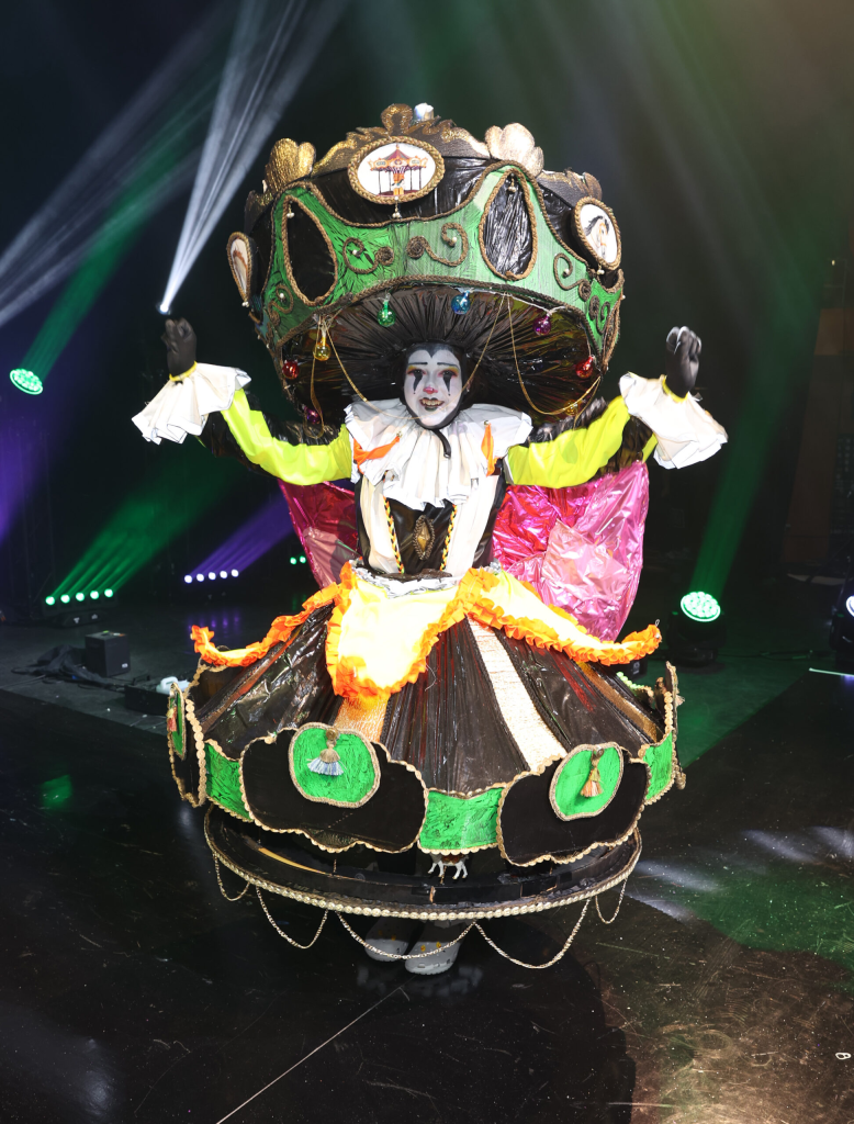
Last years winner of the title of World Designer of the Year in the Junk Kouture competition was Carousel Couture, designed and created by Lauren O’Neill, Alexandra Giltenane and Sarah Kinnnane. Their design is inspired by a funfair and to create it they sourced hi-vis vests, binbags, pipes, cardboard and old toy animals and turned this ‘junk’ into an incredible, merry-go-round themed outfit. They decided on the shape of the dress as they thought they concept of a merry-go-round’s continuous spinning was a great representative of circularity in fashion.
Creative Media raising awareness of Sustainability
As climate change becomes a bigger issue it’s become more important than ever before that we spread awareness of its effects and how we can start thinking more sustainably. In recent years, the most common way of spreading this awareness is through different forms of creative media shared on the internet and social media.
There is many accounts, organisations and businesses on platforms like TikTok, Instagram and Facebook who focus on sharing awareness on climate change, how they are helping and how you can too. These accounts (especially ones on TikTok and Instagram) often use short-form content and quick but memorable information to engage younger generations as they are who climate change issues will affect most.
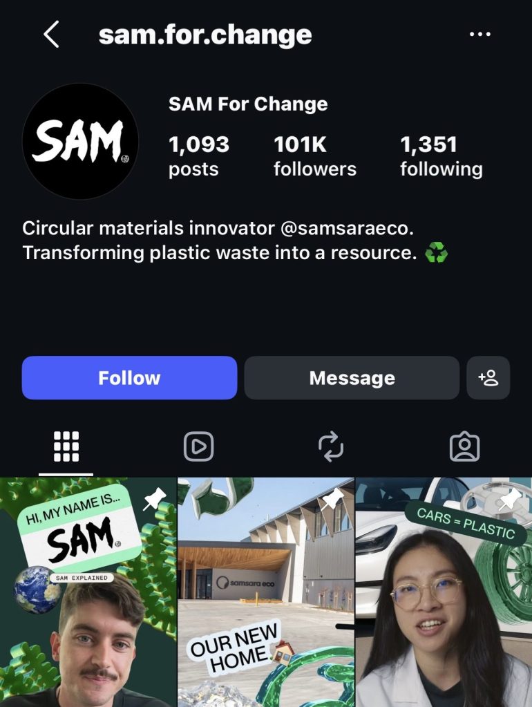
Sam For Change is an organisation working with scientists to create plastic eating enzymes so we can reduce the amount of plastic waste in our environment and reuse it to give it a better purpose. They share all of their progress and updates on Instagram to keep viewers engaged and hopeful about their mission.
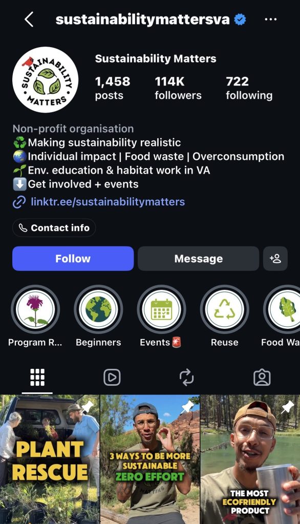
Sustainability Matters is a non-profit organisation who focus on sharing information about sustainability and easy, unnoticeable changes you can make to your home and life to be more sustainable.
Other ways people are using creative media to spread awareness of sustainability is through film, on platforms like YouTube there are people who have posted short films related to the effects of climate change and photography is also an important way of spreading awareness as it is how sustainable ideas and projects (like Junk Kouture) are shared and if we didn’t have photos of the piles or rubbish or our contaminated oceans, we would never know just how bad the consequences of our actions can be.
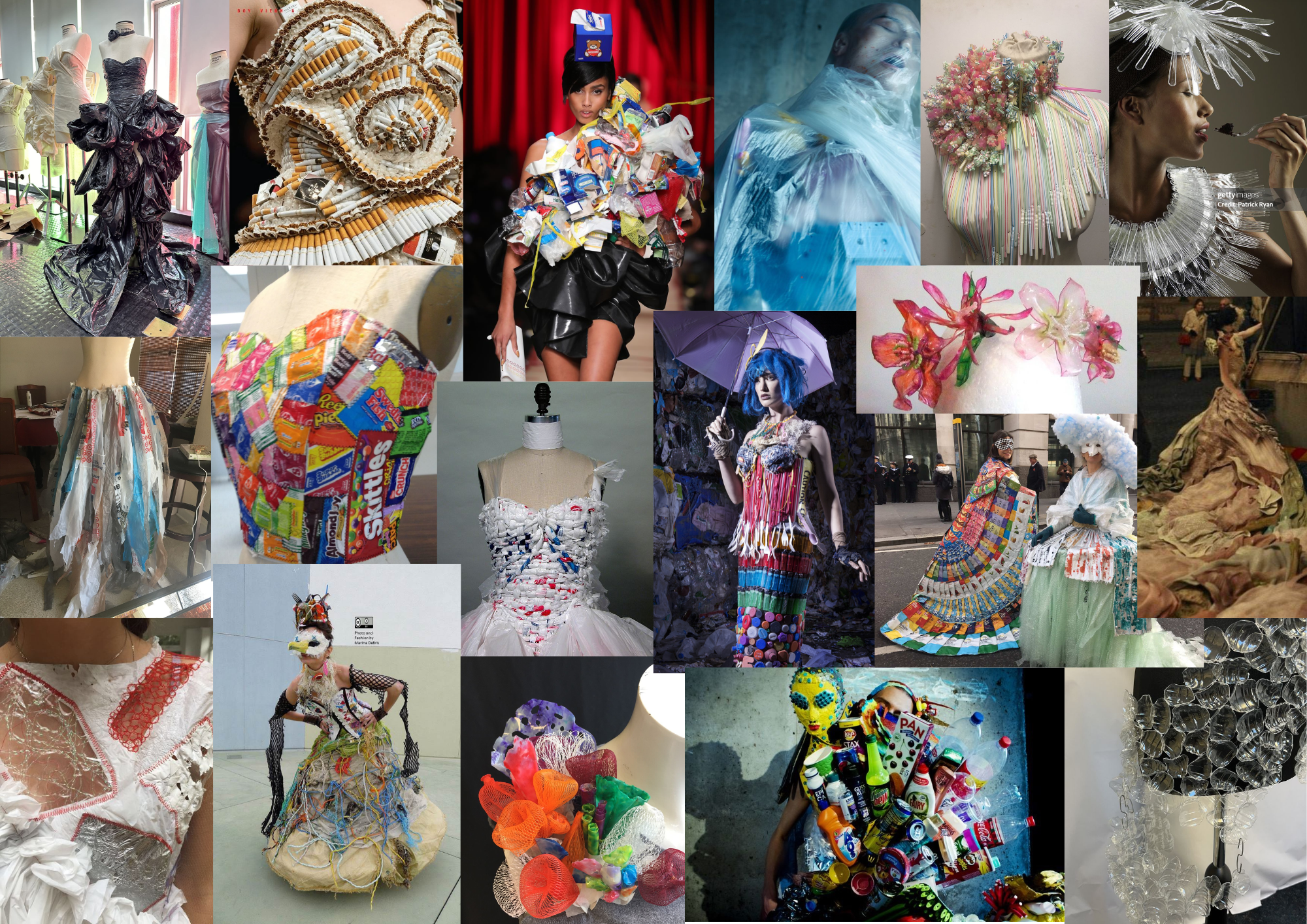
After doing some initial research on the Junk Kouture competition and sustainability in general, we decided the theme and message we want to spread with our design is going to be littering as we feel that it is a very big issue that doesn’t seem to be talked about enough. After coming to this decision I created a mood board with images that inspired and related to our ideas.
After completing this we started on some artist research to help us to continue developing our ideas.
Artist research:
Marina DeBris
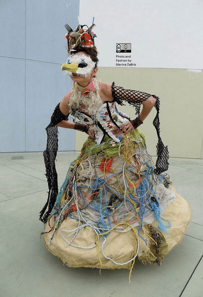
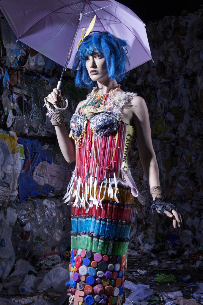
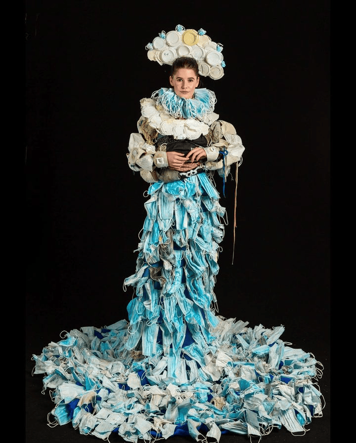
Marina DeBris is an Australian artist/designer, she is know for being an environmental activist, and an anti-plastics campaigner but she is best known for creating various forms of art (including clothing) from trash found on beaches with the goal of raising awareness of beach and ocean pollution.
The rubbish she uses in her work is in the same condition as it was when it was found, so no washing or cleaning. She does this to create discomfort and force people to see this issue.
What I really like about her artwork is how she uses materials she finds out in the world that have been washed up on the beach. This is something I’d like to try too as it’s a good way of sourcing unique materials and is also good for the planet.
Julia Che
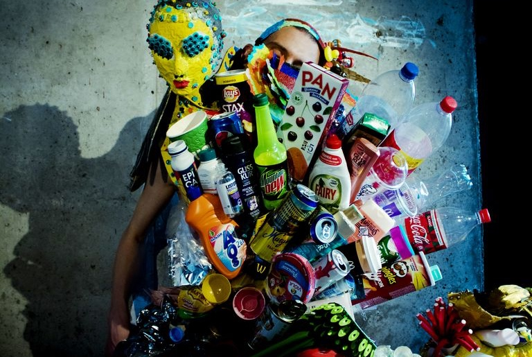
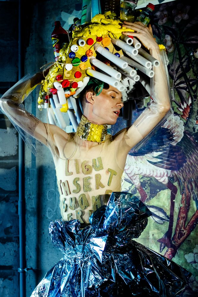
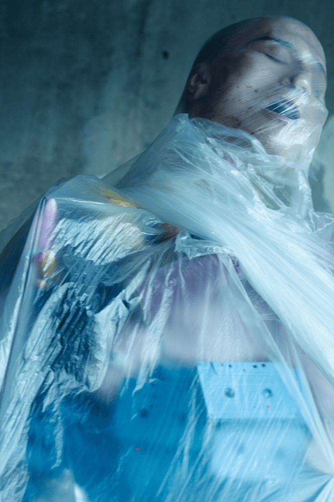
– Modic Fashion Editorial – UNIVERSE
This is the work of Julia Che, a Russian designer, these pieces were created for a Modic Fashion Editorial and are made entirely out of ‘rubbish’. The idea behind this editorial was to get people to see the beauty that can come from things generally considered trash.
I really like this concept of repurposing litter to be something different and the message that we can reuse our waste and turn it into new things. I also really how she has used such an assortment of things to create these outfits an the different, bright colours that still work together, I’d like to experimenting with using brighter colours to make our outfit stand out.
Ainne Burke
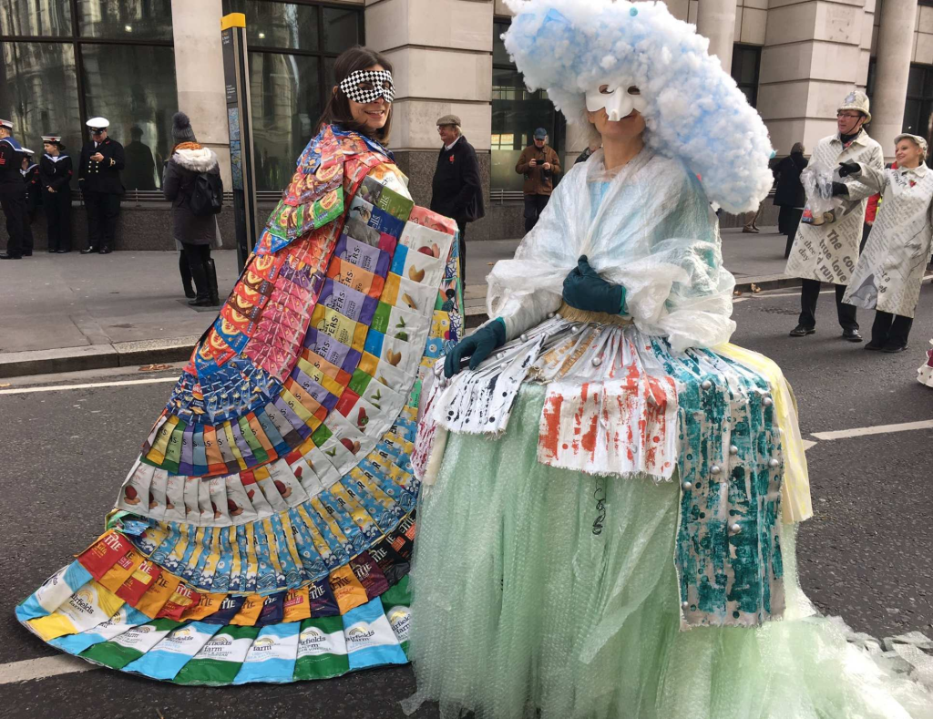
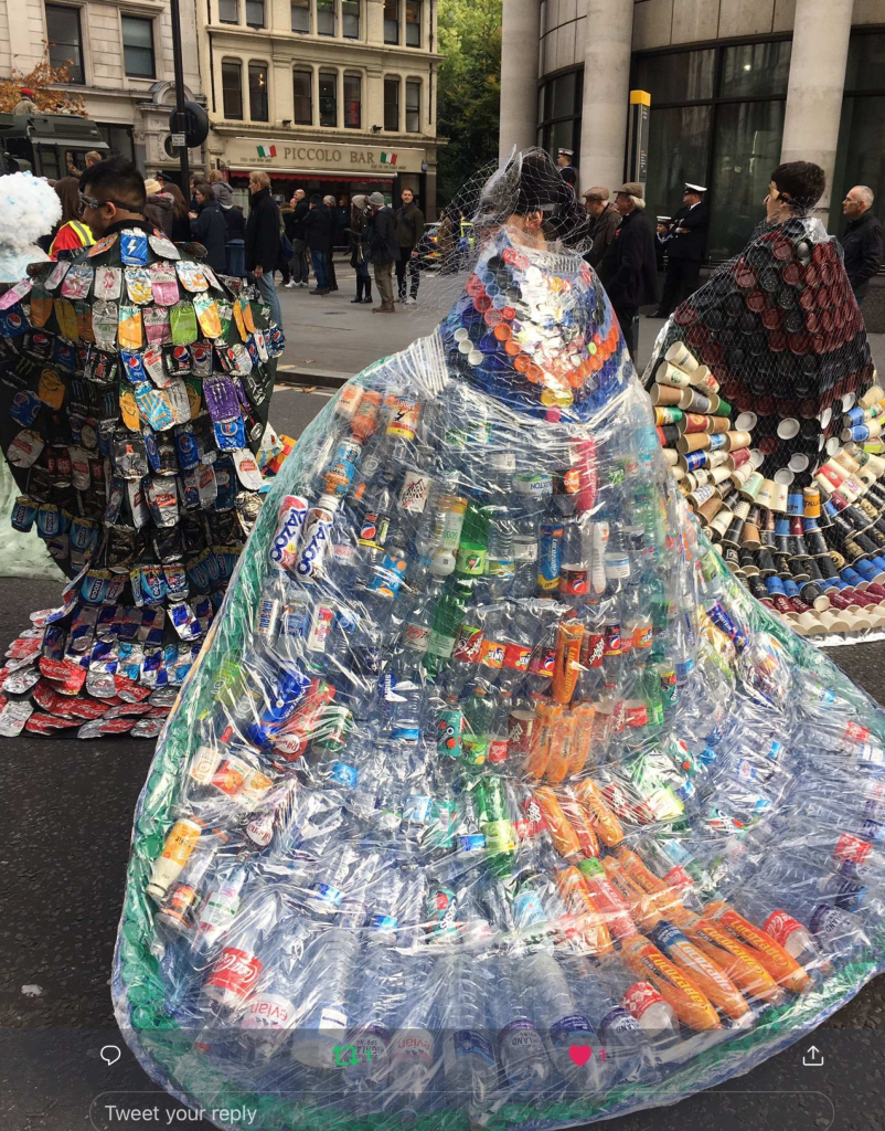
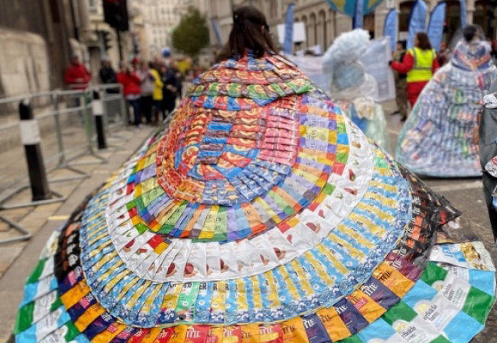
Ainne Burke is an Artist-in-Residence at Imperial’s Grantham Institute – Climate Change and the Environment. She created four cloaks entirely constructed out of litter that would otherwise be sent to a landfill collected by street-sweepers. The purpose of this project was to raise awareness of waste produced by product packaging.
I again really like this idea of using other peoples rubbish to create an outfit as I think the message it sends is very clear and effective.

